Nice , I agree your points 
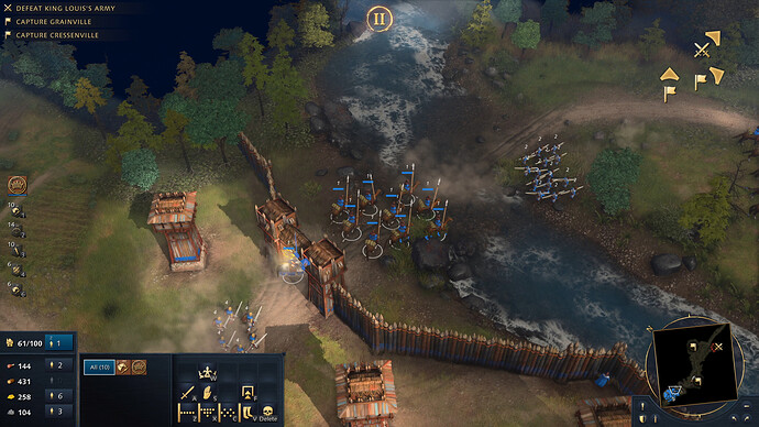
‘Realism’ often reduces readability - that AoE 3 screenshot is a very good example of this. Colours blend into one another, and combined with the lighting it means infantry look small and very hard to distinguish.
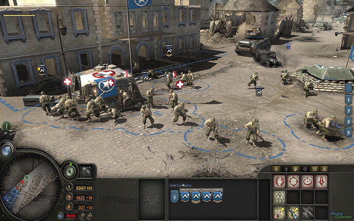
CoH was very good in this regard - some of the squads looked a bit ‘cartoony’ (a complaint we’re seeing now for AoE 4) but were always immediately distinguishable during battle, which was important. You weren’t clicking around trying to find the right squad because ‘everyone wore camo and looked the same.’
In this regard, I think AoE 4 looks much better than AoE 3. If people want ‘realistic’ uniforms then I’m sure mods will come out to address that - the important thing is you always know what a unit is when you’re looking at a load of them bunched together.
REALLY nice but , please don’t complain here
I’m not complaining - I’m doing the opposite. 
Can you show me an example from these CoH cartoonish units you mention?
Because CoH was one of the less visually readable, more realistic RTS games around and gamers (including me) + critics didn’t seem to care about this readability thing everybody seems to think it’s sooo important with AoE IV.
it’s less visually readable is because coh has banners to identify units, and this thing goes to all coh clones (iron harvest, ancestor legacy, etc…) always have realistic graphics but they have banners for the players to identify the enemy units and the way to counter them, and all of them uses squad mechanic, because it will be unbearable to identify units without banners in these games.
I would imagine the northern “port” you describe is a Shipwright of sorts, where you build your ships - on the left potentially a water based version of the Market Place? A Trade-port?
There does seem to be neutral tradeposts in the game where you can send caravans to as opposed to other players - maybe there are neutral trade-ports too?
You hit the nail in the head, actually.
You can create a readable RTS without focusing only on readable UNIT VISUALS. CoH has different audio cues for different units, has more flexible zoom, has small identifying icons on top of each unit (I guess that’s the banners you mention), has a great UI, but most of all, it doesn’t think you are dumb and lets you get familiar with the units.
There are riflemen, mortar and anti-tank soldiers in this screenshot and Relic didn’t feel the need to kill realism by making giant rifles or pink uniforms.
yes you can, only if this was coh clone or something similar to it where the game is pretty much a squad based with banner system and not individual units like in aoe, i barely care to look at the enemy units but instead to identify who i’m picking fight with.
but in aoe case your playing a game that uses individual units system and not squad based system, you have to identify the enemy units when your playing in a player point of view
the weapons doesn’t look that big when you are playing from a player point of view (with the exception of bows.) and i have to identify them from this point of view and they said something about the units visual changes via blacksmith upgrade (don’t quote me on this i might be wrong about it.) and the civs units in the game will looks very different unlike in aoe2 were all units looks the same aside from the unique ones.
so no i think giant weapon and pink colors work for these games unless if you solution is to give aoe4 units a banners to identify them?
Maybe they will add an option to scale units to your preference. A set unit scale for competitive or similar scales that won’t effect gameplay, and then a wider scale for SP
Icons are a cruse unless they directly support the underlying theme ala SupCom’s detached “universal war on a radar screen” framing. A medieval game should not be looking like MS Excel.
Imagine SC2 with unit icons… hilarious!
Also, CoH has squads, if you had a icon for every single soldier it would be a mess to surpass all messes. In fact CoH is already way too messy and remains pretty niche for that reason.
Not what readability is about. Bad readability simply looks like crap whether or not you’re familiar with the units. Again: imagine SC2 with unit icons… hilarious!
I hope that, even if they do that, the minimum scale of buildings will be bigger than the one showed at fan preview.
It’s not the buildings that aren’t correctly scaled, it’s the units
No it’s buildings, looks at a barracks in comparison to a house. Different buildings don’t operate on the same scale. Building are, however, for the most part correctly scaled internally (door, windows, etc being the correct size in comparison to the walls and the roof); this is new to AoE and even AoE2 had really bad internal scaling.
Not that any of this matters much, at least not to me, I think it looks pretty fine.
Have you played vCoH?
Do you not remember Grenadiers wearing white pajama suits? The game didn’t use historically accurate camo for the most part, because it was (rightly) thought to make units hard to tell apart. This is a problem you then encounter in a lot of realism mods.
Likewise, CoH had team colour markers - vehicles had coloured stripes across them, so you immediately knew which player controlled them.
There are more examples, but you get the gist. CoH was never designed to be ultra-realistic.
I have to be honest. I have also participated in threads asking for better graphics coz yea why not push it a little. It can always be better in some way right. But looking at these screenshots its actually everything I wanted when i was a kid and played AOE2. Already looks cool i must admit. For sure better than AOE3:DE. So gl to devs with the finishing touches
Screenshots looks really good. I hope they add some SS which is not in a different camera perspective, instead an ingame ss with UI.
I’m a little confused, on one side I don’t like graphics, on the other it seems cool. Btw I hope animations will be more realistic
I think this is probably difficult to implement in practice. The center of all of the units and all of the buildings have to be in the exact same position for all of the players and the hitboxes for all the buildings and units have to be the same for all players, so that the gameplay is consistent for everyone.
That means that you now have fixed objects in 3D space that you can then scale the visual model. If you make the model too big, then things clip into eachother. If you make things too small, then there’s no contact during combat.
I agree with you. Readability is important

