Cartoonish graphics are way more accessible and usually, devs choose this kind of graphics when they are on a limited budget. It is way easier to work and a lazier way to make a game.
Some developers work alone and do better than this one. (For example, Manor Lords)
And if you zoom in, the units look so plastic. Including armors (excluding some of the Greek units’ material) and unit looks.
3 Likes
To be honest, I fail to see the problem here. It’s not as if the original AoM already had the same art style.
5 Likes
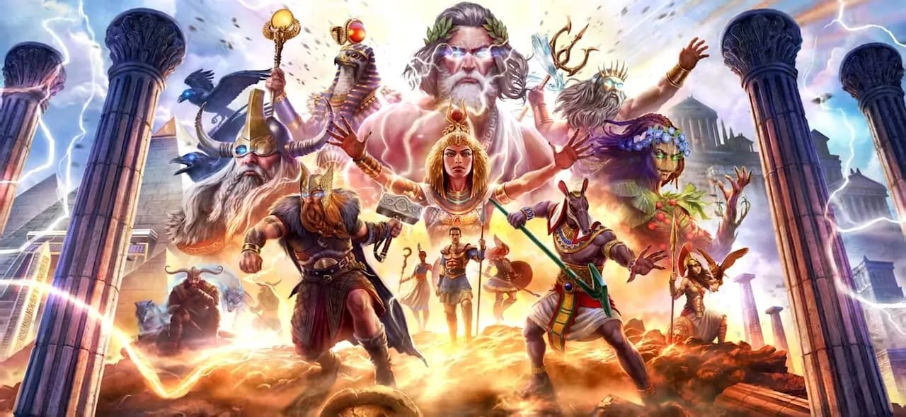
Yeah, this bothers me the most. ![]() I grew up with the old art for the gods and this Gaia, Anubis or Athena do nothing for me. I liked how human they looked back in the original. That art got me into Greek mythology. This art looks kind of like SMITE.
I grew up with the old art for the gods and this Gaia, Anubis or Athena do nothing for me. I liked how human they looked back in the original. That art got me into Greek mythology. This art looks kind of like SMITE.
EDIT: That’s probably Seth, not Anubis.
2 Likes
I mean you are just asking for a completely different artstyle compared to the original Age of Mythology, also it isn’t necessarily easier or lazier.
Manor Lords is a completely different game with a completely different artstyle.
I think you just have different expectations.
1 Like
I just have a higher standard.
I do not accept a game like AOM Retold
It will be a flop
Just like WC3 Reforged
The devs do not listen to the majority, so they will face the consequences.
I am just saying my opinion and the future of this franchise.
If World’s Edge thinks cartoonish graphics is their art style. Oh boi they are so wrong!
People always hoped if it was better…
I don’t see the problem. It’s the same art but with far better graphics and color palette.
1 Like
Nah, I think “higher standard” is you wishing for different stuff and artstyles. You want a game that doesn’t look like Age of Mythology and that is fine.
11 Likes
Who’s this “majority” that you speak of ?
Relax you don’t speak for anyone.
10 Likes
Look at Twitch and youtube Comments.
i was so sceptical about the art direction, i think they nailed the graphic style amazingly well. i LOVE how huge and imposing the myth units are now. the buildings look on point great readable and similar to the old game but still a lot imrproved.
also farms, trees and the giants look WAY more better now (in my opinion amazing) i honestly hoped we would bet cerberus as a myth unit and not a titan, but i think he looks WAY more badass now compared to the old one. (titans looked the goofiest in old AoM with the exception of ######### and atlantean titan)
statues of the gods look amazing.
i LOVE the colossus, minotaurus, medusa, pegasus, argus, phoenix, wadjet and fenris design SO MUCH. (also if you look at einheriar you finally see UPGRADES on units!)
finally titans can walk across water!
but i also have to point out a few personal concerns:
-
its a bit strange that some myth units got amazing overhauls like the above mentioned ones, but then others
again like valykrie, pestsuchus and centaur look way too similar. and also sometimes way smaller compared to other myth units but maybe its the perspective? -
chinese was confirmed but not included (which is nothing problematic at all just a bit confusing)
-
the coverart looks greatly coverful but i also prefer the old art more. hoped they would do more “ancient” but more high resolution and colourful art for the gods. so kinda a bit of a hit and miss for me.
-
i would have loved to see jormungandr cause the unit was the most ridiculous looking unit compared to lore. hope they make it bigger.
-
i saw hydra and hoped it would finally have multiple heads at the beginning cause thats the trademark of hydra normally and even i liked the growing heads mechanic you could not really utilize it in games that great and it never really felt like hydra. hoped for a more drastic design like argus for example. but there is still time and i hope they i will change this.
-
didn’t see any new myth units or finally the mechanic for units to be able to fly and land. would have loved to see this.
the presention was wholesome and really nice. the woman who presented it looked a bit like a curvier helen of troy. really fitted well to the presentation ^^
all in all the news exceeded my expectations and all the stuff i was sceptical about looks way better than i expected but the stuff i hoped for (new flying mechanic, chinese, new gods/myth units and more fitting design for e.g. hydra wasn’t there - yet. but i am promising when i look at argus and fenris especially. also i still hope every civ will get some unique heroes and not just in campaign which always felt like wasted potential in my honest opinion) still not sure about the artstyle of the gods tho. but ingame is the perfect blend between serious and colourful/fantasy.
2 Likes
So in you opinion a game not advancing its graphics is a way to go?
Do you know how Call of Duty, CS, Dota, Battlefield etc advanced through the years?
I think you dont know it.
Now you have a lot of homework to do.
The Cartoonish critisism isn’t applicable, except for maybe some of the Atlantean myths.
On that note:
HOLY MOLY, Gaia sticks out like like a sore thumb in the splash screen, she needs a complete makeover. That does just not look right.
The Arguses (Argi? Argus in plural?) Looks straight out of Starcraft 2 and the Automaton looks like early League of Legends. Theres also the fire Titan/Kronos which is way to satureted.
The updated models that goes for the original style is great of what I have seen, but these that has a new design has to go back to the drawing board as they look alien to everthing else.
1 Like
My dude, do you know what an artstyle is?
Looks like the game is looking helluva lot more updated than 2002, that is for sure. But most importantly it looks like Age of Mythology. I don’t think a lot of people would want Call of Duty graphics in AoM Retold.
If you don’t understand that, there is no point in dragging this conversation.
4 Likes
Well, people are saying another mobile game.
PC standards are higher in 2024 when it comes to graphics.
Times changed, AOE and AOM gotta change their mind on many things.
cartoonish
Stylized and not going for a grounded, realistic look =/= cartoonish.
Looks fine, as it should. It’s not AoM2, the point of reference is the original game and its presentation, tone, and art style.
I’d be happy to play AoM which is more gritty than Dark Souls and Exanima combined, but it would look weird and out of place here.
11 Likes
argus looks SICK. 1000 times better than the original one dk what your talking about. the gaia one well i think they wanted to go more with the godofwar style where she looks less human i think that fits her identity well. (even tho as a 12 year old i really liked orginal gaia much ;-)) didn’t see the automaton have to look again. behemtoh also looks way more serious and menacing now but i personally hoped for a more drastic change in design similar to argus.
its strange for me that despite every myth unit got a glowup some look way more changed than others which look way more vanilla which is sometimes a good, sometimes a bad thing.
I don’t think it is cartoonish but it is defenetly clashing artstyles. Gaia’s redesign is inexcusable: she looks straight out of Disney’s live action remakes. The Atlantean Myth units looks like they warped in from another game (the Argus, the Behemoth and the Automaton).
However a lot of it looks right and like AoM would probably look like with modern graphics but it looks like two different teams are working on making the models. One team wants to make updated models of the original while the other team wants to cram their own vision in the game and change what was before because they think theirs is better.
1 Like
This. The goal of a remaster/remake (which the Definitive Editions of AoE 1 - 3 and Retold are) is to match the artstyle of the original. And imo Retold nailed it.
3 Likes
To ad to what my problem with Gaia’s look is:
When I see the splash screen the Gods looks like they are drawn with a rather classical timeless look in mind while Gaia is very “modern”. Most of what we see from the others looks like it could be from anywhere from the 90’s games styles to current times while Gaia’s style popped up around 2016 at the earliest and it is not something that fits, wether I like it or not.
2 Likes