 GAME INFORMATION
- GAME BUILD #: 101.102.24724.0 (#90260) 11771158
- GAME PLATFORM: Steam
- OPERATING SYSTEM: Windows 10
 ISSUE EXPERIENCED
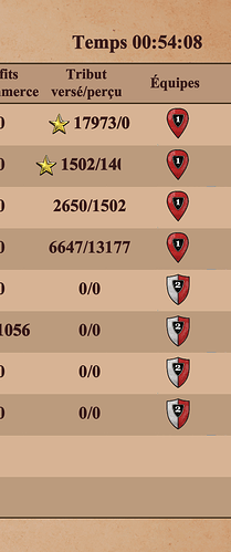
In some translations, the text is slightly too long for the boxes allotted. The technique of scrolling the text then becomes ridiculous and barely readable. (See top right in the video.)
 FREQUENCY OF ISSUE
- 100% of the time (ALWAYS)
 REPRODUCTION STEPS
Here’s the steps to reproduce the issue:
- Open the game in French
- End a game and navigate to the stats screen
 EXPECTED RESULT
There are various ways to solve this.
- Make the space for it slightly larger
- Scale down the font size (à la Adobe PDF form fill & sign) or reduce tracking for text so it can fit
- Use more abbreviations (here ‘Nombre’ is reduced to ‘Nb’; one could also abbrev. “dév.”)
- Use a better scrolling design, e.g. scroll slowly and then pause for a second at the end rather than twitching endlessly
- Improve translation practices; in this case “technologies” would have been fine and slightly shorter than “développements”
 IMAGE
IMAGE
Note in that this video, the word “développement” should end in an “s”, so either the scrolling is not revealing it or the problem would be even worse if it were correct.
