GAME INFORMATION
 These details are CRITICAL; DO NOT skip them or your issue may not be reviewed.
- GAME BUILD #: September PUP
- GAME PLATFORM: Microsoft Store
- OPERATING SYSTEM: Windows 10
ISSUE EXPERIENCED
DESCRIBE THE ISSUE IN DETAIL (below). LIMIT TO ONE BUG PER THREAD.
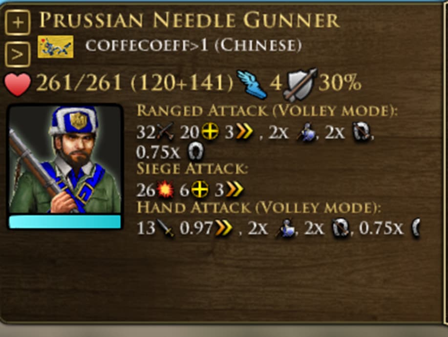
The new skirmisher Icon in the public beta looks really off compared to the original. Its the hat, its off to the left on one side and the golden badge looks like its off to the right. Its really off looking at it. The cap just needs to align in the direction the unit is looking at like in the original.
FREQUENCY OF ISSUE
How often does the issue occur? CHOSE ONE; DELETE THE REST!
- 100% of the time / matches I play (ALWAYS)
IMAGE
ALWAYS attach a PICTURE (.jpg, .png, .gif) or VIDEO (.mp4, YouTube link) that highlights the problem.