These are things that I personally would like to see implemented:
Unlimited clan members. Why limit the members of a clan to 200? To avoid a monopoly or something like that? Personally, I would like there to be no limits.
List of total people online for both XBOX Game Pass and Steam.
List of connected people who play competitively or are in the waiting room. It would also be good how many of your level are playing or looking for a game.
List of friends (online or offline), and be able to see profiles and statistics just by hovering over their names.
Give the option in the menu not to play the intro cinematic every time you start the game. It’s fantastic, but we’ve already seen it a million times and we want to get straight to the point.
More life to the interface in general inside the lobbies:
Historical data and curiosities as ESO did
More conceptual art on the menus.
News and official announcements.
Social networks of content creators.
Show the activity of the forums within the game.
Return the old range categories:
Recruit, private, soldier, sergeant, first sergeant, etc…
On the pre-match loading screen:
Mercenaries, natives and outlaws that will be available.
The silhouette of the map.
Tips on the loading screen. (Like in SC-2 for example). Useful for new players.
Inside the game:
Being able to control an ally’s units in case he loses connection or surrenders. In addition, the resources are distributed among those who continue in the game (Sometimes you want to demolish buildings of the ally that has surrendered or disconnected, or sometimes you see an opportunity to save the game). (Also present in SC-2).
View player statistics within the player summary. (ELO, Streak, etc…)
Quick access button or key to repair all. (I don’t know if it already exists). it is somewhat tedious to repair the buildings and wall segments one by one, especially in treaty.
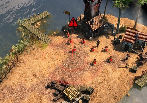
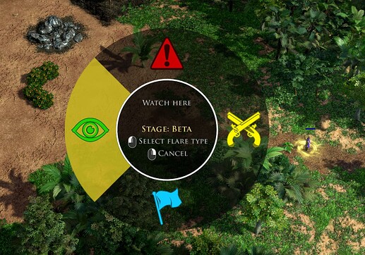
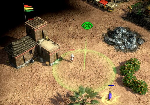
When you use the flare it is also visible to the opponent. I don’t know if it’s a bug or something deliberate, but some players use it in a toxic way and it’s somewhat irritating. I think it’s better if only the allies can see.
Being able to see resources and income per second of allies in the player summary.
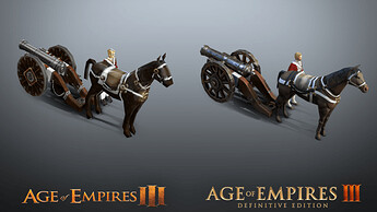
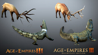
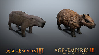
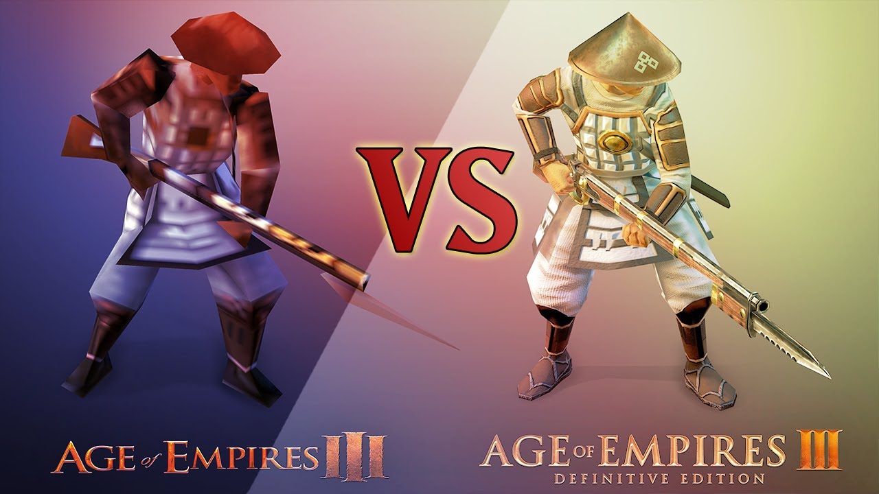
Legacy game graphics as an option in the menu (just like in AOE-1 DE). The minimum settings of the AOE3-DE game should look like the maximum of the legacy game. The polygons were never noticeable until you got too close. I played 4v4 smoothly and very smoothly in the legacy game with everything maxed out and it looked great.
Obviously in AOE3-DE they look better, but the video is to make my point.
Give the option in the menu so that in case of pressing the ‘start’ key it does not take you to the desktop. (Sometimes you press it accidentally and it would be nice to have this option as in SC-2).
The game behaves like a window even if it is not configured as such. When the AOE-3 (legacy) game started, once it was opened, the screen was taken. That is to say: in DE I have to click on the game icon in the taskbar to be able to access it. I don’t know what differences there are between the original (legacy) and the current (DE) app, but it should behave like the original game.
In case you have set the screen to turn off over time if you are away, even with the game open it also turns off, this did not happen in the base game either.
When one player’s connection drops temporarily, why does the other continue to play as if nothing happened? Shouldn’t the match be paused for both teams while you reconnect? I don’t know how many it happens to, but sometimes the connection drops for a few seconds and once I connect again the pace of the game speeds up to reach the “current” state, since the game did not pause for the other player or team. The problem is that during that time you didn’t control your units and they are drifting in that fraction of time and it can cost you the game.
The period of opportunity to reconnect should also be extended. Why not around 2 minutes? and after that give the other team the opportunity to eject or continue waiting.
Gives the option so that the monopoly and revolution notices do not occupy the entire center of the screen. It can make micromanaging difficult.
Have preconfigured game options. For example if someone always plays competitive 1v1, he won’t have to always select supremacy / 1v1. With just a competitive pick, you’ll get right to the point and start looking for a game right away.
