In comparison to Voobly and HD, the tooltips now take up more space and have a black box as background. While playing and watching twitch these black boxes are rather intrusive by constantly flickering on and off. This has raised the following thoughts;
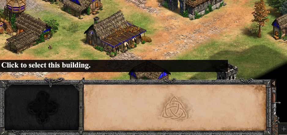
We can split up the tooltips into 2 categories, the necessary (for icons) and the useless (inside the gameview). When you hover on eg; a building you get the following tooltip.
I don’t see the need for any tooltips within the gameview, these ‘tips’ are intuitive even for someone who has never played the game before. Really no one benefits from them.
On the other hand tooltips are necessary when hovering on icons, to see unit/upg stats/costs. To see what the buttons in the menu do ect.
During NAC3 we could see how Hera had to pause his game vs Tatoh to look up the cost of longboats, because he had turned them off for this reason.
=> My suggestion is to make the default option to only show tooltips when hovering over icons.
Arguably just remove all the unnecessary tooltips within the gameview, if I am making an oversight on this don’t hesitate to let me know.
When you are looking for icon info it’s nice to have tooltips, when you are microing in game not so much. Additionally to improve on this make sure the black boxes only cover the text (see above).
Devs please give a sign if this is anything you would consider.
I wouldn’t argue for a option to remove every tooltip from the UI, but why not, anyways.
What I would like to have is a option that alternate into only meaningful tooltips or into these with also ‘tutorial tips’, as I would classify that one on the image you posted.
I was confused by your comment, I think you misunderstand. It is already possible to turn off all tooltips.
With necessary tooltips I mean when hovering on icons, such as the archer icon in the range, the fletching icon in the blacksmith, or any of the menu icons.
With useless tooltips I mean anywhere inside of the gameview; when hovering on a building, a tree, a unit ect.
Well, what I meant is just that I disagree with removing what you call “useless tooltips” by default. We could just stand with a option that treats them as “tutorial tips”, and have them toggable off, with only the “necessary” remaining on.
Yet, you can’t ask the game to set the default by what you personally prefer.
Why not? If no one benefits from particular tooltips, then why are they there? Default settings should guarantee optimal settings, players should not be expected to dig into settings to remove useless features.
I agree that an option to remove the background panels would be welcome.
You would be fairly surprised to know how much these kinda of “silly” tooltips helps to get people that are not acquainted with games in general to have a brief understanding of what inputs do in the game.
Really though? They are not that complicated settings imo.
This is not about it being complicated or not, this is about providing the best experience by default.
it should be what most of the players want
I agree… That is the reason why I made this topic.
You would be fairly surprised to know how much these kinda of “silly” tooltips helps to get people that are not acquainted with games in general to have a brief understanding of what inputs do in the game.
I’m more surprised how you think the impact on screen of these useless tooltips is in any way relative to the amount of players that benefit from them. Ofcourse you can always find the most novice player that needs to be told that clicking on objects actually selects them, wow great tips.
‘Click to select this villager.’
‘Click to select this military unit.’
‘Click to select this building.’
‘Click to select this gate.’
‘Click a villager to gather wood from this tree.’
‘Click a villager to gather stone from this mine.’
If these are not already obvious to anyone who has ever used a computer, they should be clear after reading them one time. After that they become a constant annoyance that you -at least - need to be able to turn off seperately from the necessary tooltips. I have heard no compelling arguments why they should not be off by default, we know that if they are left on by default the reality will be that they will remain on in many cases. That is a fail in providing the best experience to the majority of players/viewers.
I see there are also some longer tooltips about hunting ect, I guess this is DE’s way of adding value to these tooltips. But one could argue that there are better places to introduce players to the basic of hunting. In the art of war eco management challenges for example.
Here you can see hera playing with tooltips disabled, because he finds them too intrusive to have on. This is not ideal when he needs to look up unit stats/cost. At least there needs to be an option to only show the necessary tooltips. (When hovering on Icons)
Also Viper would ideally like to have the useless tooltips off, but he still needs to see tooltips on icons to see unit/upg costs. It really becomes time that the game makes a tooltip setting that is adapted to the needs of a regular player and improves the twitch viewer experience.
Both of the following issues would not exist if tooltips weren’t constantly popping up when your mouse is in the gameview, there should be a setting to only show tooltips when hovering on icons.
-I noticed tooltips need to be on to see elo in the lobby when hovering over player icon, why would you not want to be able to see elo? It forces players to have the tooltips on.
=> I would not mind having tooltips on if they weren’t so needlessly intrusive, as is explained in the opening post.
-Readabillity panel settings don’t affect tooltips, this should be the case. Alternatively a seperate setting.
=> Readabillity panels aren’t intrusive when hovering over menu buttons to read information.