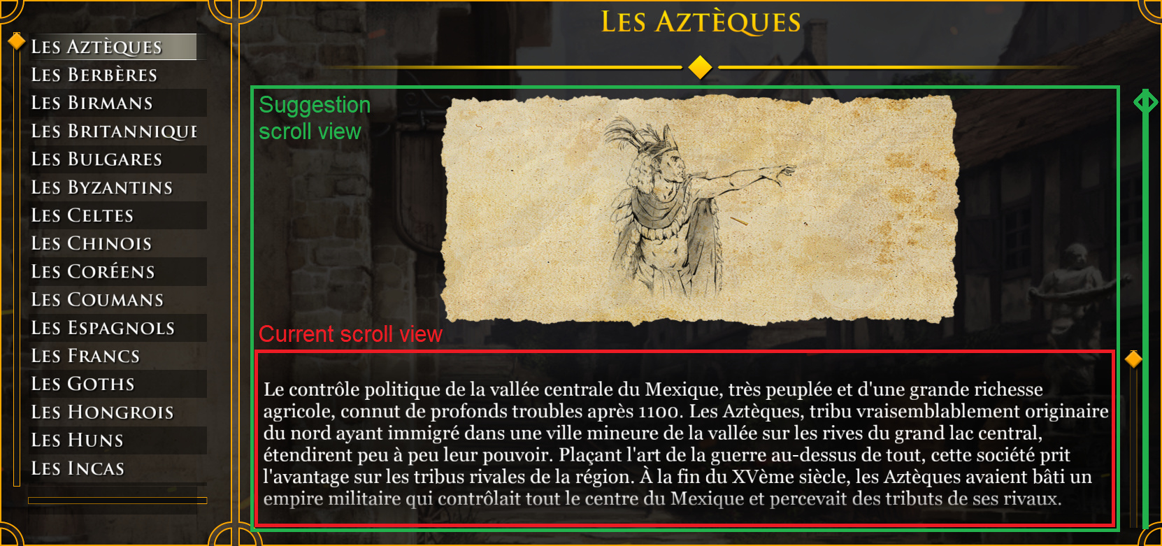
In the “Story” mode, where we can read information about civilizations, the text area is very small (in height) and thus uncomfortable to read.
Could it be possible make the illustration part of the scroll content as well ? (see schema below).
This way when the user scrolls down the illustration is replaced by a larger text area instead of this 6-line view.
Sincerely,
An UI developer.
5 Likes
I dislike reading in short windows, too.
When composing a new message on the forum, it is in a short window, as well; and I dislike it. It doesn’t help that I tend to type a lot. Thankfully, we can manually lift the window up to make it taller on PC. But, still…
In the game, I honestly don’t play ‘story’ mode much yet… but I probably will at some point. Hopefully they address your concern before I get around to checking it out.
PS: As a UI developer, can you please help shift your colleagues away from metro-style interfaces, and the fascination with having a color palette of only two or three colors everywhere? As a visual person, it is helpful and more efficient to see icons having different shapes and colors. With the current trend of UI/UX design, which has gone on for way too many years now, there’s a deep fascination with making every icon be the same shape and have the same two colors… and it’s only getting worse. It’s kind of annoying. Even AoE2:DE plays on this theme to an extent by having every single menu button be a wide rectangle, colored red, with a white font. No matter if you’re exiting or continuing, going back, or clicking to a sub-screen… they all look the same. A nice recipe for mis-clicks and having to spend time reading them first to make sure you hit the proper one. They should be more intuitive than that.
2 Likes