Yeah, some UI/UX updates would be neat someday! Some discussed in the past that I’d like to see at some point, in no particular order:
- Drag-scrolling, as talked about in the AoE forums here, might be nice. Here’s an example on reddit of what that would be like:
- https://www.reddit.com/r/aoe2/comments/g3c978/is_there_a_way_to_pan_the_map_like_every_other/?rdt=34772
- No idea how often I’d use it, but could be neat
- Give some options to players as to what they want to see for their main menu. For example, could make a “Classic UI” toggle, so players who are nostalgic and want the old AoE2:HD main menu interface back could use that. Still surprised to not find much of a nod to AoE2:CE / :HD, except for the actual match gameplay and graphics itself.
- I think the Options menu tabs could use some tidying and tightening up, re-organizing, better section delineations, smaller font (more info displayed per page), and different colors used to help it be more intuitive and easier to look through and use, as well. It feels a little cluttered and discombobulated… harder than it should be to find what you need, imo
- Bigger text scroll window for civ histories, since reading paragraphs of info in a short window is not too fun: [SUGGESTION] Improve "Story" UI by enlarging text zone
- Add some green buttons to the menus, since red usually means Cancel/No and green means Continue/Yes. Maybe even a neutral plum/purple of some sort for some buttons, too. You can still make it look neat with well-chosen shades and saturations. As a visual person, I hate having to read and process the button text every single time because the non-intuitive color choice. This is an old collage, but still applies for the most part if not entirely:
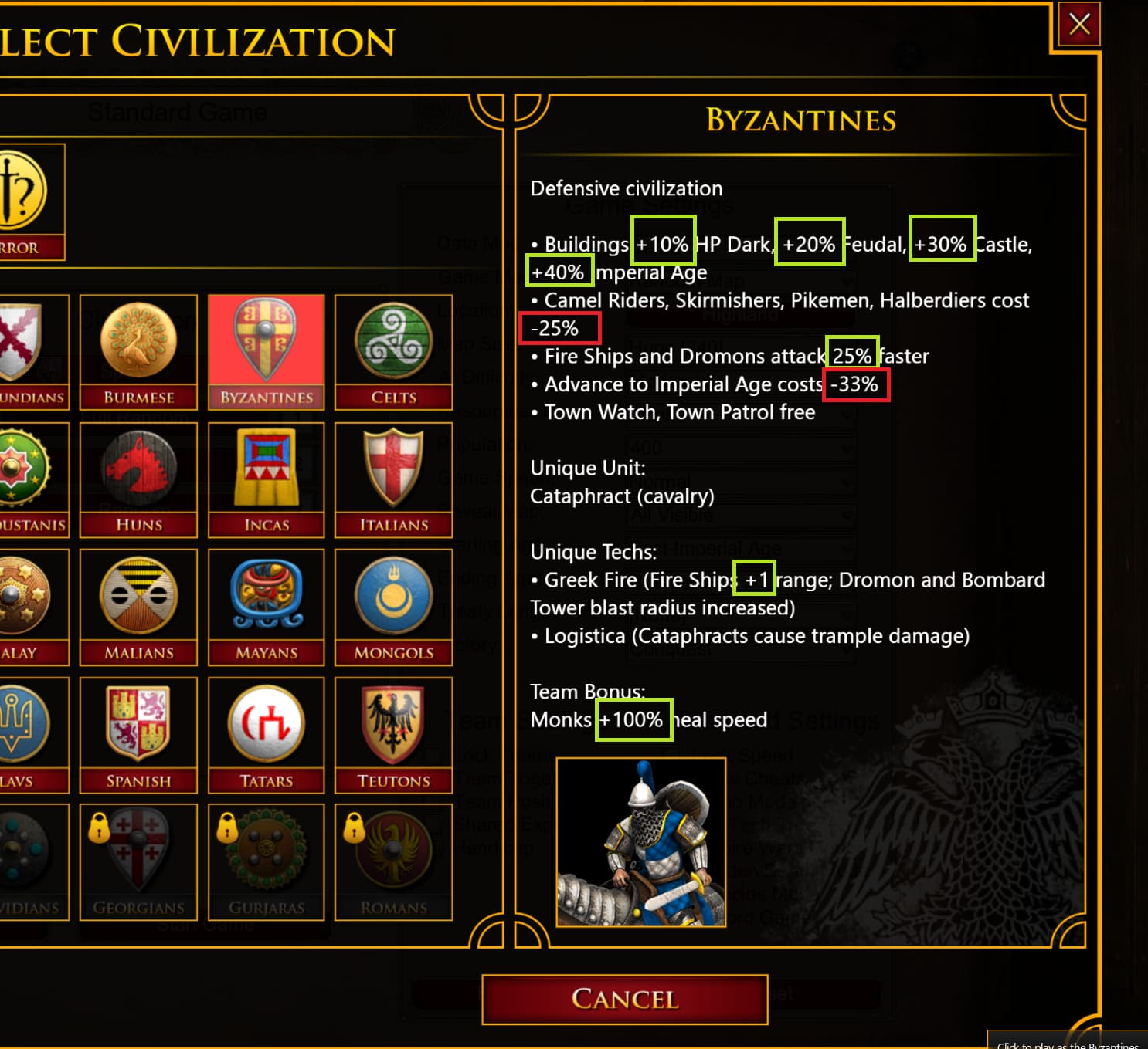
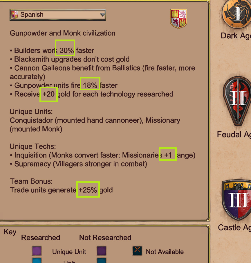
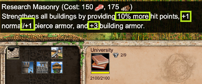
- Color-code the text do denote + (green) and - (red) stuff, in screens like this:
Edit: It should be “green” color is stuff “good for the player”, and “red” is stuff “bad for the player”. I know at least my first screenshot has errors regarding that philosophy I was careless with my highlights…
… To name a few possible quick wins