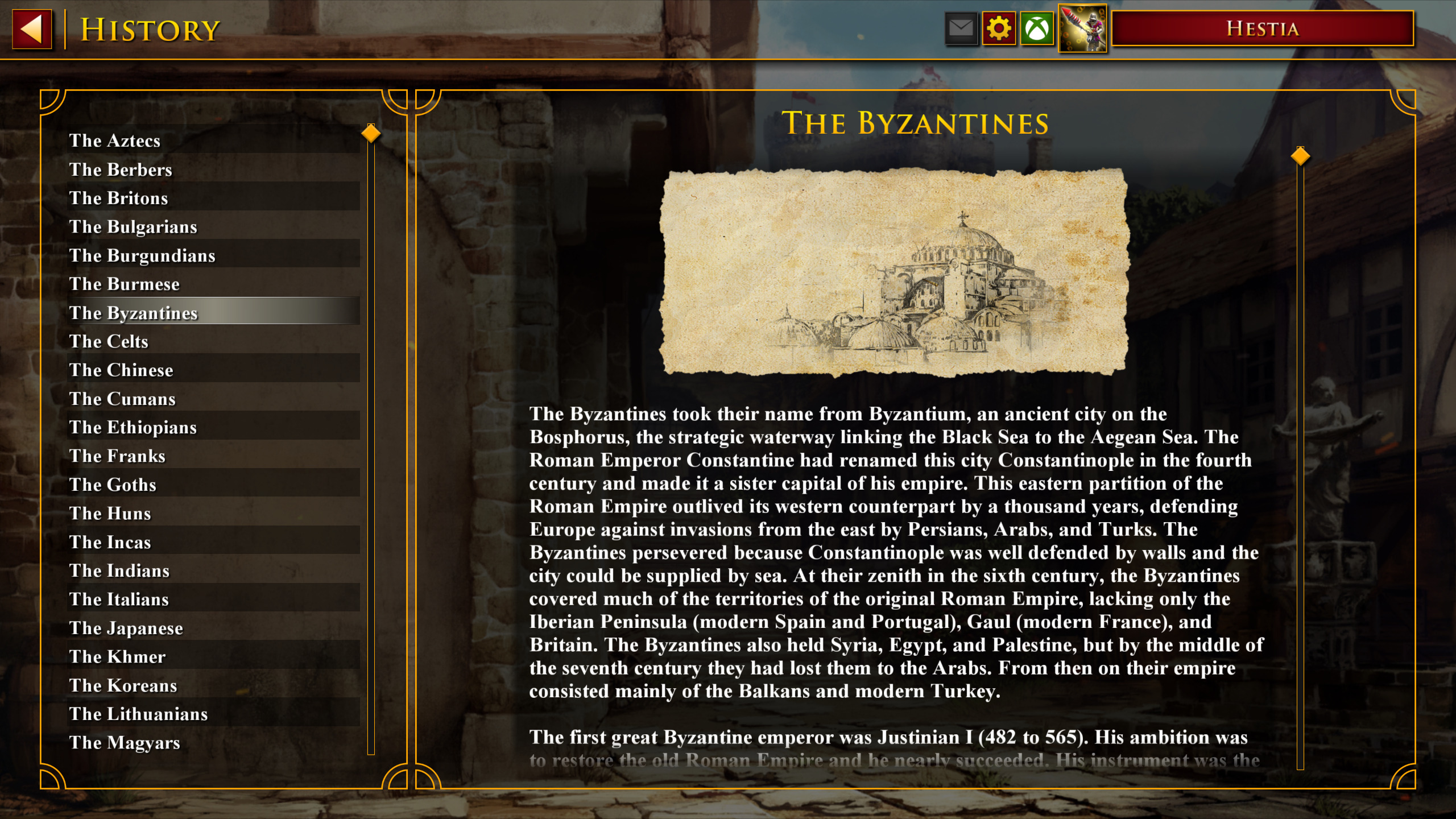
If you compare the History section of DE with that of HD, the reading experience is a degradation. The text is only scrollable in a wide thin rectangular area, displaying only 6 lines with very tight spacing between lines. In HD, the layout at least feels like reading a book: bigger height to width ratio, enough spacing, and a better font.
A super fast fix for this, is to make the cover photo for each history article scrollable, so that space is not wasted.
True! I loved the older art style of history it was much more readable!
BTW there is another problem related to history section, modded history texts placed in mod directory don’t work, we have to replace original game files in order to make it work. Please fix that issue as well.
I dont like this new modern feeling. Seems it true for the new main menu in the november patch. I dont like that either. So i fully support this idea. This looks much, much better.
Looking back at the screenshots, I found something amusing: Did anyone think the upper screenshot is shorter in height than the lower one?
In fact they are both 1920x1080. How could it be designed in such a compact way, in an already tight vertical space
Besides, I found the semi-transparent background very distracting.
Devs, I know you do care about UI right? At least you refresh the main menu in this anniversary patch. Please give history some love. Thanks! @GMEvangelos
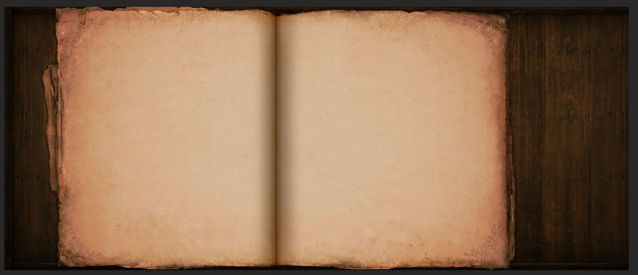
Since you’re working in modifying the history section, you may be intrested to know that in the AoE2DE\widgetui\textures\backgrounds folder there is this file:
If you know how to work with the xaml files putting this image as background doesn’t sound too messy. I’ve already tried but programming is not my strong.
Yes my ambition (or wish) is to make this happen! But I’m only a starter at WPF/xaml stuff So what I could do atm is quite limited. I will keep exploring.
It feels weird though, the spacing on this background. I expect to put the list of civs on the left page, and the paragraphs on the right one. But the widths are so close. Ideally the right page should be wider.
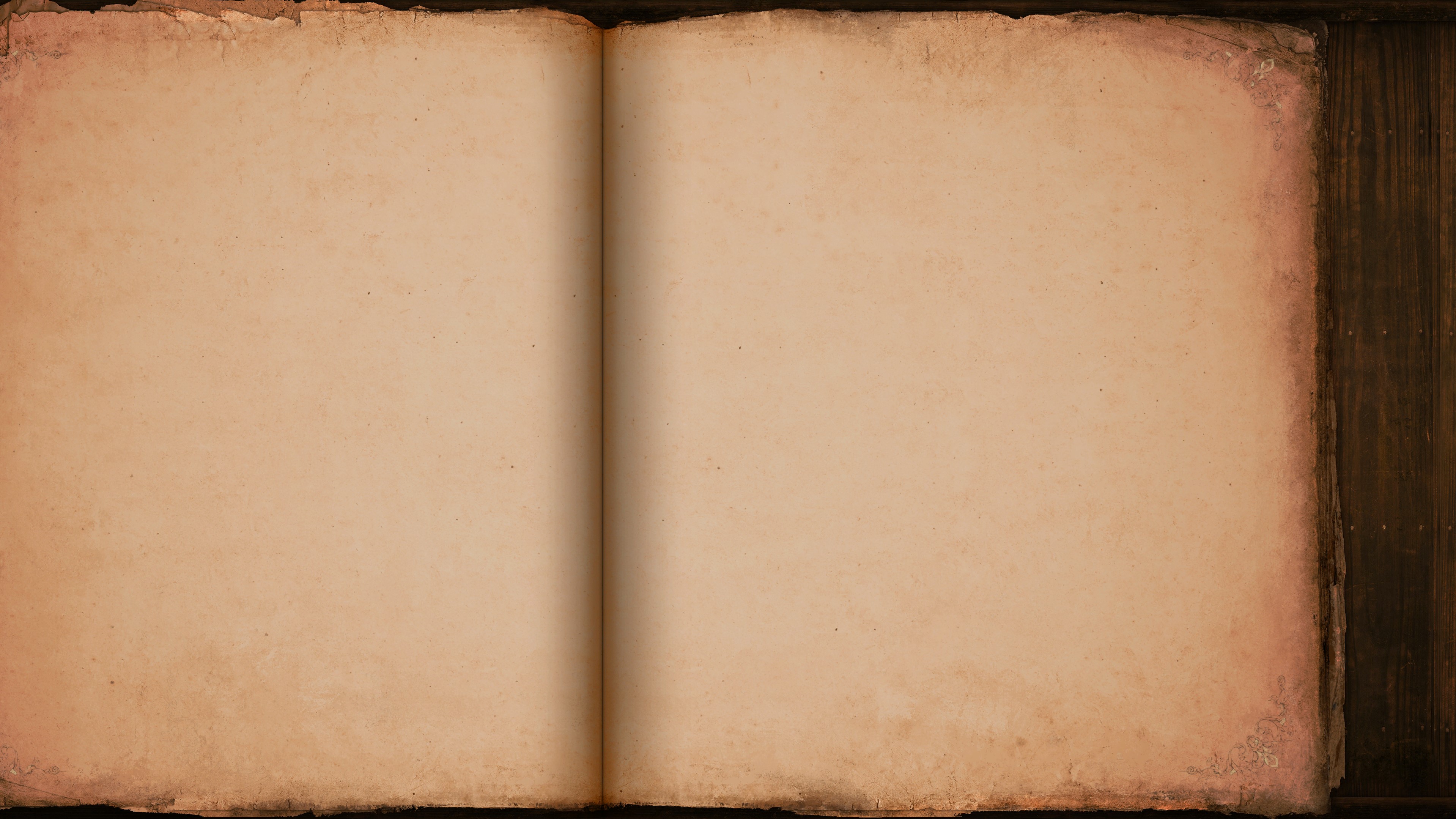
The background images seem to be designed for those ultra wide screens. The main menu background also has parts at the sides cut off from the screen in normal resolutions. If this book image is cut only from the left side the size proportion of both pages gets more similar to the distribution of the current history tab.
OMG this is amazing. I can’t believe how professional you made it look. This is how it should have been made in the first place… this is how the whole game should look like.
Congratulations my friend. Maybe the best UI mod out there in terms of quality.