No for starters I wasn’t sure what your point of mentioning the slideshow, which is why I asked for clarification, I only reference the UI color blindness option as it only shows up in the new DE editions (its effectiveness is an entirely another story).
I also don’t think the UI was designed at all for color blind people. especially when they chose blue background with yellow icon and green and red color coded them for different purposes. I think it was a design decision by World’s Edge to dumb down the UI.
Also, a very minor pet peeve of mine, but can we please get corpses to stay for a bit longer? In Age 2, it is really co to see devastation of a combat in form of a huge cemetery of dead soldiers. In Age 3/4 they just vanish immediately.
This could be an option as to not damage performance for lower end PCs.
You’re wrong for thinking you can do somebody else’s job. The UX is great, mostly. It appealed to me very much, and I’ve been playing AoE games since the dawn of time.
The UI is not very informative. It may look good, (that is subjective) but it does not give you a sense of control over your game.
The minimap is unusable. Can’t find most things on there.
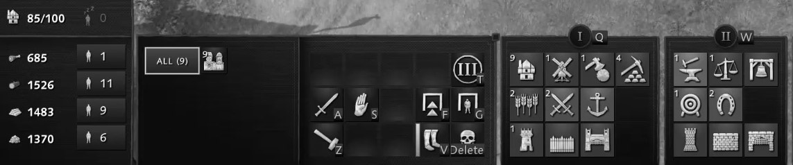
The villager build tray is really confusing to use. It’s all just a mess of icons which do not pop out at you when you are looking to build a dock for instance.
And there isn’t enough info about gather rate, number of traders, unit population cost, and many other things I want them to have.
The short version is that the UI holds up well against various forms of simulated colour vision deficiencies. Not that I’m personally against adding more colours - but the existing ones work just fine.
I think they could do a better job with contrast (which is where color choice would be best) because of the myriad of color blindness types there is. (Icons should be changed especially for wood and stone gates and the lumber camp. The 2 tower icons should be revised as well
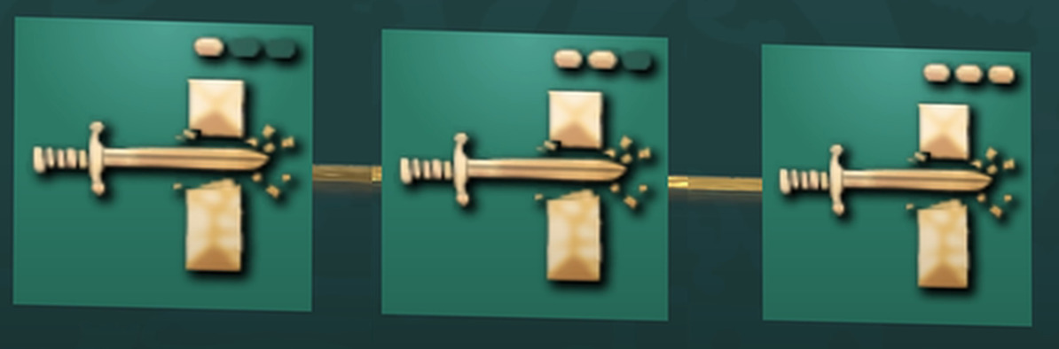
Melee dmg1, melee dmg 2 , melee dmg 3.
Sure there are better fluff names they could come up with, but its not that necessary. And this method actually makes it easier for new players to understand.
these are super zoomed icon screen shot, if it weren’t for the circles on top you wouldn’t know what tech level you’re actually researching because the point is they are using the same icons for every single level.
yeah they could to better tbf.
but it isn’t completely bad or hard to understand.
Having some kind of numerical indicator helps you understand what tier it is.
(they’ve done this to units as well)
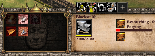
exactly my point. You don’t know what it does unless you actually look at it and read the description. Some of them are not even worth wasting resources on. By contrast AOE II had better interpretation for at a glance look
its readable for non-color blind people, but in the monocrhomatic blindness simulation above the UI is muddy and contrast is poor. just makes it hard to look at for long periods of time. its basically color at 80-85% de-hued.
Everything is subjective and nothing matters unless enough people care, but for me, the icons in this game are so poorly done they distract from the entire experience and cause me to question the entire direction of the game. It’s similar to how sloppy spelling and grammar in a published paper erodes an author’s authority or legitimacy.
Again, I say this understanding people like the icons. But they stand out so much to me from all other games in the franchise that it’s really hard to consider them even remotely acceptable.