Not really because the video clips we have seen look worse than the Beta
Because graphics makes a game look nice. I like playing games that look nice but I don’t look at a game and say," Ugh. Disgusting" and walk away. I watch some videos on YT and see if I like the gameplay. After, the point of playing a game is to play the game, not look at the scenery.
If you believe this you are severely biased
Are you really gonna argue semantics with me?
If you value your time and money why are you spending thousands every year to stay up to date with the latest gaming tech?
Did I say you didn’t? Doesn’t change my opinion on the topic
Where’s the strawman? I didn’t attack anything he didn’t say, I "assumed’ something (which I am almost 90% sure I didn’t assume)
He complains about almost every single thing and if there is a thread that is pointing out the things that some guy likes about the game, him and a bunch of others come in and derail the thread with their complaints. It is as if they think that anyone who likes anything about the game is a fanboy
I would not feel right about discussing graphics when the beta had clearly different looking graphics
Except it isn’t a good faith post.
I totally understand that, I know quite a few people who are banging on the graphics who just want the game to do well. But I seriously have a hard time believing he genuinely wants the game to succeed when according to him, basically the entire game needs a rework.
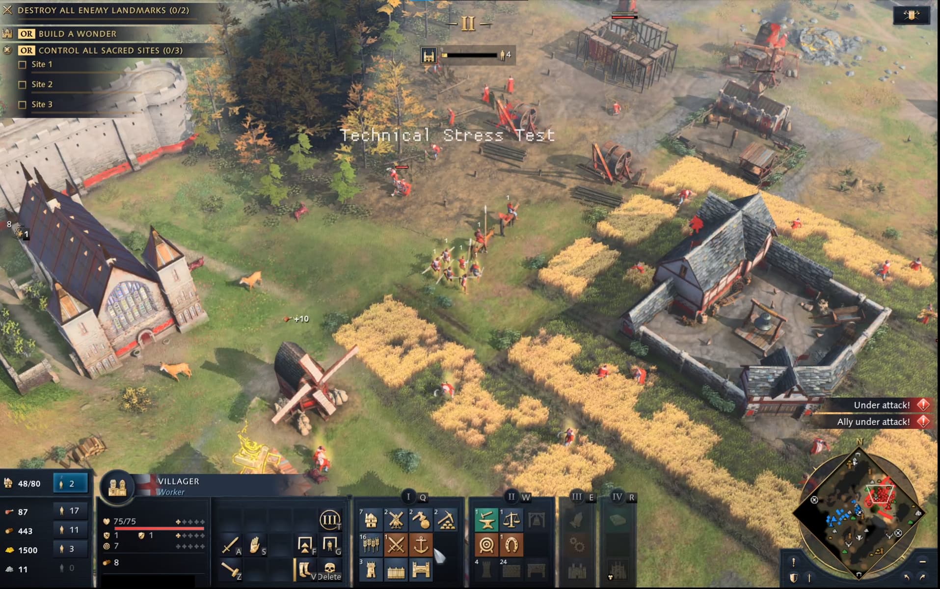
How does everyone like the gold icons after experiencing them with the Technical Stress Test?
I get confused, they slow me down, they require more brainpower and analysis than ideal, I get more flustered as I try to hunt down the proper gold icon/button to click, I mis-click, and it feels pretty sterile/clinical compared to the alternative. As well, the UI/UX taking up so much space at the bottom of the screen is undesirable, imo.
I wasted like 30-45 seconds in a match trying to place a wooden gate on a stone wall twice. I was accidentally picking the gold-coloredwood gate icon rather than the gold-coloredstone gate icon. And among other things, I always have to pause and think before selecting the tower I want because of the two gold-colored tower icons
Yes, muscle memory has and will continue to kick in a bit, but why or how would that be a desirable thing for an RTS to rely on? It will take many games to have comparable efficiency to a more colorful, better represented UI, and might never be truly equal for many players. Handicap players just because of UI design?
I assumed the early images shared on social media by the devs of an Accessibility meeting would help avoid this type of thing. Since you’d want to design for max usability for each group of users (visual, kinesthetic, inabilities to see color, etc.). Oh, unless the plan born from that meeting was to level the playing field; making all players see the exact same thing regardless of their ability to see color or not? Could that be possible? That, truthfully, could maybe be the answer of why all icons are the same color, come to think of it
That’s the worst part of the game, while graphics is a issue, mostly on tier 1 and 2 units ( lack of texture) tier 3-4 look better (still lacking), I have a hard time identifying things in the UI, as instance when you produce villagers and prelates, you can barely see the status production portraits in the left, I lost time looking at those, and since everything is gold color, I press buildings or units by mistake…
Will they remade the UI? don’t think so, hopefully reviews will point the issue, I never complained about UI for any RTS, this is the first one, the first one I have readability issues also Identifying infantry units or cavalry on screen. I don’t see the so called readability, if they add more details to units ( like some different colors on uniform not all blue, better weapons texture not just plastic weapons) I think it will be 1000 times more readable, also I had some fps drops with decent PC, at this point I started thinking that they chose lower graphic quality because they realized their own old engine won’t be capable to produce a high quality product in 2021
Dude, feel free not to speak for me. I’m a part of this ‘fanbase’ you speak of. I’ve played all the Age games throughout my life and I had a blast in this beta.
The devs don’t owe anybody anything. They’re making the best game they can. Buy it or don’t. I, for one, will be.
This fanbase elitism stuff is just redonkulous and immature. You speak ONLY for yourself.
I absolutely love the game but this might just ruin it for me
Hmm, so we were right that you would change your mind once you actually saw them ingame. Now it is only textures compared to the whole list of things before
Pretty sure everyone does, don’t know what they were thinking. Tbh, it feels like a lazy way to approach it and for people who claim they want readability, this is severely not readable.
? The readability is very good imo, I think games like Ancestors Legacy, Company of Heroes, Spellforce 3, ect have bad readability. AL and CoH only are readable because of the big floating icons, without them I would have no idea what was going on.
Yes, it looks like they dipped them in paint and said, " Ta da!"
CoH3 is built on the same engine I thought and that looks very high quality
I think the aoe4 icons are far more readable than aoe2. Especially the blacksmith ones which people seem to criticize the most. Sure the aoe2 ones look nice but they really don’t give much indication what they actually do or which tier they are. That information is actually in the aoe4 versions.
As for clicking the wrong gate which you said you had a problem with, the two gates are literally separated into different panels since they are available in different ages. Far easier to not misclick than in aoe2 where they are actually right near each other.
I’ll be honest: I like how the icons look. They don’t distract me from what really matter, which is not the menu. I wouldn’t want some over-stylized 90s aesthetic on them.
HOWEVER. I did build lumber mills instead of mining camps more times than I can count. Imagine my confusion and despair once villagers start heading back to the TC with all my gold.
Just some additional color coding would fix that and maintain their purpose and style. At least until I get used to building everything through hotkeys.
Except AoE2 icons have colors, so it makes intuitive sense which one is which. One is brownwood, the other is greystone. Pretty hard to not know which is which. I’ve never mis-clicked them, and it’s because of that. The distance between icons isn’t related to the perma-gold discussion; you can scale the UI in AoE2:DE to your liking anyways. I like 75%, you may find 125% helpful? See screenshots at bottom of my post. (I think when you click each, they go to actual in-game size.)
Yep, I always need to apply cognitive power on those icons, too. The circle of the mill makes me think coin/gold, but then I see the pile of gold in the other one and I sort it out. If the wood was brown and looked like wood, it would be great. But that can’t happen here… it wouldn’t look slick and metro enough for the year 2021
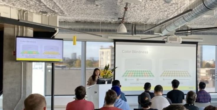
Here’s the old Relic image (2019) I was referring to. I guess it was in the news, not their social media(?) – but this was at a time when any photo released was with tremendous care/purpose/authorization, so I’d think they approved its release at the time:
My point is once you learn that one is in feudal and one in castle and realize that the UI is organized by age, it’s just as hard not to know which is which.
How does that translate into the UI design? Color blindness is a feature found in most RTS games made by medium to large studios. Now are you are referring to its execution as the reason for such a bare bones UI?
Designing solutions to help color blind players play the game more effectively definitely translates to UI design, and it should. Normally, devs make color-blind modes, and such – as seen in AoE2:DE and others. That’s part of UI design. I’m fully aware many studios do this, as I’ve previously noted. I’ve actually voiced concerns for UI/UX design and visual solutions with color-blindness in mind at random times quite a while at non-game industry jobs; when nobody else around me on my teams probably even thought of it, let alone brought it up in meetings. (I can attest that nobody ever brought it up but me; and they always seemed like it had never been a thought before).
Regardless, you’re taking my hypothesis I stated above (which I don’t really know if you actually read that particular post, or if you’re just going from my latest post with the photo) and twisting it to be as though I think that is definitely the case; which is completely incorrect. If I made it seem like I had 100% formed that conclusion, my apologies. I didn’t.
I said it “could be” that they wanted to level the playing field for all players by making the icons the way they have; and then I asked what people thought, so we could discuss. It was a hypothesis from left field, as I hadn’t thought of it before and haven’t read anyone theorizing it before. I never said I believe they probably did that. There’s a difference. To be honest, I believe they just wanted to make a slick UI fit for 2021, or much more consistent with modern day Microsoft standards for UIs. After my thought from left field, though, I think there’s a 0.05% chance the icons are as they are because they maybe wanted to level the UI/UX playing field for all players by making universal icons that look the same for all players regardless of color-blind or non-color-blind. (Nothing inherently wrong with that, and would seem noble, but it’s something we’re not used to for AoE, and I think there are probably better solutions that’d be more widely accepted and beneficial to all.) AoE4’s gold icons are completely color agnostic; using purely contrast and shapes/silhouette to communicate their intent. I can’t speak from personal experience, but I’d be curious to know if the default gold icons are completely readable for most or all forms of color-blindness due to the icons mainly just relying on contrast and silhoutte.
Additionally, ‘Accessibility’ applies to multiple facets of life, not just color-blindness… and it can lead to periphery discussions about different learning styles and different approaches to everyday things to cater to different subsets of society. So, I surmised that during the color-blindess presentation, they also maybe touched on those things.
All in all, it just seems a little odd to me to not have icons that the more visual people of the world can identify with. Making a lot (most?) players rely on muscle memory to navigate the UI seems like a very strange solution to me But I digress…
 But I digress…