Age 2 was never cartoony or semi cartoony, there is a very old interview video with the original devs of age2 explaining how they were looking for realism in age2…
Well, they might have been looking for realism perhaps LOL, but they got somth else. AOE 4 is true to AOE 2’s result
If you ever find that video please let me know. I’d love to see it. This topic comes up all the time, and some insight to the original devs’ intent could help the discussion.
 - Behind the Scenes making of the PC Classic!")
After first hour…
Don’t understand why people say age 2 is stylized or cartoon lol, clearly age 2 look realistic with 2d sprites and engine limitation in 1998
Note that I like more age3 than 2 but put that interview as an example, original devs always wanted to go realistic approach or use better graphics, they tried with AOM then with AOE3, I don’t need to post a video for that, it is just obvious just by looking at age evolution…
12 Likes
just say that you don’t know/understand why you are talking about… to analyze deeply a game you need to remove the nostalgia glasses…
1 Like
Dude. I’m the one without nostalgia here. You are literally ‘coming back’ to the old time objectives of the game when that doesn’t matter any longer. AOE is seen differently now than then. People have played AOE for 20 years and AOE 2 is no more and example of graphic reallism. Nostalgia is to remember that “those graphics were reallistic back then”. AOE 4 just follows the line after what AOE 1, 2 and 3 offered.
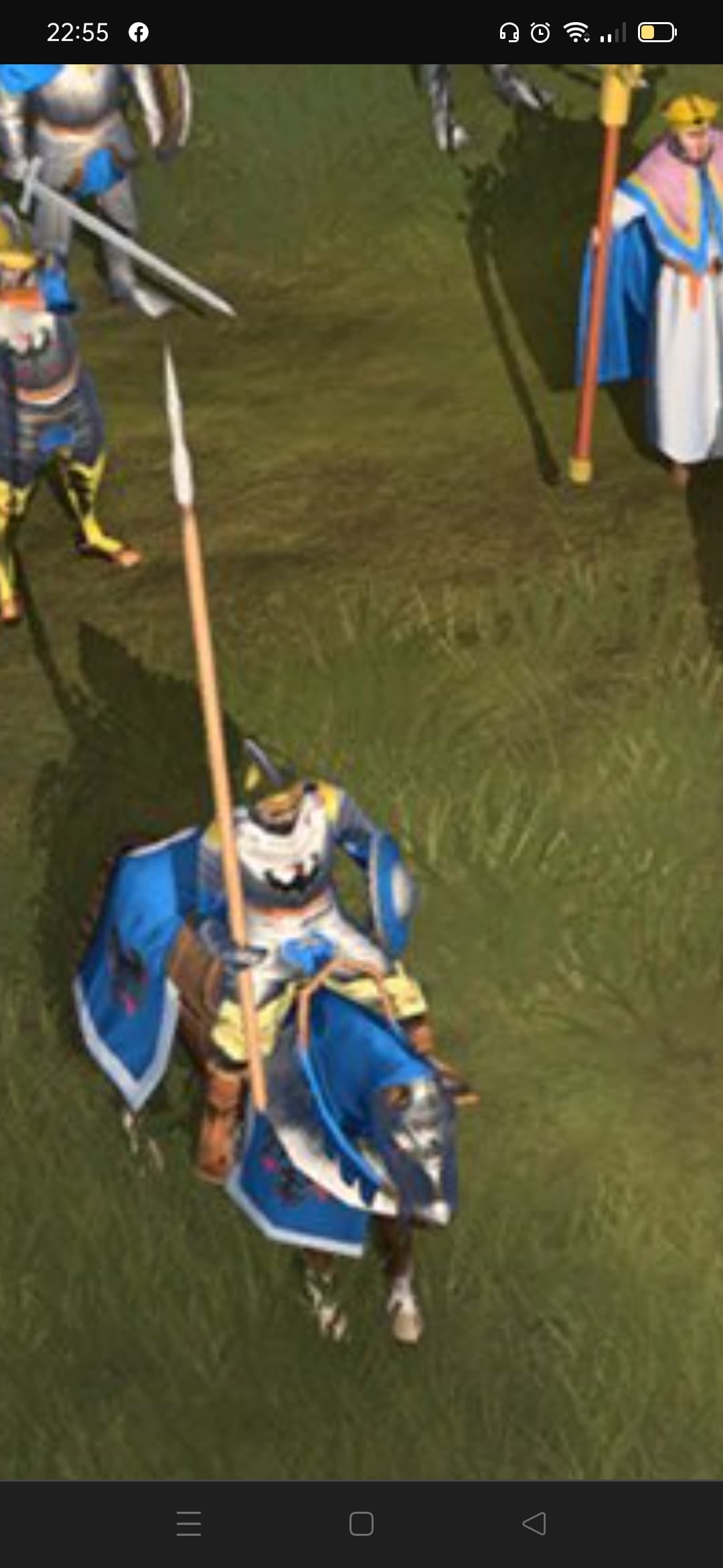
AOE 2 DE. Latest DLC. Tell me that is not stilised. I mean: I don’t give AF about why. It is slightly stilised. That’s AOE, like it or not. This is not Total War. This is not Spellforce.
4 Likes
Gotta love those boys.
1 Like
Every single game on the planet Earth is stylized ![]()
What is this discussion even about? I see it keep going and going.
1 Like
The main problem Is not the artstyle and if AOE4 Is stilised or not. We are talking about the textures quality. AOE4 has not this quality. That’s all.
1 Like
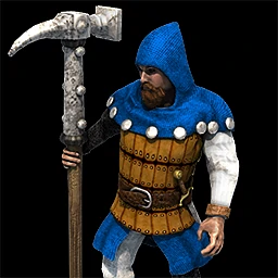
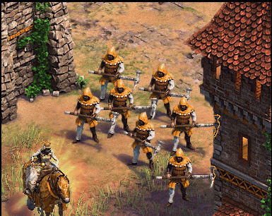
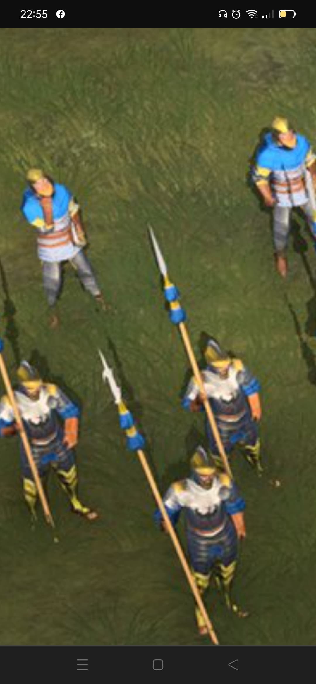
The oversized weapons is just a lazy unit design imo, and despite that it’s still difficult to differentiate units, especially when in a blob. The units are too colorized.
This is especially obvious for the early military units, though I think the later ones are fine. To be honest, the biggest gripe I have with how it looks it’s the scale of the military buildings. They just seem like they were vertically squashed, it’s really distracting for me.
They are and they definitely did it on purpose. I’m pretty sure it’s to prevent any difficulty seeing units or buildings that are above a building. Like in aoe2 units can be completely behind a castle.
1 Like
Just put a highlited outline or a silhouette of the unit with the players color when they’re behind a taller building. You know, like most RTSs.
1 Like
Yeah they could do that, but looks like they decided to go the route of making that mostly unnecessary.
The only building I think really suffers for it is the keep.
1 Like
And the intro shows how Aoe2 looked in dreams of devs and fans - very realistic

1 Like
Damn, 58… My condolences.
1 Like
You’ll get there eventually, don’t worry 

3 Likes
You’ll get there eventually, don’t worry

i don’t want to ![]()
![]()
![]()
1 Like
Or they just wanted to make a cool cgi trailer. Ya know, like a lot of games