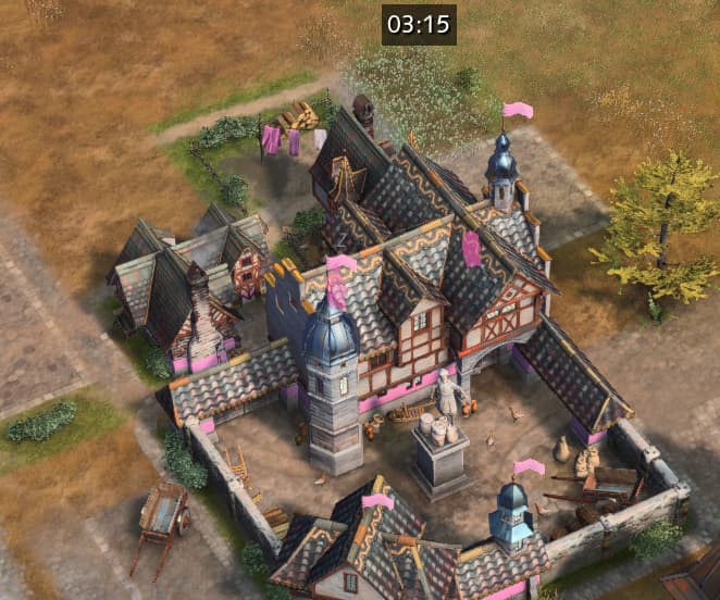
Can you spot the villager? (Not that one! the silhouette to the right is a sheep)
Right now, their oppacity is so low that brightly lit objects (like those tiles) virtually override the villager. Maybe due to the filter disproportionally influencing lighter/darker overlapping shapes.
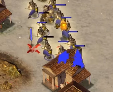
In comparison, here is a little snippet from our old friend, Age of Mythology
Unit’s silhouettes fully overlap whats infront with a very bright colour. This is much better for readability, as the state in which it currently is, both reduces visibility of buildings as well as the silhouettes themselves. By being 100% opacity, they would be fully visible and I don’t think this would retract from the buildings themselves, as there would be no confusion as to what is part of it and what isn’t.
Look again: Ironically, the colour of your team is brighter and more visible–this makes it confusing, as at a glance, how are you to tell what SHADE of pink is a villager?
I fully believe you can’t have both ways. I think AoM’s approach is the right one. What do you think?