With the upcoming launch of Age of Empires IV, we’re happy to announce the “soft launch” of the new https://www.ageofempires.com web site design. The new site features some of the same beautiful imagery and UI from Age IV and brings a number of improvements to accessibility and performance. What makes it a “soft launch”? We wanted to get the new site out in front of our fans as early as possible so we can start iterating on making additions and improvements. In order to get it launched sooner, we’ve taken a hybrid approach to the site updates.
As you browse through the site you may run into areas of the site that still have the old theme still applied. Not to worry, that’s expected and as you continue to navigate through the site you should naturally flow between the old and new themes. As we complete updates to the remaining areas of the site, they’ll automatically get switched on with the new template. Once our conversion is complete, we’re looking forward to focusing on adding some new features for the site as well as making improvements to our forums.
This area right here must have some forums sections too! Maybe grab a couple of topics from the /top weekly route? There are RSS feeds that you can hook into.
Can’t wait to see that same UI convention from AoEIV applied here in the forums!
Hey @punkfalco thanks for the feature suggestion, adding forum posts to the Community Connections section! I added an item in our backlog to explore that further when we have time. Also, keep an eye out for the forums re-theme, no promises on timing, but hopefully we’ll be getting to that in the next few months. We’re working hard to roll out all our updates, and provide the community with a great web experience! Thanks!
Will there be a stats section for aoe4? Also will there be an official data API so that we can make community stats sites and tools ? (Sorry I know this isn’t the right place to ask but I’m not really sure where to and this is kinda tech related I guess…)
We’ll have leaderboards at launch and then will be building out additional stats and APIs later. Some of our APIs are/will be public, others require authentication. But we’ll definitely share what we can.
\0/ as someone who wants to develop stats content for the game this is excellent news thank you if you need any help testing or feedback on the apis please do let us know. Will there be a developer sub-forum or anything?
Looks like the re-design has gone live on the forums now. Whilst it does look really nice is there an option to change the theme at all? I have a sight condition that makes looking at white text on a dark background very difficult and unpleasant. This is then dialed up to 11 with the bright orange/gold bars that are now everywhere . If its possible to switch to a light mode it would be greatly appreciated, or if one doesn’t exist please could it be made?
This new design is a nightmare. Major eyestrain. I will unironically need a new glasses prescription if I spend too long looking at this new colour scheme.
This forum resign just led me to find the chrome extension “stylus” which allows you to inject your own CSS and re-style it as you see fit. The forum for me is now a high contrast abomination but at least it doesn’t trigger my eye condition anymore
Hi You can change it back under your preferences on your account, go to preferences select interface and change from AoE4 theme back to AoE theme GIT. Hope this helps
i. You can compare the new design with Discord’s default, which strains the eye less, because Discord has significantly less contrast between the main text and background colors - its “white text” is grayer, and the background less dark. Our current main background is extremely dark (RGB 24, 29, 41).
ii. The dark background also screws with the black-on-transparent artworks in old updates.
iii. The “face in a void” background art can look positively scary. Remember how the well-meaning AOE2DE loading screen easter egg gets many players scared or unsettled? This face has a similar issue.
I’d suggest the following changes, in order of importance:
i. Reconsider, or at minimum, simply reduce the light-dark contrast of the default dark background vs white text on both main site articles and forums.
ii. Remove the “face in a void” background image, perhaps replacing it with something with a neutral psychological effect when viewed out-of-context.
iii. Add a “light mode” theme to give users more options.
iv. Address the appearance of old updates - perhaps give them a bright background, or replace the images with their equivalents under the new theme.
I was just about to say the same. I had to get creative and manually format a list using icons recently, but hope they can fix, because this was far less than ideal
Bulletpoint
Nested bulletpoint
List item 1 List item 2 List item 3
Etc.
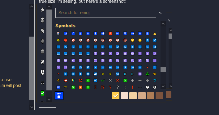
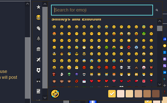
Also, not sure if it’s the same for everyone, but the emoji/icon pop-up box has tiny icons now (at least from PC it does), so had to use CTRL+Mousewheel to zoom in, pick my icons, then CTRL+Mousewheel back out. Not sure if forum will post true size I’m seeing, but here are a couple screenshots:
 if you need any help testing or feedback on the apis please do let us know. Will there be a developer sub-forum or anything?
 . If its possible to switch to a light mode it would be greatly appreciated, or if one doesn’t exist please could it be made?
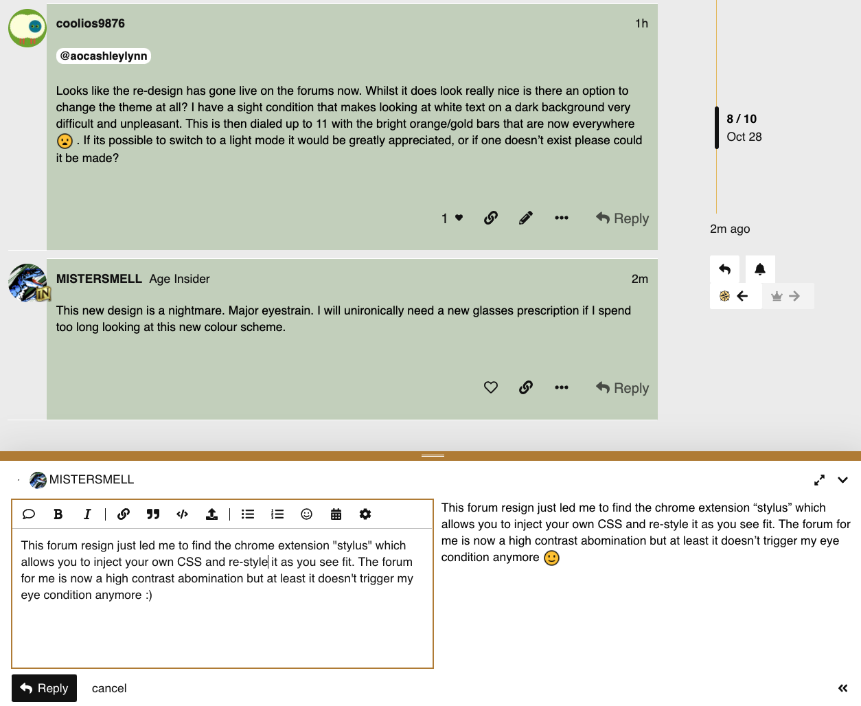
 Bulletpoint
 Nested bulletpoint
 List item 1
 List item 2
 List item 3