- Oh, cool, bulletpoints…
- Were fixed!
- And numbered lists…
- Were, too!
@SlenderBadger98, fyi
Is it possible to have quote boxes be indented a little bit again like the old site? All the quote boxes are justified far-left with the text we write, so it all vertically runs together. I think indenting the quote boxes and not having them span the full-width of the box will help readability (maybe don’t justify far-right either).
Just for sake of example, you could probably toggle back and forth with my post here between old website style and new style to see what I’m talking about. Yes, the words are indented in the quote boxes, but I think the actual boxes should be, too. (The old quotes were bold text, too, which may also help; not sure if it would look okay with the blue background, though.)
I feel the old version of the site was a lot more readable with regard to quote boxes.
text text text text text text text text text text text text text text text text text text text text
more text text text text more text text text text
even more text text text text even more even more text text text text even more text text text
etc.
And then I write more text here and continue to write write write write write write write write write write write write write write write write write write write write write write write write write write write write write write write write write write write write write write write write write write write write write
Someone is quoted here…
And then I write even more text here
Someone is quoted here… with a bunch of info info bunch of info info bunch of info info bunch of info info bunch of info info bunch of info info bunch of info info
Write write write write write write write write write write write write write write write write write write write write write write write write write write write write write write write write write write write write write write write write write write write write write
In my opinion, it all just kind of runs together in the new format… and isn’t as readable.
To be honest, I liked the previous one so much more (looks like too much HaloWaypoint Forum theme). Hopefully, we can switch back.
Edit: worked.
I really dislike reading the patch notes in the new redesigned website. I stopped reading them just to post this…
It’s too bad because I actually used to really enjoy reading the patch notes (in the old website). Everything was tight, laid out nicely, font size was good, bold words were easily distinguishable from regular font, and it was just super easy and fun to read, with minimal user interaction. Like, I could grab a bowl of popcorn and read through with minimal effort.
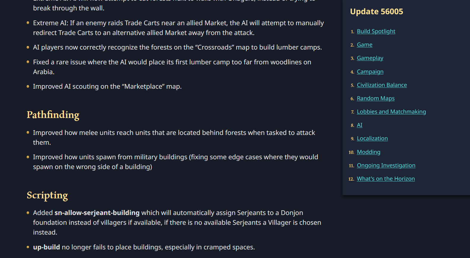
But I just saw the patch notes for the latest patch in the redesigned site, and it’s not nearly as good. So much vertical space wasted… big font, a bunch of vertical padding between rows, a ton of scrolling needed, bold words don’t stand out at all because regular letters look pretty bold as well, huge images, a gigantic navigation pane on the right side, etc. Why make us scroll, scroll, scroll through 30+ pages of info (I stopped counting after 25)… which used to fit on just a small handful of pages? Someone mentioned AoE4 is giving them carpal tunnel syndrome symptoms because the zoom is so close, but now the patch notes will do the same with all the scrolling required.
The redesign was meant to help accessibility and usability. I definitely don’t see that happening at all with patch notes. And as far as I can tell, there’s no way to view the patch notes in the classic theme. (I just changed my theme, and it still shows the new version.)
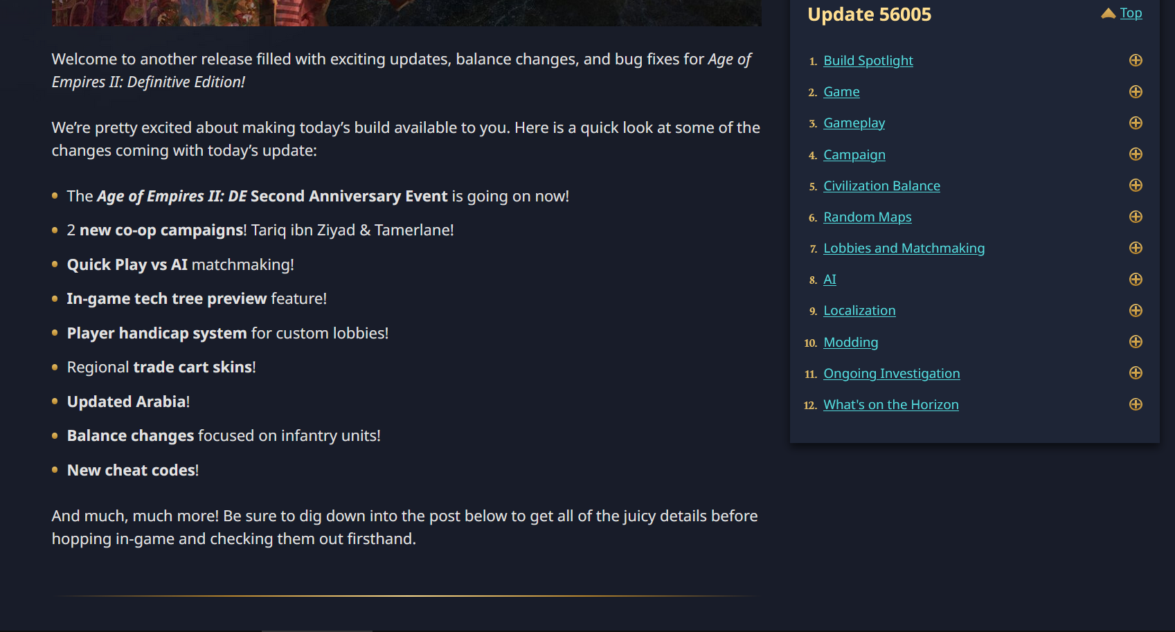
This one single page on my 24" 1080p monitor, literally, only has 20 words of patch details on it (21 if you count the ampersand):
Other screenshots, just showing all the vertical padding, big font, bold words that blend with regular font, lack of info per page compared to the old version, etc. It’s so big on my screen, I feel like I go cross-eyed trying to read it, and should wheel back in my chair about 2 or 3 feet…
I’m on the fence. In general, I like the new theme for the forum (not for the AoE4 icons, btw)… and I particularly like it when viewing from my cell phone… but there are things like the patch notes and some various forum-related elements that make me scratch my head.
I’ve never known incredible amounts of vertical scrolling to be a universally loved trait of website design? In fact, I’ve seen time-motion studies and UI/UX focus group feedback suggesting the opposite.
Instead of looking forward to reading the patch notes, I’m now going to trudge through the hard-to-read 30+ pages to read all about it. I, personally, will be CTRL+Mousewheeling the font to be tiny, which I shouldn’t have to do and not everyone will know to do. And it doesn’t solve several of the issues I’ve noted
…
PS: This same vertical padding between rows thing is happening all over. I wish a parallel-universe Internet existed where the latest inferior, doesn’t-make-sense UI/UX fads weren’t adopted by everyone on the planet at the same time.
I’m sorry for the critique. I just try to make it constructive criticism to help the site, and to hopefully someday enjoy the forum and patch notes experiences as best as possible.
@DodoNotDoDo is there any updates on when/if an official aoe4 API will be made available (or even a beta)? Sorry I know this still isn’t the right place to ask but it’s where the conversation started. I was hoping to update my stats website with aoe4 content and would love to do so based on an official API.
The next update likely won’t happen until March or so. TBD what all that will include. We may have a beta version available sooner. We may add basic match history before then, but I’m guessing you’re looking for more detail than that.
For my existing website basic match history may be enough (depending on what you mean by basic). Stuff I currently use for the aoe2 version includes:
More detailed information such as the units / techs / resources over time would be amazing for being able to dive into more advanced stuff if it’s at all possible to provide, but yer the above is all I was hoping for atm 
Hey @DodoNotDoDo ,
I was wondering if there was any update on the match api?