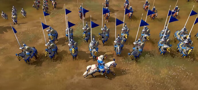
I’ll be honest and say that these particular ones look a bit jank and short, but it is interesting to note their absence when they were front and centre in the early trailers. It always reminded me of that scene in Kingdom of Heaven, of armies banding together and preparing for battle.
Maybe I missed it, but has there been any comments on why they’re gone?
1 Like
In my opinion, units look worse with the flags. So perhaps they removed them due to aesthetics
1 Like
I don’t disagree, but I also think it could’ve easily looked better with some adjustment. For instance, making the flags longer as opposed to being short. I’ll say it does add some charm to the knights.
1 Like
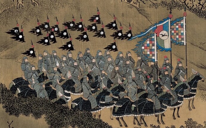
The key point is that the cavalry in the picture is from Mongolia, why should the Mongolian cavalry use the European style lance? The oriental lances were not like that at all.
And, of course I think it’s OK to add this flag to the lance of knight from England or some other European civs.
1 Like
They obviously wouldn’t have to add a european styled flag to their weapons. Here is a depiction of some heavy ming cavalry. It just looks great in general if given a little more effort than having a triangle for a flag, and instead, having a textured flag for each knight in the game.
Also, image I shared above from the game actually features animated flags. They look rough in the stillframe, but I still wish we could’ve had them rather than not. Here is the actual clip. Looks infinitely better in motion, especially as they run and it flows with the wind or when they charge.


