I play at 1920 x 1200 resolution with the menu zoomed out as far as I can via the game menu. Why does the menu font look so bad? It reminds me of a Flash/Java platformer game’s graphics, how they get all pixelated and weird looking when zooming in or out because the 2D graphics are at a fixed, non-dynamic resolution – so you’re zooming into a medium-resolution JPG image (visually annoying). (E.g., when you get by a mission and the game world zooms toward your face)
This is a direct screenshot from AoE2:DE, full-size – assuming the forum delivers it that way. Look at the “w” in Town and "e"s in Center for big offenders. No characters are particularly impressive, though…
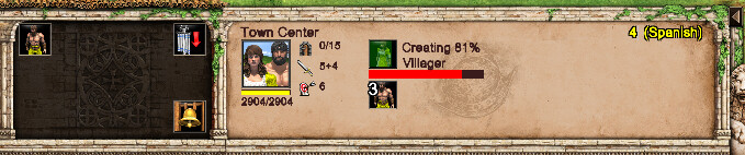
This is me zooming into the above image via MS Paint. Look at how muddy the letters and numbers are. (I’m just zooming-in so the details can be seen… I’m not meaning for it to look like a CAPS LOCK yell or anything):
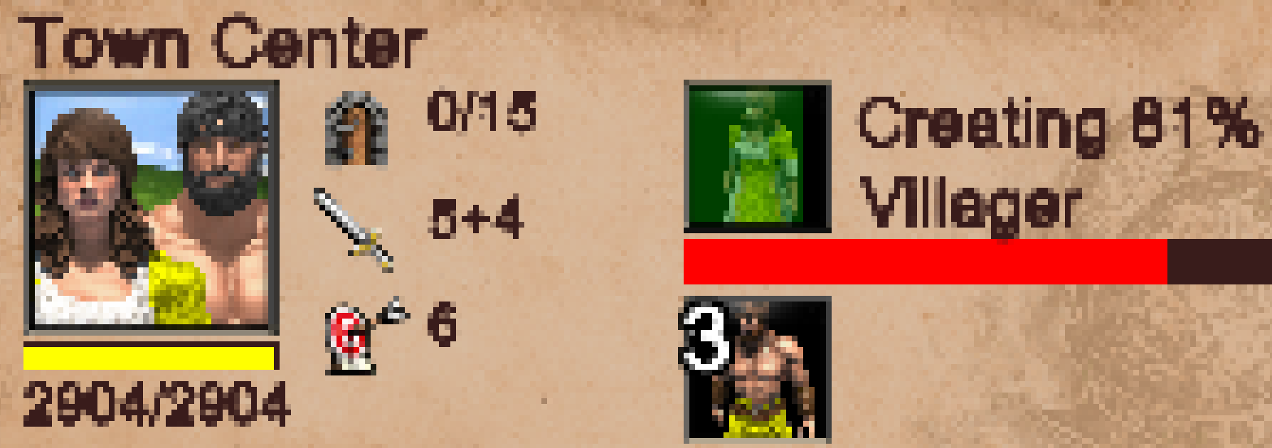
Yet look how crisp the letters and numbers were in AoE2:DE. They're slightly bigger font, but DE's font comes nowhere close in terms of clarity, preciseness, impressiveness, or pixel detail...
I know there are two font options available in DE, but, honestly, neither of them look that great. I think the issue is bigger than just font choice; it’s how the fonts are implemented into the game. No matter what font you use, I have a feeling they’d look muddy and ‘blah’.
It’s like the DPI (dots per inch) for the menu(s) needs to be greatly increased or something, to allow more pixels per inch