Tell my by the gods, why the 2000 game and it’s first re-issue of 2013 looks better in the sense of fonts than now? Where did all these gothic styled fonts gone? And that’s not the only problem that these cool artistic fonts are gone, the text literally looks unsmoothed with sharp edges and all these glithes which make text bad-readable. Please fix something about that! And yes, all text in menus including start menu looks ok, but all hints and unit names\objectives\other in-game windows text looks terrible.
21 Likes
I have reported that in beta surveys over and over to no avail.
That font looks terrible indeed. I can live with the sans-serif version, but it is still a downgrade compared to the original game/HD Edition.
15 Likes
The fonts are not my favorite either :-/ They seem less fine, intricate, and precise than they were in old AoE2 to me. And I think it’s a larger font now, if I’m not mistaken – which I don’t like.
2 Likes
I hope they can add more fonts in a later date instead of sans-serif only.
2 Likes
why did they converted all fonts to dds textures while old game versions used ttf directly. aoe2, aom, aoe3 did this and all was fine, ttf means TRUE TYPE font and feels like it was typed on paper. Now we have useless and senseless textures for that which looks so terrible distorted.
4 Likes
This is doing my head in aswell. All they had to do was keep it the same and it would be 100% absolutely amazingly perfect! But instead we have these aweful fonts, takes away all immersion when playing campaigns ngl
4 Likes
I like the current fonts.
1 Like
I play at 1920 x 1200 resolution with the menu zoomed out as far as I can via the game menu. Why does the menu font look so bad? It reminds me of a Flash/Java platformer game’s graphics, how they get all pixelated and weird looking when zooming in or out because the 2D graphics are at a fixed, non-dynamic resolution – so you’re zooming into a medium-resolution JPG image (visually annoying). (E.g., when you get by a mission and the game world zooms toward your face)
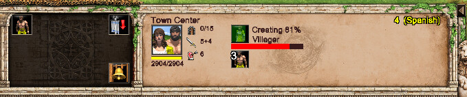
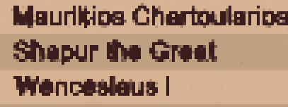
This is a direct screenshot from AoE2:DE, full-size – assuming the forum delivers it that way. Look at the “w” in Town and "e"s in Center for big offenders. No characters are particularly impressive, though…
This is me zooming into the above image via MS Paint. Look at how muddy the letters and numbers are. (I’m just zooming-in so the details can be seen… I’m not meaning for it to look like a CAPS LOCK yell or anything):
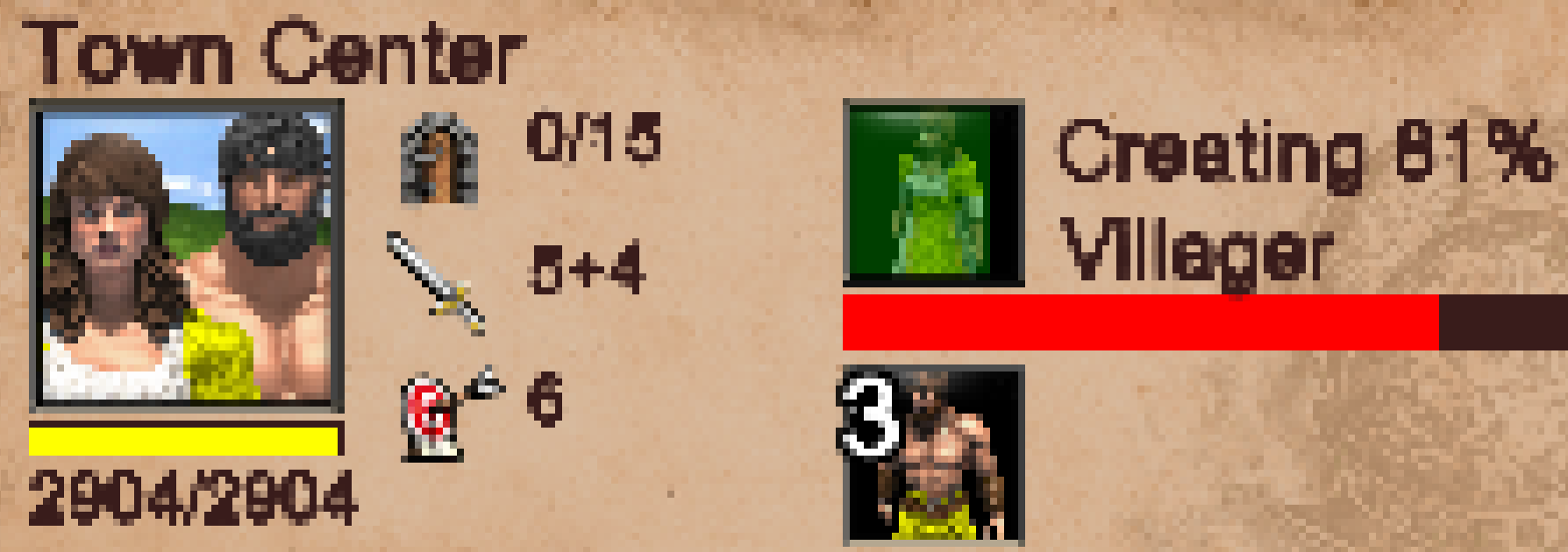
Yet look how crisp the letters and numbers were in AoE2:DE. They're slightly bigger font, but DE's font comes nowhere close in terms of clarity, preciseness, impressiveness, or pixel detail...
I know there are two font options available in DE, but, honestly, neither of them look that great. I think the issue is bigger than just font choice; it’s how the fonts are implemented into the game. No matter what font you use, I have a feeling they’d look muddy and ‘blah’.
It’s like the DPI (dots per inch) for the menu(s) needs to be greatly increased or something, to allow more pixels per inch
10 Likes
Yes fonts look gritty/unsharp.
1 Like
They tried to go for a modern look for the game, but they ended up with a mobile game like UI. I also found the gothic fonts much more immersive and good looking.
I hadn’t noticed how better original fonts were until I saw those screenshot up there.
5 Likes
Yes, it’s really distracting and non-immersive with the fonts how they are. And I feel the same in other places, too, like the tooltips area and even the menus where you choose different options
The fonts are fine, you are using an UI scale too small that is pixeling the text, make it bigger that should fix it for you.
1 Like
The fonts aren’t fine; they’re ugly. And my decision to adjust their size to small via the in-game option because I hate large fonts and like small ones should not result in an ugly display of small font. The font might look decent in an 800x600 resolution game in 1995, but not so much in HD in 2020.
4 Likes
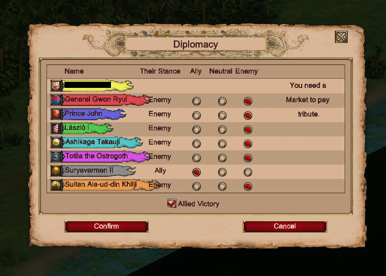
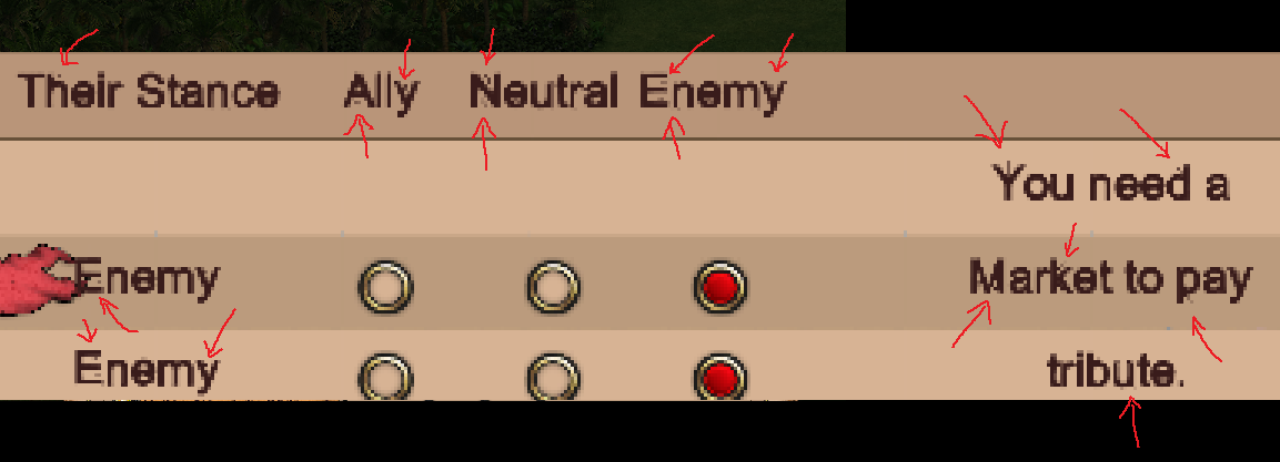
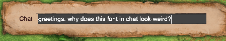
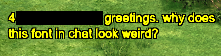
In playing recently, I noticed fonts everywhere are not that great, even in Diplomacy and Chat windows. I don’t know if they’ve always been this way and it’s just now bothering me more, or if they’ve been degrading over time, or if they were recently degraded… but these don’t look good at all to me.
Muddy, not crisp. A lot of room for improvement. Legibility and a feeling of refinement gets lost.
I think of other games where graphics and words are so tight and crisp in menus, HUDs, and panels; I love that feeling. And then seeing AoE2:DE’s non-crisp text, it isn’t so nice to look at…
Zoomed-in
And just pointing out some of the anomalies here. Believe me, the text, in general, is muddy in many places. But then there are all these pixel artifacts, as well…
If the choice of font or font-processing somehow comes down to worries about individual players and whether or not their PC can handle making crisp fonts(?), then please make it an option so that individual players can have a choice. Fixing fonts would be a nice quality of life improvement.
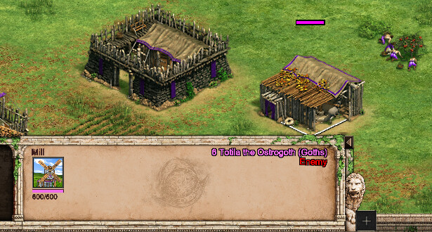
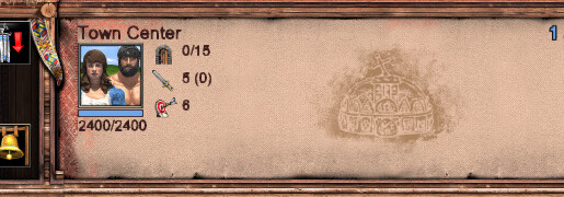
Look at the “Mill” word, the numbers, and the upper-right text 
And then in watching a replay, look at how bad this font is showing:
3 Likes
That looks like a bug, everything looks perfect and smooth in my game
You should report it, also try changing the UI scale and resolution to see if it’s tied to that
1 Like
We definitely need more fonts besides that Sans-serif. Idk with the devs, are they really that hard to implement in the game, I prefer Old English font for a medieval RTS game.
3 Likes
Fonts look better for me, though indeed not perfect.
I prefer the new font style however, way more readable for me than Times/Gothic style fonts.
1 Like
For some reason after the anniversary patch, the fonts look a little blurred and therefore worse than before.
Did anyone else notice this as well?
1 Like
Yup, fonts are terribly implemented. The big issue is anti aliasing, I don’t know how they managed to get that wrong. Even crappy Unity games render fonts perfectly.
Paired with the inconsistent sizes (for example, tiny resource numbers but gigantic tooltips) just reading the UI becomes a pain.
Until this gets fixed, at least we have a decent control of UI scale. It made it a little more bearable to me, at least. Hope it works for you too.
Not only the fonts, but also menus and loading screens in general need some love. And I mean serious, professional UI design, because some stuff look really amateurish now (it looks like scrolling through a design student’s Behance profile).
I know I’m being rude here, but it looks like they spent too much time with that particle effect in the menus instead of hiring a designer. Don’t get me wrong, I love the effort the devs are putting into the game, and I’m sure they’ll find a way to improve this.
4 Likes
antialiasing only works for the edges on buildings, other than that there is no difference, like i said before the issue with the fonts are when you are using an UI scale too small, then it looks crappy and blurry, you can modify those fonts colors and size in the commandpanel.json, leaving the option to anyone to modify those files is great.
In the anniversary patch they changed the font color restrictions for some stuff, but the font style is the same.