[BUG] Font doesn't look very good, even at big UI (125%). And pixel artifacts throughout the game

:arrow_forward: GAME INFORMATION

  • GAME BUILD #: 43210
  • GAME PLATFORM: Steam
  • OPERATING SYSTEM: Windows 10

:arrow_forward: ISSUE EXPERIENCED

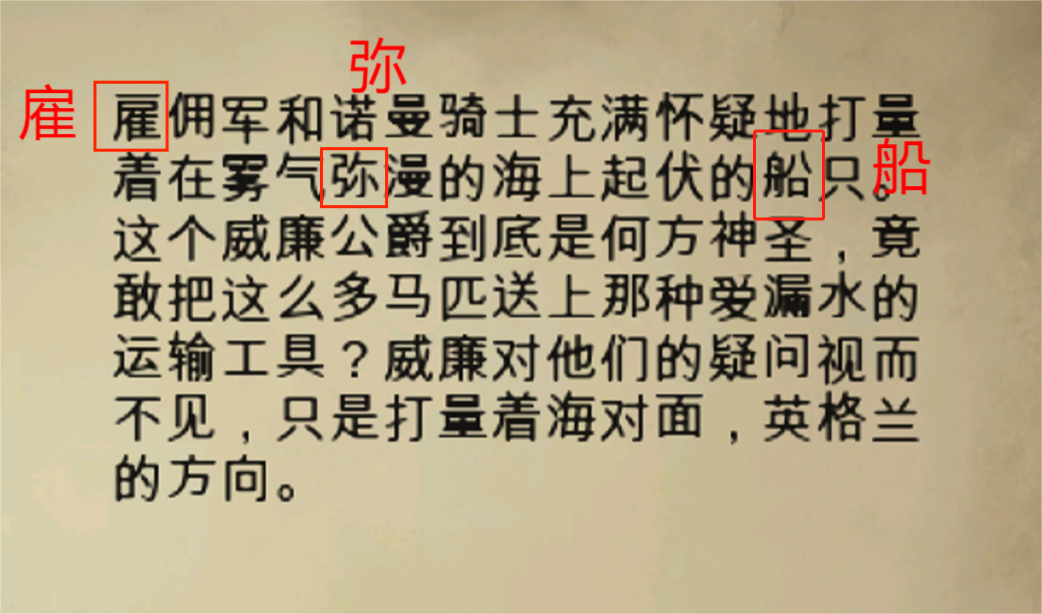
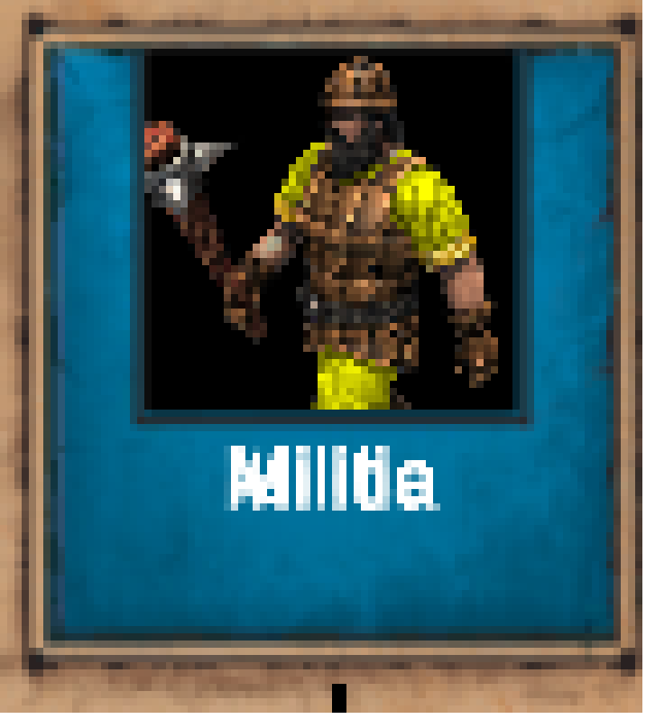
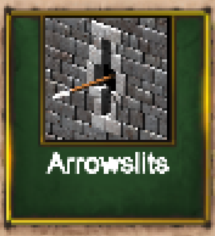
Lots of pixel artifacts in the font, seen in many places of the game (UI panels, chat window, game menus, diplomacy window, replay control panel, etc.) Makes some words look muddy, fuzzy, blurry, and, generally, harder to read… sometimes with pixels from one letter seeping into adjacent letters, and vice versa. The font does not look crisp and sharp like AoE2: HD used to. Additionally, the font has kerning issues where the spacing between letters is inconsistent, and baseline issues where the bottom-most part of letters varies letter to letter.

Increasing UI zoom to 100% or 125% makes the font a little better, but still not perfect; artifacts still exist, as do kerning and baseline issues. Since I want to play with a minimalistic UI, I choose 75% UI zoom setting. Ideally, the graphic quality/clarity of the font shouldn’t suffer at all when going to 75%, and should be improved for all settings.

I’d prefer a font option that has less bold font used (e.g., tooltip words don’t need to be bold, imo; they were used sparingly in AoE2:HD), and font without black outline around it… as those are, at times, contributing factors.

Here is a discussion thread about it, with several screenshots in some posts. Recommend looking here for comments and plethora of screenshots:

:arrow_forward: FREQUENCY OF ISSUE

  • 100% of the time / matches I play (ALWAYS)

:arrow_forward: REPRODUCTION STEPS

  1. Launch AoE2:DE and look at UI panels, pop-ups, and other elements that have text

If it matters, I play using a 1920 x 1200 monitor, with both my Win10 and in-game resolutions set to that.

:arrow_forward: EXPECTED RESULT

In AoE2:HD, I’ve never had an issue with fonts. I loved AoE2:HD’s fonts and implementations:

image

:arrow_forward: IMAGES

Here are just a few examples. Please see the thread noted above for several more.

Zoomed-in here to better see the pixel artifacts and muddiness:
image

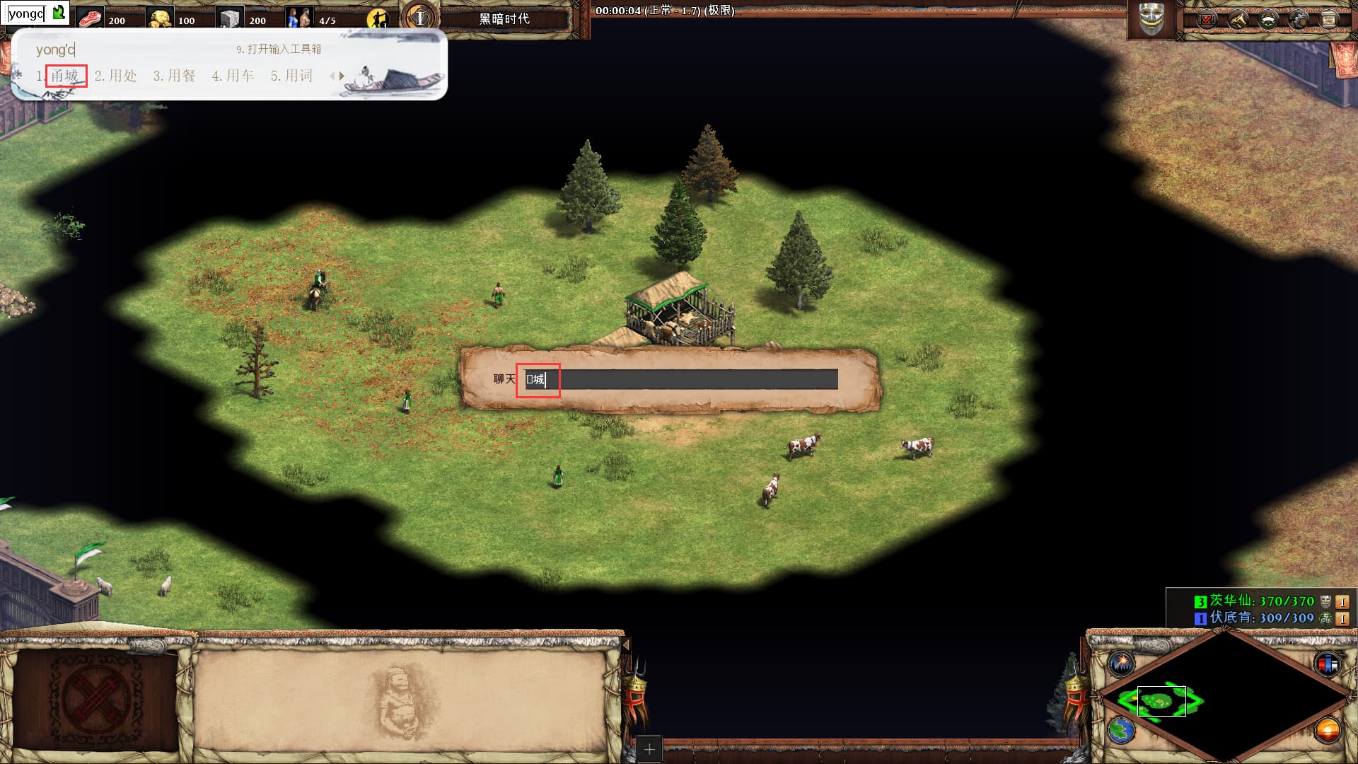
Kerning issues example. Some letters touching; some not. Some letters look italic, others not as much. Space between some letters is sizeable, other letters not so much. (But also some pixel artifacts, not highlighted):

Baseline issues. (But also some pixel artifacts, not highlighted):

Even on menus and drop-downs, artifacts:

:arrow_forward: GAME FILES (SAVE / RECORDING)

N/A

5 Likes

I had the same problem when I tried playing AoE II: DE on a 1366x768 display. The game only supports resolutions that can be easily scaled like 1920x1080 and 3840x2160.

2 Likes

Please type the number of the actual build. You just have to open the app settings and take a look at the build number.
image

1 Like

Ahh, thanks, I thought I put the build # in my post, but see I just put the wrong number. Had been a while since I made a bug report.

I’ve fixed my post to say, “43210”.

I usually get the version number from the bottom of the main menu of the game, but thanks for the heads-up. I wonder what the ‘5867313’ designation in the game means.

PS: I don’t see any way to get that info you screenshotted from Steam or Win10 for a Steam installation of the game? I tried right-mouse button > Properties in Steam, as well as the Start menu, but no luck

I am using the store version and I don’t know how to check the build of a game on Steam.

1 Like

Seeing this too. Also on a 1920×1200 screen. The in-game tech tree is particularly bad due to its small fonts.

2 Likes

Ahh, yeah – definitely see the issue there in the tech tree, too. Some are pretty bad quality:

image

image

image

image

image

It’s seen on the main menu for Steam players:

1 Like

Horrible looking UI! Does anti aliasing have some effect on this bug or it all looks the same nevertheless?

2 Likes

It all looks the same for me :confused: I have anti-aliasing off:
image

But I’ve also tried it on, as well as played with other settings

1 Like

Sad to read. Well. Let’s hope for a fix in the coming months then :crossed_swords:

2 Likes

Having the same problem with 1366 x 768 resolution. I’m hesitating between buying a screen for my laptop or coming back to HD.

At least i just spent 7€…

2 Likes

That’s too bad. I hope you don’t buy a new screen just to see fonts better :open_mouth:

Issue still persists for me…
image

Etc…
image
image
image

Trying to play with those bugs get my eyes tired and its not confortable at all.

So i´m not doing, and probably I´m goin to install Conquerors or HD again and wait to see how these problems are solved.

1 Like

The font, its size, and clarity – how it appears in those games, including on the semi-transparent pop-up panels – is amazing. I love it there. Hope it comes to AoE2:DE and AoE4 someday.

Wow. Never thought I’d hear myself say such words for a standard Times New Roman font or whatever generic font it likely is, but it’s true

Fortunately for me, I can and will still play the game with the sometimes fuzzy and mostly lackluster big Arial font or whatever it is. Mainly because the font is only a fraction of the overall game experience. However, it definitely tarnishes the game a bit. Shows a slight lack of polish and care

1 Like

Hi all!

Is this issue still present in the new update? 58259

1 Like

Definitely still occuring. Didn’t have this issue prior to the update as well. The font is kinda blurry and a bit smaller. It’s very apparent in the campaign slide shows and menus:


Kinda looks like the font changed from a seriffed font into a sans serif font, but the option is not ticked.

1 Like

Hello devs, Its still a bad update for Chinese
First, there are still many missing Chinese characters that cannot be displayed, we raised this issue two years ago but it has not been resolved(Please see the red box in the figure below)


Secondly, the Chinese fonts are displayed more ugly after this update, and many of the Chinese characters have overlapped or even missing edges(Please see the red box in the figure below)

Oh I see, thanks!

Seems a different issue from the above, blurry instead of sharpy. Do you have the same issue as @SailedOrpheus98 guys?

Hi Iko! I will check later to see if patch fixed or helped the issue. Thanks!

UPDATE:
@IkoKnight8151 - Nope, doesn’t look fixed, I’m afraid. Notice how the letters squish together or are muddy, for lack of better word. E.g., “Gillnets” almost look like “Glllnots”. “Farm” → “Fam” with an extra long ‘m’. “Sanctity” → “Sancllty”. “Militia” → “Mllltla”, etc.

image
image
image
image
image

  • I notice as you scroll the Tech Tree left or right one click at a time, sometimes the text for a tech is muddy and other times easier to read. Just depends on what horizontal click you happen to be on.

Burmese → “Bumese” with an extra long ‘m’:
image

Town Ctr’s Range almost looks like a ‘5’, and Attack Strength almost looks like a ‘6’. And the '5’s in Garrisoned Units and Armor aren’t very clear:
image

Do I have 6 or 8 max villagers possible? Is 8, but # isn’t totally clear/crisp:
image

The ‘k’ is smudgy with a white dot above it:
image

How much wood do I have? 1519, 1619, or 1819?
image

The ‘M’ doesn’t look very clear here:
image

image

image


Note: I believe the font in the menu/options screens is a lot cleaner/less smudgy than I remember reporting long ago, though. So there must have been some clean-up on that at some point. Thanks!

has this been a bug for some? I see it immediately after this update. Ughh

1 Like