Why is the main menu still such a big chaotic mess?

I think everybody is missing the original main menu which had way for character than the new modern looking slick one. But beside that, there is simply zero consistency or logic in the main menu. I was never a big fan of the new main menu and this is my last attempt to give some honest feedback. Just refer to the pictures below:

Let me know what you think of the suggestions. Hopefully we’ll see some more improvements.

23 Likes

I like the current menu UI, I don’t care if they have an option to let people use the more old school style, but I don’t think the shield UI looks that great any more, and I like the current one more. You do have some valid points though with the layout. I think the version thing is fine, because they use it for bug reports, but it should be able to be copied easily.

3 Likes

I use a mod to make the menu old. Link to mod: Mods Single - Age of Empires

17 Likes

The absolute worst: If you want to watch your replays of Multiplayer games, you need to click on ‘Single Player’, then on ‘Saved games’. Many online players do not know how to watch replays as a result.

8 Likes

I agree it does not look great. I think one problem is how some elements like the lobby screen retain the classic look so the UI has its feet in two different styles and it looks unprofessional. It feels like they wanted to go for this debatable modern style but couldent be bothered to change everything.

Contrast with AOE4, I know theres been dislike of its style but at least its consistent. AOE3:DE also looks fine to me as well.

2 Likes

It’s really bad. I don’t mind the aesthetics, but the logic is terrible

Exactly. If anything aoe4 aesthetics are terrible, but more understandable imo.

Aoe3 or aoe2 possibly did it best

1 Like

Mods is by far the worst. It’s hidden in a little box next to your profile pic on the main menu

There was an old thread where we complained about this, and nothing was done. New Main Menu and User Interface

I linked the same mod to fix the issue. Bring back the classic menu.

5 Likes

Just use mod as mentioned above.

We had a dedicated UI thread pinned for a year, and what’s the response from devs?

Having two completely different menu styles is just a terrible experience for users and the new main menu made things even worse. Imo they should pick one style (preferably the older looking one since it better fits the game and is more readable) and change the whole game UI to that style. Apart from that the main menu needs a remake for sure, it’s complicated and unintuitive. I hope a UI overhaul is on the roadmap.

3 Likes

The worst thing about new main menu is fact that it is harder to navigate. Now, to watch your multiplayer replays, you must go to singleplayer tab or there are a lot of posts on steam asking where are historical battles - Historical Battles button was removed from main menu and replaced by icon in Singleplayer campaign tab in Africa section.

3 Likes

Oh boy, do I have some thoughts!

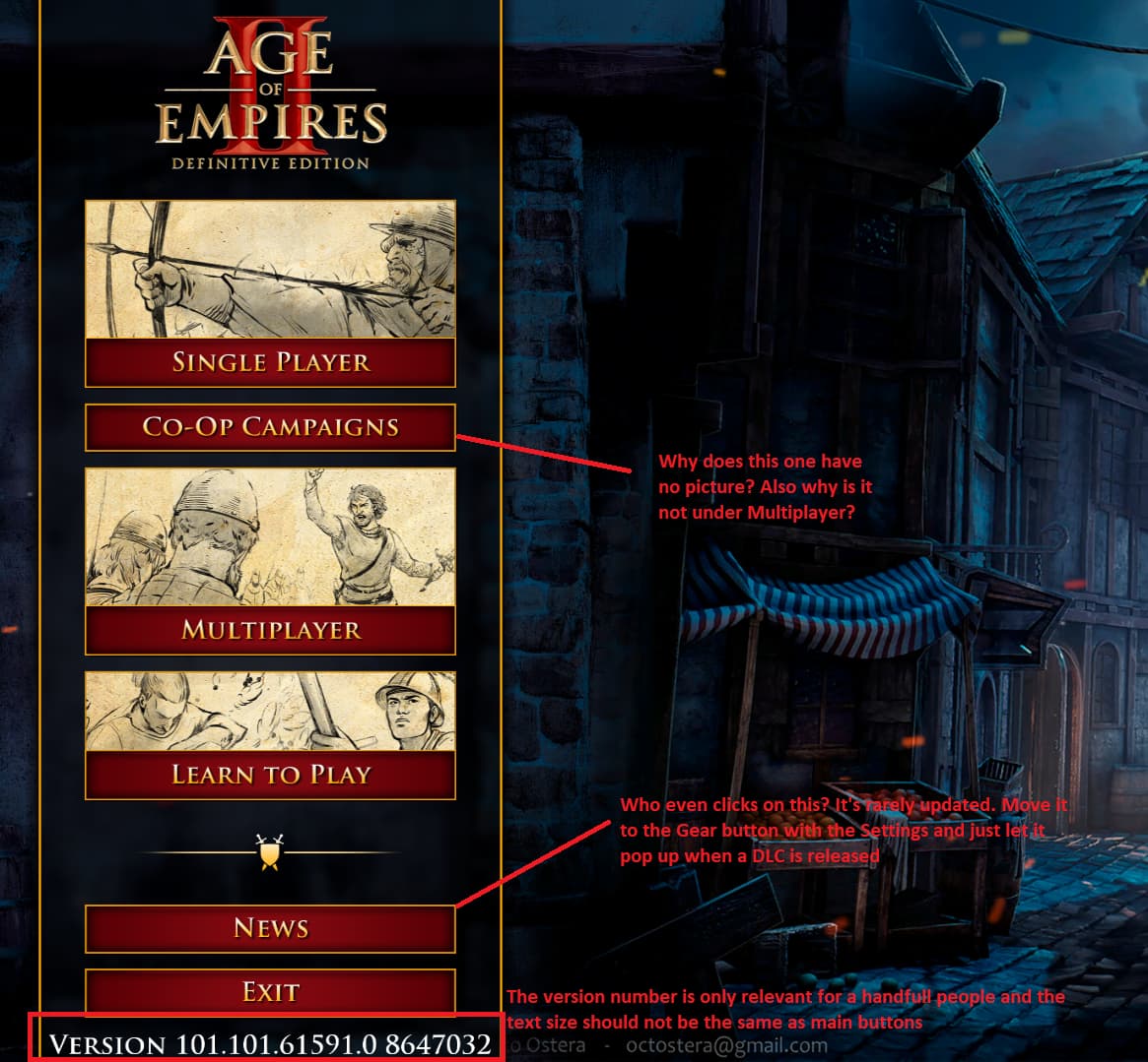
I don’t really mind the new look design-wise, I think the old style was also somewhat messy and we’re likely looking at it though rose-tinted glasses. However, I find the DE’s UI completely both messy, confusing, lacking in features, and is also often clunky with responsiveness.

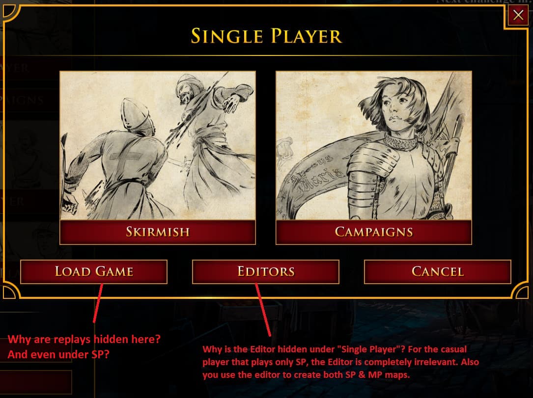
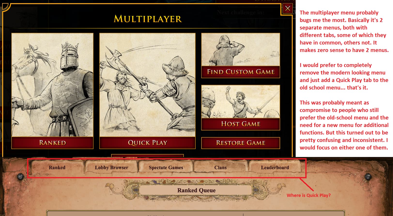
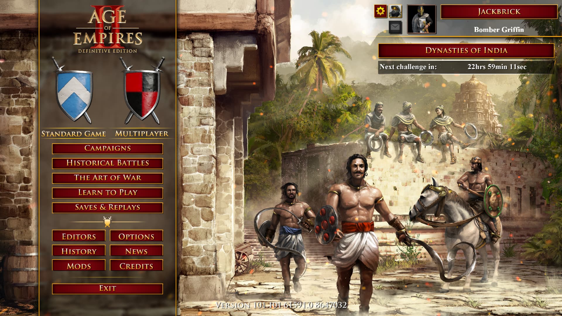
It’s messy: the design style feels like a first-year IT student made it. There is one style for the main menu, then a different style for lobby browsers etc. A third style for Quick Play or your statistics screen (and why is that COMPLETELY HIDDEN under your AVATAR, and you wouldn’t even know unless you’ve accidentally clicked there!!! Why are VERY IMPORTANT FEATURES such as Bans hidden under there!!!).

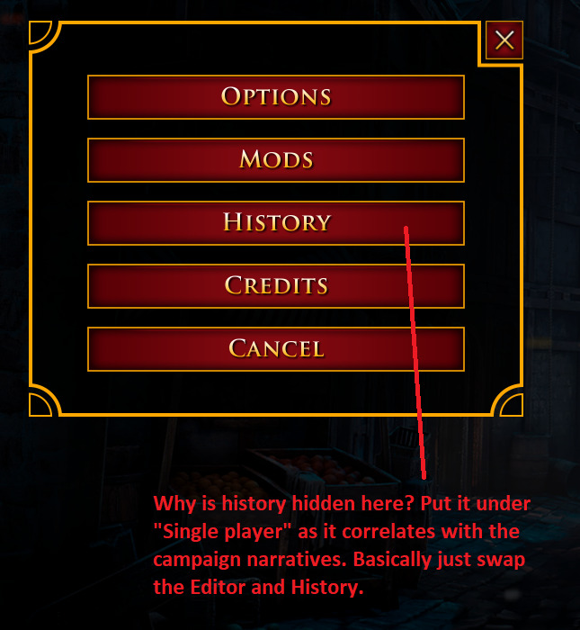
Features are also thrown around haphazardly and it is not cohesive. And people on the forums have already pointed out how messy the Campaign selection screen is! Is there no more room now for new Campaigns? Why is there Europe, and then Western Europe and Eastern Europe? I get that you’re distinguishing DLCs, but it’s just very dumb - especially if the DLC pages only have a few campaigns.

The messiness leads to confusion - because features are thrown about without a thought, it isn’t always very intuitive where to go for what you need. But also, some of the choices made are confusing! Why can’t we talk with the party you’re playing Ranked with before match is found? You make that possible afterwards, but not before?? Why? It’s just very VERY anti-social, as you’ll only have a minute afterwards to talk or plan.

Also, why can’t we add people to Steam Friends easily through AoE2? There are some features that somewhat let you, but I found it so annoying that after playing Ranked and finding few players who I enjoyed playing with and we all agreed to play together more, I had to go through aoe2.net to find their Steam profiles that I could add to friends. This is a feature that is severely needed in AoE2 and for some mystifying reason, doesn’t exist. Is it because of cross-play with Xbox?

Finally, it is also very unresponsive. Clicks take seconds to go through (unacceptable in today’s age) and I don’t even mean the current bug(s) after India DLC launch, where returning to main menu hangs up for several seconds… They did fix the Mods browser at least, so now the game doesn’t freeze every time you tried to do something with a mod!

The entire game could use a UI overhaul, to make it more intuitive and logical, designed with cohesion in mind. I don’t know if the same exists in AoE4, but from very brief cursory glances, it at least feels like it has the same style throughout.

4 Likes

Thanks for the comments about replays. I fully agree with you and added it to my post.

Frankly with the new menu layout, I do not know where to put the replays button either since it is both SP & MP but at least create a button called “Replays” and don’t hide it under “Load games”…

This is why the new simplification of the menu is terrible. I understand the logic of “keep it simple” and show as few buttons as possible but this obviously did not work quite well in this case and only made everything more confusing.

The current solution simply looks unprofessional and unfinished with both modern and classic aesthetics co-existing.

Currently i’m using this combinations to revert the old style, which are the best alternative to the new UI style:

Age of Empires II DE Classic Main Menu - Mods - Age of Empires

Classic History - Mods - Age of Empires

Classic Civ Picker - Mods - Age of Empires

as Bonus:
Color-Corrected Main Menu Background - Mods - Age of Empires

1 Like

I am probably the only one who liked the Pre-DE layout best, haha, but I thought it worked just fine.

3 Likes

I don’t know how but this mod turned itself on for me yesterday. It was so refreshing to see all the buttons I needed just 1 click.

However the downside is you can’t get to “quick play” as far as I can tell. If you know how please
Share that info.

1 Like

So other people are experiencing the mod turning itself on too? Nice

1 Like

When the game updates all your mods are unticked.

We’re saying it got turned on by itself not off + it didnt get turned on with the patch it got turned on a few days ago, idk if there were any updates then.

1 Like

Yeah super weird wasn’t it. I thought maybe someone had logged in and couldn’t bear the new menu and changed it.

1 Like

This main menu mod has quick play button

2 Likes