Over the past couple of years of updates this game has improved tremendously and the devs have done a great job adding new civs and mechanics. In my opinion, I think it is a good point in time for the devs to slow down on adding content for the moment and instead polishing what is already in the game (which they have been doing a great job at) but also the UI of the game. I think that the ui does the gameplay so dirty… It feels like a mobile game layout and it is very clunky. There isn’t a lot of consistency in some of the new additions and i feel there is a lot of room for improvement, especially with how counterintuitive the lobby menus are. Everything is confusing and there is different aesthetics fighting for your eyes. In my eyes a complete overhaul could be totally justifyable and im sure that they have the resources to find someone capable. What do you guys think?
the issue is that they started a UI overhaul but didn’t finish it
Overhaul in terms of look and feel, though most importantly in terms of UX and intuitiveness. Absolutely.
Yeah thats true. And things like the rematch button feel very out of place. Not to mention how terribly the menus perform… On lower end computers, the ambers melt your cpu and all of the animations require so much resource usage…
Yeah for sure, a combination of a UI and UX overhaul would be the best thing for this game right now imo
I deleted the ember on mainmenu by deleting “ember.pso” and “ember.vso” (in d3d11/shaders/_common/resources), but the fan of my
laptop still screams very much on meinmenu…
I’ll buy new pc. ![]()
not really UI is fien the way it is and if you want different ones leave that to the modders. there are ton out there
I use a mod called “no embers” but it really doesnt completely fix the perfomance issues that the menus of the game have.
Biggest UI change I want is: all Dock stuff on one page
Yeah, some UI/UX updates would be neat someday! Some discussed in the past that I’d like to see at some point, in no particular order:
- Drag-scrolling, as talked about in the AoE forums here, might be nice. Here’s an example on reddit of what that would be like:
- https://www.reddit.com/r/aoe2/comments/g3c978/is_there_a_way_to_pan_the_map_like_every_other/?rdt=34772
- No idea how often I’d use it, but could be neat
- Give some options to players as to what they want to see for their main menu. For example, could make a “Classic UI” toggle, so players who are nostalgic and want the old AoE2:HD main menu interface back could use that. Still surprised to not find much of a nod to AoE2:CE / :HD, except for the actual match gameplay and graphics itself.
- I think the Options menu tabs could use some tidying and tightening up, re-organizing, better section delineations, smaller font (more info displayed per page), and different colors used to help it be more intuitive and easier to look through and use, as well. It feels a little cluttered and discombobulated… harder than it should be to find what you need, imo
- Bigger text scroll window for civ histories, since reading paragraphs of info in a short window is not too fun: [SUGGESTION] Improve "Story" UI by enlarging text zone
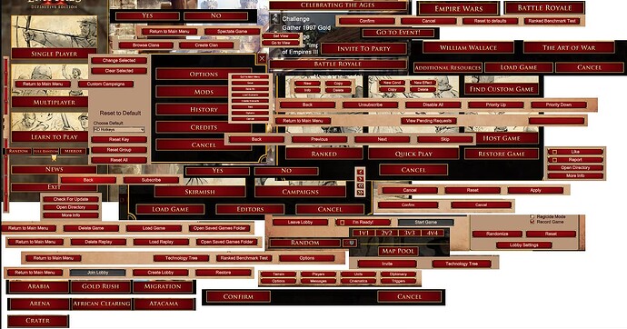
- Add some green buttons to the menus, since red usually means Cancel/No and green means Continue/Yes. Maybe even a neutral plum/purple of some sort for some buttons, too. You can still make it look neat with well-chosen shades and saturations. As a visual person, I hate having to read and process the button text every single time because the non-intuitive color choice. This is an old collage, but still applies for the most part if not entirely:
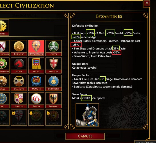
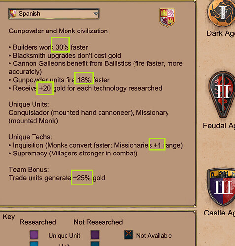
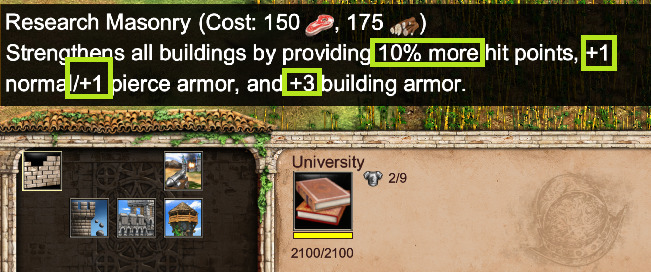
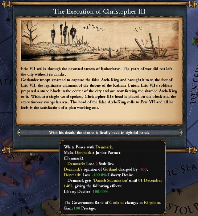
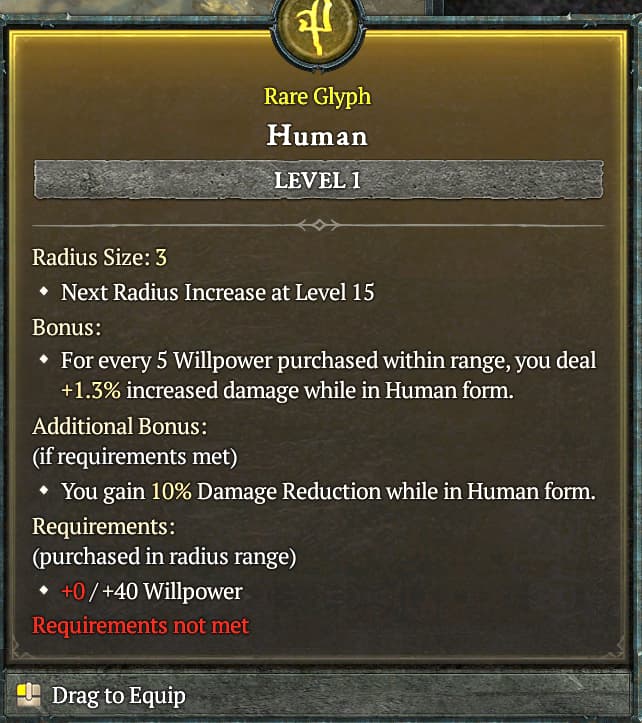
- Color-code the text do denote + (green) and - (red) stuff, in screens like this:
Edit: It should be “green” color is stuff “good for the player”, and “red” is stuff “bad for the player”. I know at least my first screenshot has errors regarding that philosophy I was careless with my highlights…
… To name a few possible quick wins
Yeah I think all of those are really great and practical suggestions. Something that I think is of top importance is just for someone to rethink how the different pages are accessed. For example, the custom games, replays, spectator lobbies, leaderboards, scenarios. I have over 1400 hours in this game and it still takes me multiple tries to figure how to get to the correct tab and where to find the buttons. It is just so counterintuitive.
If you’re going to colour-code number changes, don’t make a simple “+ = green, - = red”. It’s more intuitive to make : “green = positive, orange = double-edged, red = negative”. It’s notably used in Paradox games to quickly see if the result is good for you or not.
Between an unit taking less time to create, or having a faster creation speed, the effect is the same, the only difference being some weird calculations (mostly fixed by now, but the numbers used not to be right). Why should one case be red and the other green ?
Most bonuses would be green, the exception being some limitations such as starting with less resources.
If we’re talking about improving the UI, why not make the menu closer from the good old CD version in the city street, with shop signs being the different modes ?
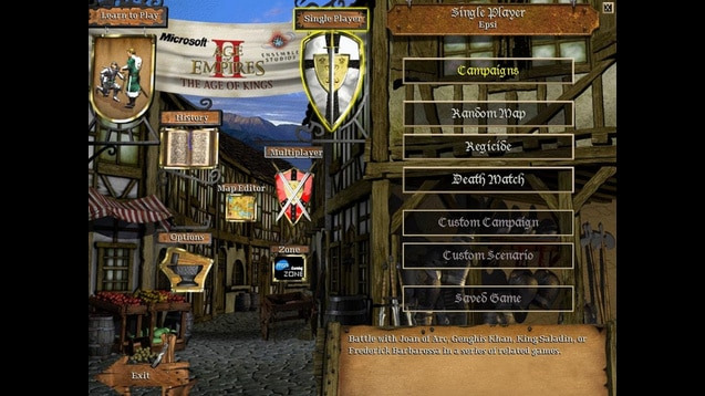
You might be interested in my Classic History mod
I’m sorry, I’m not sure what you mean by double-edged?
I thought green made sense for any positive value or positive percentage, and red made sense for any negative value or negative percentage. Is that not true/good?
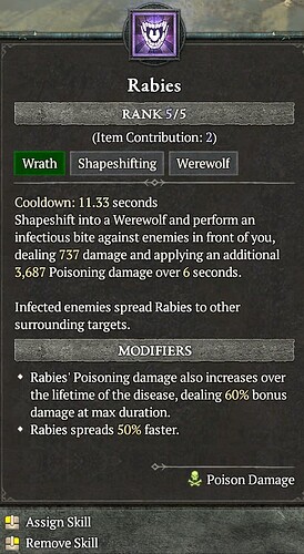
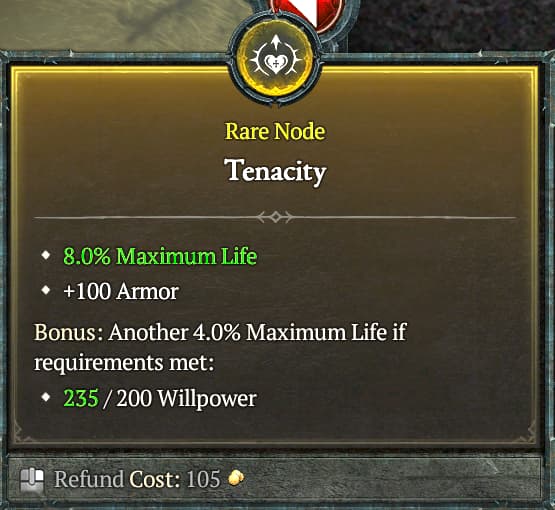
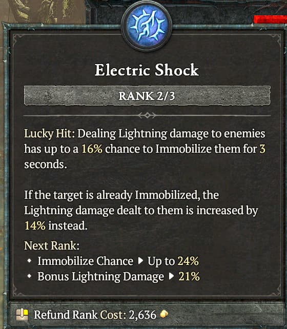
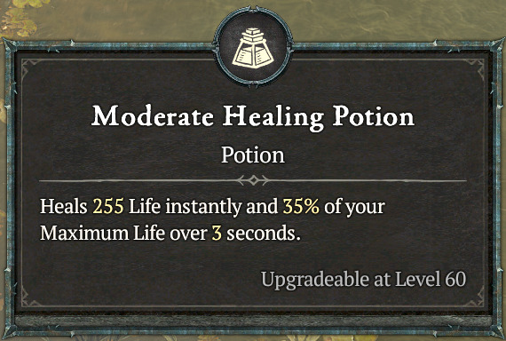
In your screenshot, I like that certain words are highlighted a different color. I like that Diablo IV does similar, too, but haven’t spent time to decipher D4’s logic. Whatever they do I like, but I’d prefer the yellow was more different than white… which is where green makes more sense to me, where it makes sense to. Either way, yeah, using at least two colors (red/green) is fine, but probably three is better to highlight certain words or have different values meaning different things (like “737” damage directly below… probably shouldn’t be green or red). As I read D4’s values more, these aren’t apples-to-apples to AoE, so take the screens with a grain of salt, as just examples to ponder:
Nicely done! Looks like you made it one big scrollable window, which is what needed to happen to that page ![]()
Yes! For sure, that’d be great. That was in my bulletpoint #2 ![]()
UI icons at bottom left, needs to be improved imo.
Now with drop off mechanic, the bottom left area is overloaded.
kinda funny the ambers can’t be disabled without a mod
I disagree, I think that the grid is still fine as long as it is all on one page. To be honest I think that the ingame ui is fine the only things that needs work is the dock. I mostly think the menus need modernization
Yeah I’d also hate a 2nd page. So add a new column maybe?
Double-edged = the change has both positive and negative effects depending on the situation. But it’s rare, the only one that comes to mind for AOE2, and I’m really stretching it, is the Huns not needing houses as you lose an usual quickwalling option.
