So… I’ve been discussing the update preview with some players in Discord and in YouTube, and there seem to be two things almost everybody agrees on:
The new update seems AMAZING
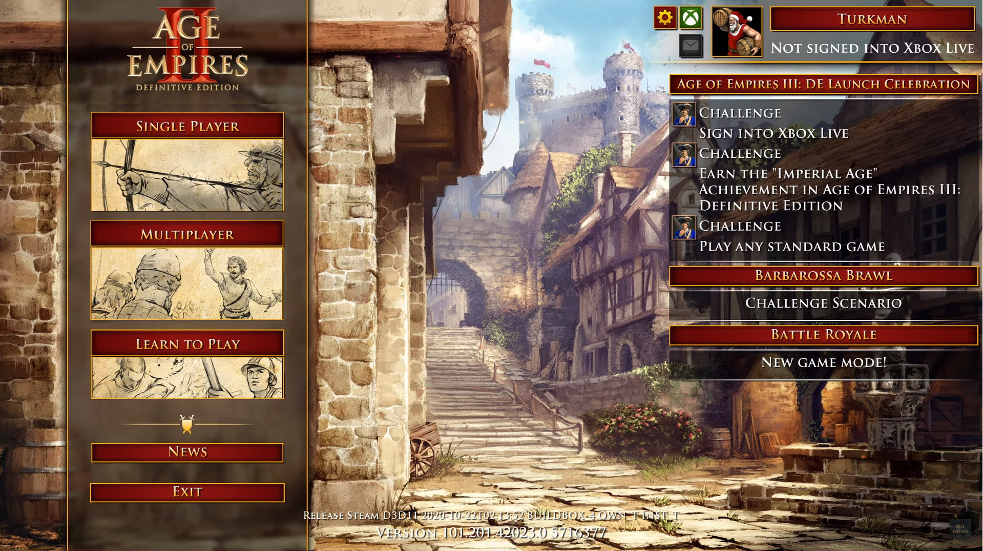
That main menu though…
Personally, I understand there are many modes in the game, and there’s the risk that the main menu may become overwhelmingly full, but… I very (very!) much dislike the new style. In terms of accessibility, we now need an extra click to reach absolutely everything, and aesthetically, I don’t feel like the hand-drawn pictures (or the buttons’ image-above-text-below structure) match the overall style of the main menu.
So, what do you all think?
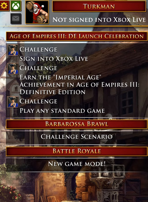
From the November update preview:
We also updated the main menu UI. The amount of content and options in AoE2:DE is mindblowing, and has only grown in the past year. The new main menu UI simplifies navigation in as many ways as possible, making it easy to find the content you care about.
They also said it in the video that overall less clicks will be needed so I’ll stay optimistic for now but overall I agree with your opinions. Altough the current UI can be pretty bad at explaining to new players that what part of the game is singleplayer since it only indicates the custom game vs AI as singleplayer, so the new UI definitely has some bigger advantages (not only small visual stuff).
@Szebo210 That’s true, and I love that they’re focusing on potential new players.
I think most people are disliking it because it somehow makes you feel it’s wrong, or fake. I think it’s because it’s just not coherent with how they’ve been dealing with titles and images elsewhere in the game. Just look at the right side of the main menu, where the red banner is always at the top, indicating that a “category” is starting, and then all the icons and information belonging to that category go below that.
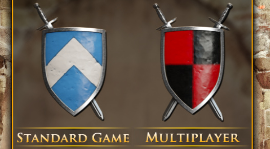
I’ve gone and used my mediocre paint skills to swap the positions of the text and the images within each button (also brought the whole thing down a bit) and I am genuinely surprised by how much I prefer it now. It doesn’t trigger my OCD nearly as much.
It looks ugly honestly, but i am quite sure i am gonna be able to mod it and remove those pictures and get better looking ones there, but i’d rather to keep the shield buttons.
If the devs think we need this new abstracted and “classy” (i guess?) menu - then get rid of, or at least hide by default the stuff on the right that seems to be in direct conflict with the “less busy” style they are trying to go with.
I understand trying to make things easier for new players, but it seems they are making things a little too complicated by trying to hold a new player’s hand through the menu of the game. That holding of the hand, however, will quickly become annoying to anyone who plays the game regularly and is just trying to get through the menus.
This update to the GUI appears to be choosing form over function
I don’t like the distribution of the new menu, but the really bad thing of the new menu are those art works that doesn’t feel that they represent anything at all, they are just random hand draw images that look like place holders. If the art work were made at least in color and with more realistic approach like the background menu it could work perhaps, but not like this, at all.
So much red and tan/gold everywhere. Starting to feel like a Michael Bay film and his obsession with teal and orange.
I could use a little more use of color, and not black & white pencil sketches for menu items. Purely subjective, though.
It’s so strange, however, how everyone who has done UI design in and since the 2010s have all come to the conclusion together that no colors exist in the rainbow except the two or three they select for their product. I’m all for brand recognition and themes, but some companies have gone way overboard. I know for a fact you can have “themes” with more colors than two. Somewhat related: it’s really hard to fathom how Windows 8’s design philosophy has ended up taking over the world for ten years straight so far; and is only getting worse. AoE2:DE isn’t quite as bad, but I feel it is borrowing from some of the philosophies of it… and this hurts usability and intuitive design.
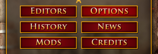
As for the main menu no longer having an “Options” button or a “Mods” button, I’m not liking that change; assuming it sticks.
No more “Credits” button seems a little disingenuous to those who have worked on the game. Hopefully it’s still available somewhere, and I hope they add a fast forward (and rewind) button for it.
“The amount of content and options in AoE2:DE is mindblowing, and has only grown in the past year.”
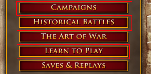
The options in the menu are not mindblowing. The menu is simple but littered with junk like all the stuff on the right and the “NEWS” button. Shranar highlighted some important details; like combine Campaigns, Historical Battles, and Learn to Play into one menu, but highlight the path to the William Wallace Campaign for new players.
So in the future I can’t get to campaigns, mods, options, editors, history, etc from main menu with 1 click, but have to do at least 2 clicks every time? Simply awful . There is easily enough space in the main menu for all the buttons, no need to hide them.
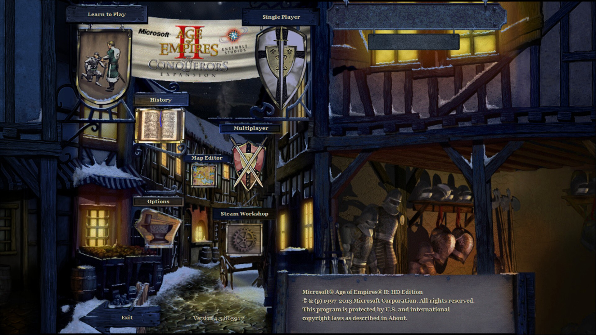
Current main menu is good enough. I will probably start to miss it after the update.


 . There is easily enough space in the main menu for all the buttons, no need to hide them.