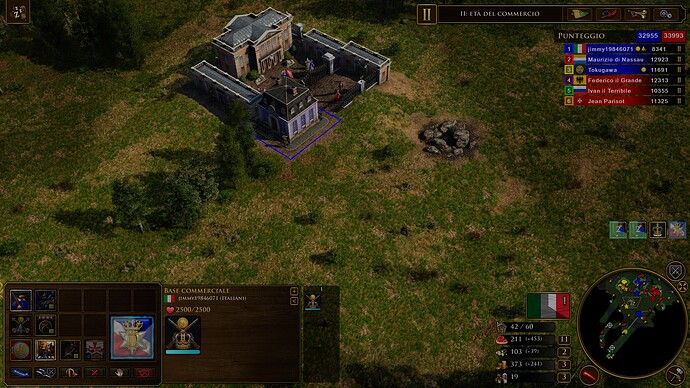
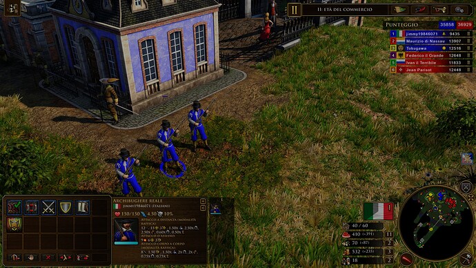
yup they are an aoe 1 mechanic originally but aoe 3 refined it more. It made much better which this is why I mention as the new standard but i understand your point
Of course, in AoE 2 they are not there, but they come back improved in AoE 3…
What Aoe4 should add with next expansions to increase the appeal for the who play campaigns and skimish (we already have the best inspiration: AOE3de. Developers should take a look inside the saga)
- More diplomatic options with new interactions with AI:
Many different possibilities available for the players:
- asking goods but also troops
In the below video i asked to my CPU allies to “attack a enemy now” and they answered with own personalities:
And choosing to coordinate specific strategy with your allies. I captured a video from Empire Earth 2 with this beatiful option
######################################################################
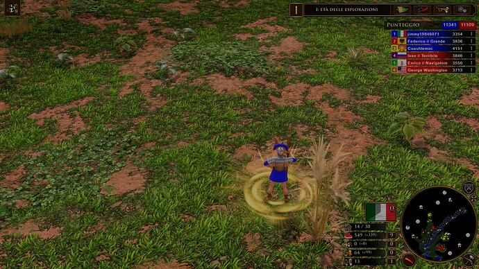
2) GAIA
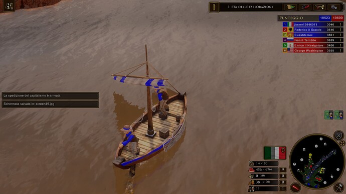
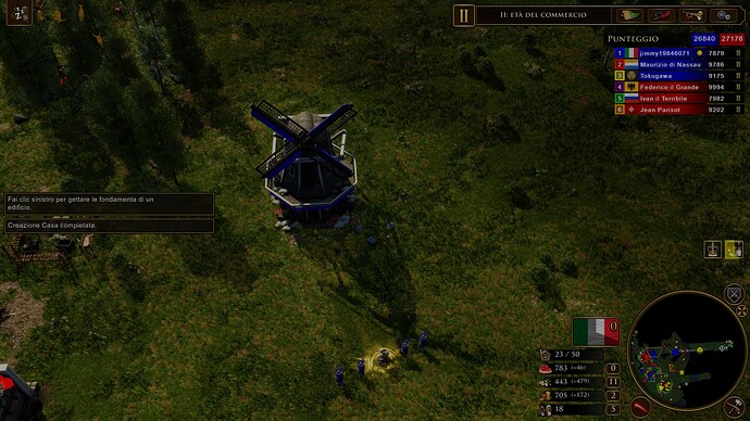
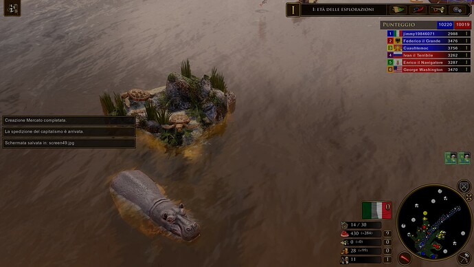
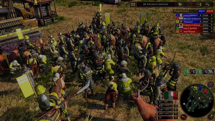
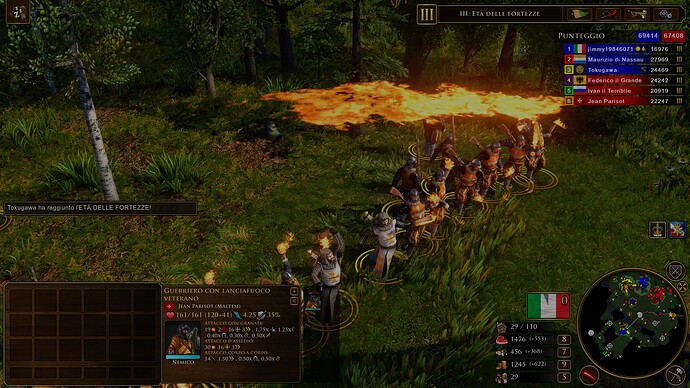
we can quietly admit that AOE4 lacks of vivid biomas with credible fauna and vegetations. This should be a priority for developers and they have to reach what previous titles already done in term of amazing maps full of life.
![Age of Empires III_ Definitive Edition 01_07_2023 11_50_51|690x388]
(upload://3q1aDIDX5tG2sRzrgP50LAhV56R.jpeg)
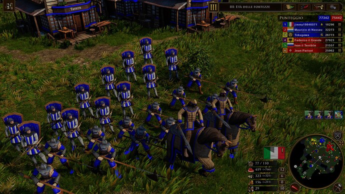
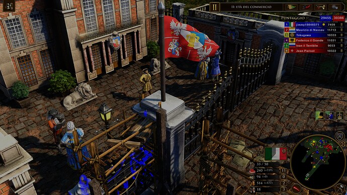
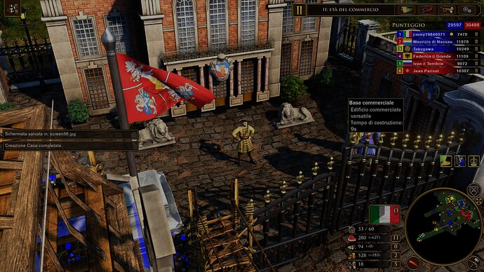
- Improve model details with better textures:
See how look realist the armours are
![Age of Empires III_ Definitive Edition 01_07_2023 #####################################################################
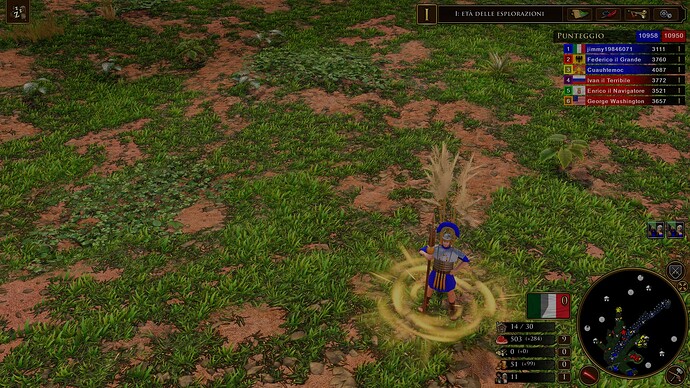
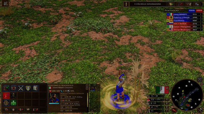
or see the wear on the Roman legionnaire’s armour. These are small details that add to the immersion and richness of the game world
-
Different Zoom options (zoom in and out).
improve the models detail and relating texture is nothing without a better “zoom in” because you are can’t see the improvements themself. Aoe4’s closed alpa had have this type of zoom, similar to company of heroes but pro-players probably asked to reduce it.
For a good equilibrium between “multiplayer and cinematic immersion” i think that what Tantalus done with Aoe3de is perfect
-
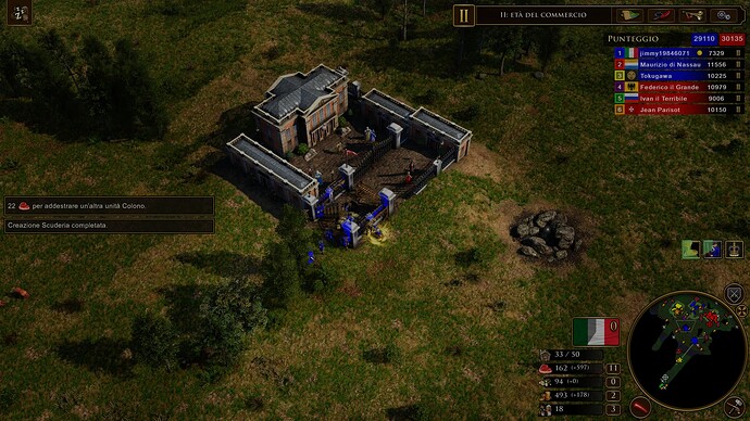
Outposts and Mercenaries
Outposts and mercenary taverns: these mean simply more strategic options for players during the skirmish or campaigns.
Aoe4 should have them because it’s a historical facts: 1000-1600 are the epochs of professional warriors: lansquenets, spanish Tercios, swedish mercenaries, heavy french cavalry, wales archers and more.
The national armies were born in 1700. AOE4 doesn’t cover this period so i think it could a right update.
AOE3de made it perfectly
- A world MAP Conquest
Controlla i dettagli
Traduzione vocale
596 / 5.000
Risultati della traduzione
Risultato di traduzione
star_border
The world map is an incredibly attractive game mode for many players because it offers real-time alliance options, different strategies with the choice of playing battles in real time and the feeling that you are really conquering the world. Relic has already introduced this mode in COH3 but I think the representation of BFME2 is suitable for AOE4. Furthermore, I read that this mode was also designed for AOE3 but then abandoned because it was too complex for those years. But I think now technology allows it to be implemented again.
I don’t want the AOE4’s failure but i would like to see a “premium experience” for single players.
It could seems a egoistic point of view by me but i simply think that this game lacks of immersion and it has been designed for e-sport.
I can respect that but this is not AOE.
Cheers, jimmy.
I agree with everything… even that the units can build bridges like in the Mongol campaign…
When I see unit portraits in Aoe3 DE, one more beautiful than the previous ones, i ask myself who in Relic thought it was a good idea to put low effort to differentiate units when you go the military buildings and train them. Look to the mercenary skirmishers and native units variants on 3DE…
Yep, it looks like a budget UI image that didn’t demand any artistic and historical research and skill.
It is just copy and paste figures with 4 tiers that look the same.
I wish people just stopped shit-talking UI visuals. There are bigger problems then UI visuals ever were.
AOE4 has completely fine UI. It’s prioritizing functionality and simplicity. So it’s completely reasonable design choice. Even if there could be few small changes to make certain parts easier to recognize.
Fancy UI and Icons are distracting and hard to read. Combined with the fact that reading information on fancy UI is harder. It makes sense to have simpler UI visuals. Players can focus on what is important instead of continuously staring on fancy portraits. Like why do you even need to stare at portraits ? You are supposed to stare at the units in middle of your screen… So UI being simple is actively encouraging you to minimize amount of time you waste staring on irrelevant part of your screen.
Now making a UI that has soul, looks epic, and doesn’t look like a mobile game is incompatible with being functional and readable, ok man.
The UI, for me and other users who gave their opinion at the time (some left), seems to us to be one of the worst things in the game. The fact that a few like it because they have gotten used to it does not make it good, especially for casual players.
Of course there are more things to improve and add, but saying that the UI is good because it’s a “design idea and it seems reasonable to you” doesn’t mean that most players will like it and it’s pretty obvious from the continuous criticism.
And in case you forgot, many people watch the game, whether it’s tournament play or FFA casual play on YT or Twitch or watchint content creators play, so how the game looks is important to them.
He basically wants to say :
If the UI is bad but the game is good, people wont leave and will enjoy until they fix the UI.
If the UI is good and the game is bad tho, no matter how good UI you have, there is no one who plays the game because of the UI.
He said “AOE4 has completely fine UI. It’s prioritizing functionality and simplicity. So it’s completely reasonable design choice”.
At no time has he said there are UI design that must be fixed, just readability issues.
Of course, a game can be bad with a good UI and relatively good with an improvable UI, but the UI is a part of the game that has its importance when determining if the game is better or worse, especially facing to marketing and casual gamers.
Basically I’m wanting to say: A game with a very improvable UI in the multiplayer menu and in the game, can’t even touch excellence. Are there any current good games with a UI that has a similar design?
P.S: What I really asked for at the time is that, at least, you could customize the interface in the menu and within the game. It is no longer that you eliminate the minimalist style, but that you have the option to change it at least.
That’s subjective and everyone can have different opinion. Gold-Blue is reasonable color combination for evoking the medieval royalty theme. You can’t just claim it has no soul and it is not epic due to being different then previous games. One can consider it epic, others can consider it over the top. Lot of modern games lean toward more simple UI over the detailed fancy visuals. Hell even the players modify UI to reduce the fancy visuals…
So the exact use case, where fancy UI visuals are at conflict with requirements. If you are watching content, you are probably not aiming to be professional UI watcher… Ideally UI should be invisible or monotonous and small so it’s not drawing attention.
It’s completely reasonable to request additional customization. At the same time it’s also lot of work for very small payoff at this point even if they were sold as MTX. Plus they fired over hundred devs, so something tells me it’s even less likely to happen.
I primarily poked at these who are obsessed with fancy visuals over everything else. It’s one of the least important things to complain about. Whatever there is design space to improve UI layout etc… is another matter.
In the end, if you care about the future of the game, focus on content and important details and mechanical deficiencies. Focusing on fancy UI icons, animated menu background, etc… is definitely not going to make this game better or worth playing again.
At least campaigns and casual games should have a lot more variety of options to differentiate it from competitive mode. (If they supposedly thought of casual and competitive gamers as you have suggested.).
Imagine a menu where the following settings appear for a casual game:
Minor factions on the map: Activate/Deactivate.
Support of the capital (Cards): Activate / Deactivate.
Mercenaries and Outlaws: Activate / Deactivate.
Treasures on the map: Activate/Deactivate.
Relics: Activate/Deactivate.
If the game is supposedly designed for all types of AOE players, they should have kept this in mind.
In addition to largely ignoring players who play other games other than AOE-2, they also largely ignored casual gamers.
The campaigns are not very replayable and there is not much emphasis on this. (Besides the documentaries there is not much more to be desired). I know the AOE-3 campaigns aren’t that popular because they’re fictional, but I think it’s a good story. Here I explain my opinion:
############### post:114, topic:234575"]
Fancy UI and Icons are distracting and hard to read
[/quote]
No one wants fancy
People want to see historical armor, weapons, technologies, etc that makes sense on the UI.
UI turned off many AOE fans because, for the 1st time, they removed pictures and introduces signs as technology!
This is boring and is against history. All this simplicity nonsense turned this game into a boring stale game without interesting points and areas. A soulless game.
############### post:114, topic:234575"]
Fancy UI and Icons are distracting and hard to read.
[/quote]
This is just your opinion.
And it is welcome.
But many AOE fans see it as a degradation from all previous AOE games.
It lost its meaning, standard, history, artistic visuals, etc.
############### post:114, topic:234575"]
layers can focus on what is important instead of continuously staring on fancy portraits.
[/quote]
No! People create imagination, putting this armor on their units, they look so cool, now they will perform better, etc.
Or
Achieving this technology will allow them to deal more damage, better visuals for walls and HP or effects, etc
Only E-sports players who play to win money or prize care about this SIMPLICITY!
They only play games to make money, as is their way of life and I see them as BIASED people, who use their interests against majority of gamers (Casuals)
############### post:118, topic:234575"]
Lot of modern games lean toward more simple UI over the detailed fancy visuals
[/quote]
Because most action shooter games want to give better visual for players.
This is why they choose minimalistic art style for their UI.
But if you look at Total War: Warhammer 1,2,3, Pharaoh, Attilla, etc they give UI that resembles the actual units. And people love that. They look so cool and act like a morale booster. And it is doing a lot better.
This is something I rarely see people touch upon.
It is standard for RTS games to take the route of immersive UI aesthetics. RTS games that feature simpler UI tend to be more sci-fi in nature, but still end up being immersive. AoE4 isn’t a fantasy game, but even taking into mind the idea of being a history based game, it should still represent that in some way or another.
The fact that AoE4 skimped on UI for every civilization is. just. another. shortcut by Relic. The game’s entire UI is. Here is something everyone should agree on; 2 years into post-launch and we STILL have a unreadable tech tree. If that doesn’t show they don’t want to actually develop the game, then I don’t know what will.
They are content making DLC and thats it. That is the fate of the game.
If this is the case, why do Relic’s sci-fi RTS games have at times more involved UIs? Even the notoriously-received Dawn of War III has incredibly realistic (and busy) unit portraits for the unit icons. The only one I could call minimalistic would be DoW II, and that was simply a choice at the time (that had its criticism, for not having things like faction-styled UI elements - something DoW III brought back).
Why do we assume these generalisations? Is it because they’re true? I don’t think so. They may feel true, but I think they do the devs a disservice.
You can dislike, you can hate, the UI as-designed by Relic in AoE IV. But nobody can judge the effort that went into making it. It’s unprovable. I could list the factors I think took time and effort and I still couldn’t prove it.
I mention DoW III because it did badly. Because it seemingly wasn’t given a lot of resource. But it is a sci-fi game with a UI more involved than its (franchise) predecessor, with a lot more “busy” elements that aid immersion at the cost of readability. This to me suggests the very different approach they took with Age IV was intentional.
On top of that, if the entire gold-and-blue theme in Age IV, with its stylised, almost Bayeaux Tapestry-like iconography, that extends from marketing materials, into the game UI, and even into things like construction animations and siege setup / teardown FX is “taking a shortcut”, then it’s an amazingly coherent one (aligned across many areas of the business, r.e. the product itself).
(there are individual icons I think don’t fit, like the settings icon on the main menu, but imo these are far and few between)
And if any of that is convincing, or at least plausible, you can still find the UI dire. I just object to the idea that it’s some kind of shortcut to design an entire UI and colour palette from the ground up to be some kind of “shortcut”, or a lack of effort.
I think it’s completely intentional and took a decent amount of effort. I also think that some folk fairly dislike it regardless.
I think there’s a lot of room for discussion here, and I agree it isn’t touched on much. I want a conversation. I think Relic went for function-first to an extent, but looking at AoE II and even III, there are obvious cases of function over form there too.
And obviously, some of this relates back to what changes you or I think the devs are capable of making. And that’s fair. I can only imagine what’s been going on since the Relic layoffs, even with this game being a joint enterprise.
############### post:114, topic:234575"]
Fancy UI and Icons are distracting and hard to read. Combined with the fact that reading information on fancy UI is harder. It makes sense to have simpler UI visuals. Players can focus on what is important instead of continuously staring on fancy portraits. Like why do you even need to stare at portraits ? You are supposed to stare at the units in middle of your screen… So UI being simple is actively encouraging you to minimize amount of time you waste staring on irrelevant part of your screen.
[/quote]
AoE1
AoE2
AoE3
AoM
AoEO
A “fancy” UI with portraits didn’t hold these games back. Interestingly enough, the issue of readability has suddenly become a major talking point with this game. This infestation of catering to the competitive scene at every turn to the detriment of certain aspects we all have been accustomed to for over 20 years is disturbing and I don’t have much faith in the future of AoE if this mindset continues.
A pleasing UI adds to the overall experience and while that differs among people there haven’t been nearly as many complaints with the previous game’s UI.
Maybe the fact every map has the same fauna means readability was the most important thing rather than making an overall quality immersive experience for players. Maybe that is why there was no color picker upon release. Or none of the AI are given historical names of the civs they represent like in AoE2.
Of course, the above is just speculative spitballing but we do know for a fact that units wielding oversized weapons made of plastic, ranged units firing their weapons while engaged in melee and no siege crews are a result of this mentality.
Do you see where this is headed?
Constantly harping on functionality, readability and simplicity eventually mean you’ll get the bare minimum. A soulless husk of a game. I don’t want that for AoE.
I’ve been over this before, but readability has less to do with the competitive scene that it does with accessibility.
And you’re right, readability didn’t used to be as big of a concern. Because accessibility didn’t. Even in software, where there are standards (that you literally need to meet to get contracts, like a VPAT), a lot of companies are playing catchup.
It’s very much something that still gets argued over a lot, because yes, at times, it introduces design considerations that mean things may have to be simpler than perhaps someone would want them to be.
Of course, somebody could also just prefer simplicity. ####### obviously does (their name gets auto-censored, which is also breaking all the quote tags). Are they a competitive player? Have you asked? Is their opinion wrong? Or just different?
We call this a “slippery slope” argument, and it’s rarely convincing. The devs have slowly been adding detail back into the UI (and indeed the game itself, given the improvements to terrain rendering), so I don’t think that’s the direction AoE IV is heading at all.
I really don’t know how you started replying less than a second after I hit reply to a post that wasn’t yours.
My curtains are drawn. Are you a ghost?
