I look forward to the day when devs make it easy for modders to have more flexibility to rework the UI. If the devs don’t have time due to circumstances (I understand them), give more flexibility to the modders.
Had the page up from replying to TheAchronic. I’m no good at spooky noises, and hanging out around windows would probably get someone ringing up the police ![]()
I couldn’t agree more. It’s something I’d be really interested in too, just from a technical perspective (I used to do a lot of UI modifications for the original Dawn of War).
Well, then that makes you the world’s fastest reader. I’m impressed if not a little weirded out by it.
This will be the last time I log on here at such an early hour. Carry on.
It is a shortcut.
You seem to be coming at me as if I am attacking the developers. Do you think a shortcut is something that is done because they waned to? developers tend to have pride, from programmers to artists who decide to go down the gaming rabbithole, there are usually better options than to dig their own graves at these companies. More money to be made programming elsewhere and so on. If they are taking shortcuts like this, there is usually a culprit above them forcing them to do it.
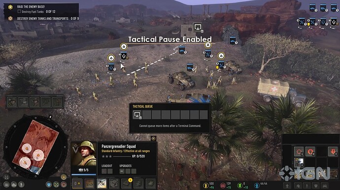
COH was released after AoE4, so if you’re judging by deliberate modern-day design decisions, why is it that COH3 goes from this UI
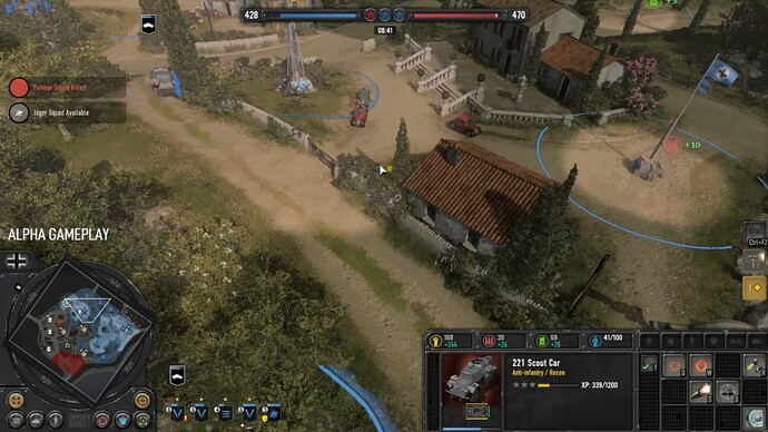
To this
To add more context, the first image is how most of the game still looks. But, the second is clearly more developed. So that suggests that they left most of the game in the same status as prior, while only enhancing the parts that players demanded to be improved. Does that not imply that most of their original UI is considered a shortcut, if they, themselves are able to improve one aspect of it that drastically?
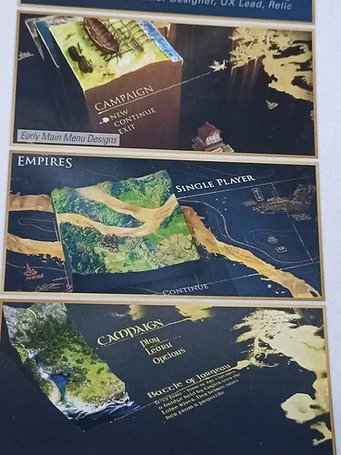
In my view; AoE4 never got that slight improvement anywhere. You can tell it is all placeholders, we have evidence for concepts they had that appear far more finished and interesting than whatever the fuck the main menu is.
Tell me this does not look infinitely more interesting than the one we have now?
Going back to the COH3 comparison images, are you going to pretend that the second UI is worse? Are you? Because that is stubborn, as it was further developed at the stress of the playerbase. Actually–apparently they too had a council, and members of that council aren’t so afraid to admit that this was one of the things they really pushed for. So am I free to talk badly about our council? Or are we so unfortunate enough that our council DID successfully HOLD BACK our own UI, by being stubborn and obsessive about “modern” graphic aesthetics?
I will never know because no one here has a shred of transparency in them. You, the developers, and those above.
And another thing. You can be as annoyed by people bringing this up as you want; but you are not the norm. There is a decades long culture prior to your arrival to AoE, and people who both stuck around and lived these games were expecting it to continue. Be as mildly annoyed by them bringing it up as you want; but what SHOULD have been, is that we got OUR UI and you could mod yours.
The base UI should not have forsaken aesthetic for some idiotic chasing of marketable audiences. The audience they should mainly focus on IS THE ONE BUYING THE GAMES.
But, reality is probably that they just ran out of time and that the current UI is more of a shortcut than an actual conscious decision. So keep defending it as if there was any shred of soul in the creation of it, because I can guarantee you there was not.
It’s a shortcut in your opinion. I don’t share that opinion.
The strength of CoH 3 is that its development efforts were more open from the start. Because it was started later, and is wholly under the control of Relic. This is a lesson they learned, painfully, with the reception to Dawn of War III. I would know, because I was there (as a fan, to be clear).
I don’t think you’re attacking the developers at all. I think you’re undervaluing the choices they make when making a product you disagree with (at least in part). It’s a common rationalisation, it’s not like you’re the only person who does this. I do it at work, for crying out loud. “what were they thinking when they did this”, right?
But, like I say below: you never saw AoE IV in-development, like you have CoH 3.
Your view is inherently uninformed, sorry. Because you never saw the game in development, as everyone has had a chance to do with CoH 3.
“oh my goodness, are you telling me it looked even worse?!”
I’m not saying anything, because, NDA. I am explicitly, here, telling you not to read into what I’m saying, because I can’t confirm anything any which way. I’m just telling you you didn’t see it develop. Factually. Which puts the comparison with CoH 3 on incredibly shaky ground.
Interesting? yes. Functional? No.
And yes, as much as things should be as interesting as possible, functionality is still important. We’re playing a game, we’re not watching a movie. Where would you, in any of the concepts presented, fit the wealth of information available to us on the current main menu?
I was never arguing about CoH 3 or any of its qualities, so I don’t really get why you’re putting words in my mouth.
I think, with respect, “being stubborn and obsessive about modern graphic aesthetics” is something we should be allowed to disagree on. You don’t seem to be presenting it that way.
This is entirely elitist and counterproductive. I didn’t take you for such gatekeeping.
I was here decades ago. I mean, not on this forum, but I an a franchise fan. The only Age games I have not played a significant amount of are III and Online. I understand it’s easy to dismiss the positions of those you argue against by drumming up some standard they’re apparently not meeting, but honestly it’s pretty insulting.
I shall, thanks. It would be great if we could agree to disagree over something that is inherently opinionated, but here we are regardless.
It’s difficult, because I find people are really bad at not being able to find a reason why they don’t like something beyond “I don’t like it”. The problem is, “I don’t like it” is valid. Your opinion is enough. The developers will read it, or opinions like it, and accept that as feedback.
So we get these elaborate assumptions about what happened in development, etc, that have no basis in reality because they’re made without a shred of proof. Just conjecture. Which I’d appreciate if all conjecture was appreciated equally, but mine isn’t, is it?
Again, eristic arguments. You keep pretending there is no fact in what I say when there is. This is because you, yourself can’t dispute nor actually make sense out of it. If you think most players who bought games with immersive UI are NOT most of the players who also enjoy immersive UI, then something is thorougly wrong. This is not trying to insult you, it is just what that means. Either you can’t comprehend a single logical conclusion or, more realistically, you don’t want to.
I do graphics. I know more than you, I have said this in the past. AoE4’s UI fails at the very thing it tries to do. Simplicity is not what it is good at either, as it forsakes functionality for a geometric appeal. This is not about modern design as much as it is about pretending that it is. Moreover, like I said, it fails at doing so, hence the suspecting of shortcuts. Really think about the amount of information that is missing in the game. Think about the positioning of key functions, buttons or again, information. It does not do it well. If you are going to keep chalking this up to opinion then the opinion is not on functionality, because it fails. The opinion is on pure feeling and reaction to the aesthetics, which you can disagree on just fine, but don’t play it up as if there is anything more to it.
You missed my point about the COH3 image comparisons. A. image shows underdeveloped Ui. B. shows developed UI. Rest of game still looks like A. That means the game UI is in of itself a shortcut. That is why asking you about whichone you prefer matters; because if you actually enjoy a shortcut, then there is no saving you brother. Can’t fix bad taste.
And of course AoE4 looked awful under development. Everything starts somewhere. But, it is only you that is incapable of seeing how it is still underdeveloped. Perhaps, like painting a picture, you have been staring at it for too long and are unable to see how it holds up to other standards.
Finally, your movie comparison is just hilarious. You’re trying to talk up functionality as if it is actually something AoE4 succeeds at (it does not, the icons are prime example if this despite your lack of understanding of why), but functionality does not always have to impede aesthetics. Saying that it should not be like a movie, when the game itself even tries to portray its story in a documentary style is just really the cherry on the cake.
What a game is first and foremost is an experience. Functionality is NOT all there is. If the game was black and white, with geometric symbols representing units, it would be a shit game. The UI interface is underbaked, and if improving the main menu means giving it more “movieesque” qualities, then that is a GOOD THING. That concept UI is wonderful and a million times better than whatever this mess of a main menu we have to day is.
This is arguing for the sake of arguing. Your opinion is not fact. You did not make AoE IV, you were not involved in the making of AoE IV. You cannot say it was a shortcut.
You can believe it was, no doubt.
You can call other peoples’ arguments “eristic” like that means anything on a discussion board with regular posters who all like to argue, sometimes over the most inane things (I don’t believe this is inane, just for the record).
You have pivoted to talking about people who bought games with an immersive UI as though this were now what we were talking about. I skipped your “marketable audience” point for two reasons, before. One, my posts get long enough as-is. Two, you don’t seem to understand that games need to sell. Every game needs to sell. And games sell for a variety of reasons.
People will have bought the previous AoE games for a ton of different reasons. We don’t all share your interests. We don’t all share your passions. Nor should we be forced to in order to win Argument Points online.
You’re making a lot of factual claims that are nothing more opinion. And to be clear, I’m not meaning to be dismissive. Your opinion is frequently well-reasoned and argued. But it’s still an opinion.
I know people who do graphics. I work with them daily. They have a range of opinions, of interests, of styles, and so on. You are not an authority because you say so, much like I’m not an authority on software because I say so. Otherwise these discussions would be over a lot faster. I could just say “you have no idea” and move on.
But I don’t, because I want to respect the arguments as provided. “I know more than you” doesn’t aid discussion. It doesn’t aid understanding. It doesn’t respect nuance.
In that case, you obviously didn’t play any of the pre-release alpha slices or betas available for CoH 3, because the rest of the game did not look like A. There were times the UI didn’t even look like A. I placed the pre-alpha slice when they’d just implemented the basics of Tactical Pause. Did you?
Or are you just cherrypicking two snapshots of development because that’s all you think happened to CoH 3?
(also this is pretty poor logic generally; there could be a bunch of reasons why the UI was developed later on, stuff like 3D art tends to get locked earlier in games development because it relates more strongly to things like performance benchmarks and other technical constraints - feel free to do your own research if my claims are not enough reassurance)
I mean, I wouldn’t say hilarious, but all analogies are flawed. A better example would be a painting, because that’s literally what concept art is.
A painting doesn’t have to move. It doesn’t have to respond to the player. It doesn’t have to consider multiple languages. It doesn’t have to consider performance constraints. There are a billion points between concept and implemented (final) product that you as an artist must be familiar with in art alone, nevermind taking a piece of art and turning it into a functional piece of software.
Functionality is not all there is. But again, that’s never something I said. Getting to be a trend at this point, and your appeal to extremes isn’t a good argument either.
You don’t like the UI, and you believe strongly in the varied and coherent reasons that support this opinion. That’s fine. Nobody has to agree, and nobody is lesser, or unwilling to comprehend something, for not agreeing.
I’m all for the UI getting improvements. Something doesn’t have to be underbaked to be immune to the concept of improvement, though, is the thing. It doesn’t have to be a shortcut.
Whether or not someone should leave the Council is not for you to say @SubotaiMGL.
At least try to make your arguments reasonable. They are not signs, they are silhouettes. I don’t see how changing pictures that at most have something like 64x64 pixels to golden silhouettes of objects is so bad that you can’t live with it. Are you even able to discern on first glance what is on these 64x64 icons in AoE2 ?
Lol, nope. History is filled with everything. Including what you call soulless signs…
Oh, keep your naivety…
Games are product meant to sell. You can create most complex, deep game with best graphics and still create absolute failure.
Did you know that most people drop the game within 2 hours of first launching it ?
First impression is most important. Trailers and fancy graphics persuade people to try the game. They do not guarantee they will stick with it.
That’s where simplicity comes and does the job. If game is easy to pickup and understand, it has much higher chance to get player interested. Compared to complex mess that takes hundreds of hours to understand.
It’s not like Relic made decision and never verified it. There goes so much time for testing A and B on audiences. Constantly asking for feedback and iterating.
I wish I could care so much about pictures and half transparent UI in menu, so I can see background image… For me there is hundreds of issues that are bigger problem with the game in the current state. People that left after playing for days and have no interest in the game are not going to be hyped and return for fancy AoE2-style UI.
That UI looks 100 x times better than current one.
BTW, look at this Is this game already dead :: Warhammer 40,000: Dawn of War III General Discussions
Know who are you discussing with…
These images were fantastic. Relic was creating this game with its personality. Probably something have been really changed along the way. But what have more impressed me were the Adam Isgreen’s words: i said them (Relic) to be creative and don’t worry about the AOE’s legacy because it’s a new game after 16 years. A new reboot for the Saga. But Relic were more conservative. So i don’t know what happened but for sure i didn’t see the Relic’s touch on AOE4. It seems to me like a AOE2 version with a bad graphic and too more semplicistico gameplay.
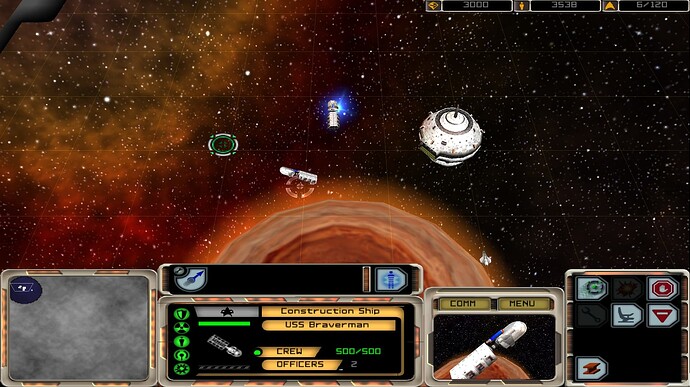
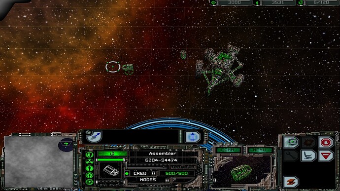
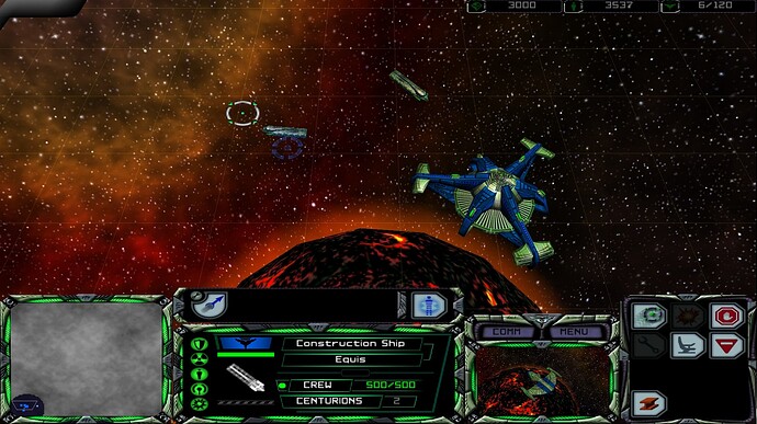
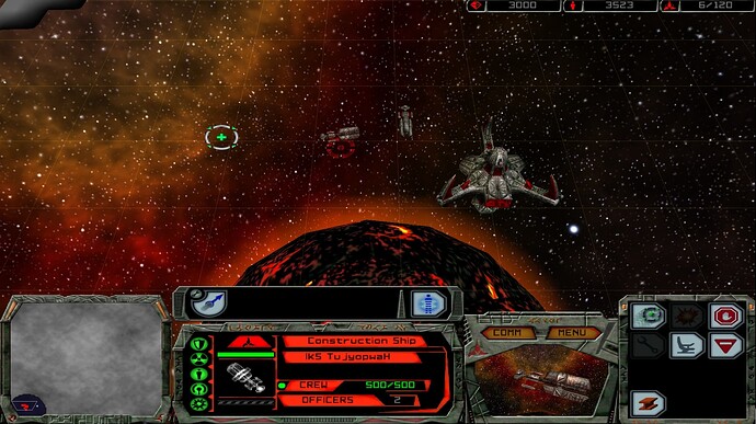
To bring in an example from an older game - Star Trek Armada from 2000 features four unique looking UIs for each faction in the game, inspired by the look established throughout the TV series and movies:
Federation
Borg
Romulans
Klingons
Actually, yes. The icons in AoE 2 DE are 256x256 so there’s generally more room for details. In the legacy and HD version, they were 100x100.
Example(s):
Double-Bit Axe (AoE 2) vs Dobule Broadax (AoE 4) + Woodworking (AoE 1) as a small bonus.
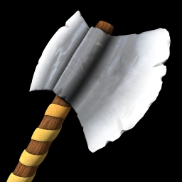

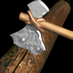
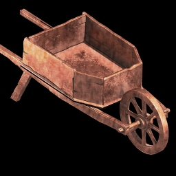
Wheelbarrow

############### post:142, topic:234575"]
Games are product meant to sell. You can create most complex, deep game with best graphics and still create absolute failure.
[/quote]
Oh, so you saying keep making the minimum effort hoping games will sell well???
That is too naive!
############### post:142, topic:234575"]
Did you know that most people drop the game within 2 hours of first launching it ?
First impression is most important. Trailers and fancy graphics persuade people to try the game. They do not guarantee they will stick with it.
[/quote]
Oh so in your opinion the first 2 hours matter the most? Are you serious???
Ok, you have low standards…
So it is fine for you. Not for many.
############### post:142, topic:234575"]
That’s where simplicity comes and does the job. If game is easy to pickup and understand, it has much higher chance to get player interested.
[/quote]
Other AOE’s are also simple to understand (well except AOE3) a little bit difficult.
AOE games are mostly too simple.
What you saying is too much simplicity without any meaning, only info.
Those things are most crucial for E-sports players.
Casuals don’t care about that, they seek imagination and implement their imagination in the game and to have fun (many e-sports players just play to make money).
############### post:142, topic:234575"]
For me there is hundreds of issues that are bigger problem with the game in the current state. People that left after playing for days and have no interest in the game are not going to be hyped and return for fancy AoE2-style UI.
[/quote]
So you have 100s of other problems? lol
But no UI?
WOW
That is a pretty interesting 100 things…
You must understand that many areas of the game must be put together perfectly in order to hook a player.
You cannot have one thing perfect and everything shit.
I mean this is simple!
We are not just talking about UI…
I talk about many things from UI, graphics, effects, unique units, variety, pause, options, civs, buildings, building proportions etc so on.
Indeed, they look much better and make sense now!
And I can tell what it is with more color and detail.
Star Trek Armada UI is atrocious… Sorry it might be specific for each race, but it doesn’t make it better. Even if resolution would be properly upscaled, it does lot of things badly in terms of UI design.
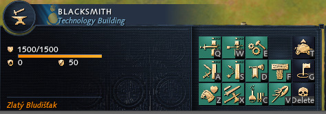
This is not a proper comparison. You have to compare it side by side ingame. Taking only parts that work and showing them is not proving the point. Look at blacksmith and try it again. Then we can talk about proper comparison and pros and cons of both ways.
Imo it actually works for what it does, the command panel on the right however indeed aged quite badly and could be considered as atrocious.
To be fair, it was 2000, so RTS were still developing at that time and there were worse UIs out there, such as the one from Empire Earth 1.
Well sure, let’s compare the Blacksmith.
General building icon:
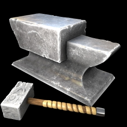
AoE 2

AoE 4
Melee attack upgrades in AoE 2:
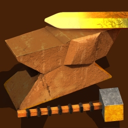
Forging
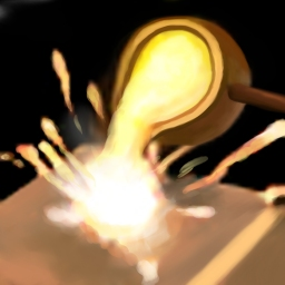
Iron Casting

Blast Furnance
Ranged attack (+ range) upgrades in AoE 2:
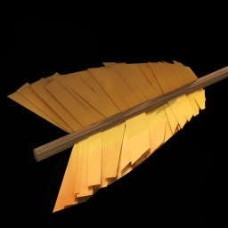
Fletching
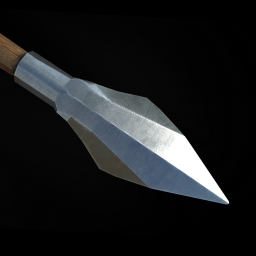
Bodkin Arrow
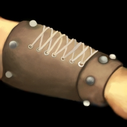
Bracer
Melee attack upgrade in AoE 4:

Bloomery (Decarbonization and Damascus Steel are identical but with added dots)
Ranged attack upgrade in AoE 4:

Steeled Arrow (Balanced Projectiles and Platecutter Point are identical but with added dots)
Infantry armor upgrades in AoE 2:
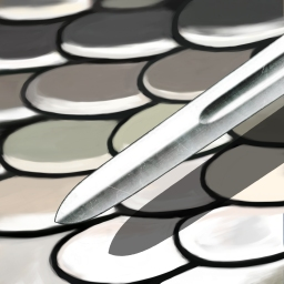
Scale Mail Armor

Chain Mail Armor
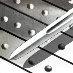
Plate Mail Armor
Cavalry Armor Upgrades in AoE 2:
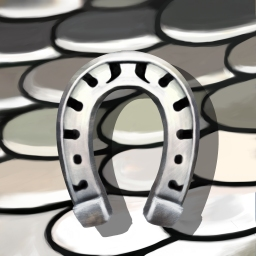
Scale Barding Armor
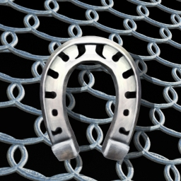
Chain Barding Armor
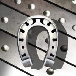
Plate Barding Armor
Archer (+ Skirmisher) Armor Upgrades in AoE 2:

Padded Archer Armor
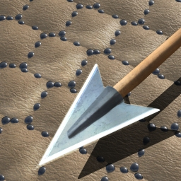
Leather Archer Armor

Ring Archer Armor
Melee Armor in AoE 4:

Fitted Leatherwork (Insulated Helm and Master Smiths are identical but with additional dots)
Ranged Armor in AoE 4:

Iron Undermesh (Wedge Rivets and Angled Surfaces are identical but with additional dots)
In AoE 2, the melee attack upgrades apply to both infantry and cavalry whereas the infantry and cavalry armor are separated. In AoE 4, the melee armor upgrade applies to all units and protects against melee attacks, so different upgrade logic.
In both games, the 1st row in the Blacksmith provides melee upgrades whereas the 2nd row provides ranged upgrades. Column 2 and 3 in the 1st row provide the infantry and cavalry armor upgrades in AoE 2.
AoE 4’s blacksmith has two additional techs:

Military Academy (functions similar to AoE 2’s conscription)

Siege Engineering (enables the construction of Rams and Towers in the field, no equivalent in AoE 2)
For a inexperienced player, I’d consider differentiating the Scale and Plate upgrades and Padded + Leather upgrades to be difficult to tell apart, but luckily you have a tech tree preview that tells you if you already researched an upgrade from that tech-line. Interesting enough, you can see fine leather textures on the leather armour upgrade that I haven’t noticed until now.
Nice, we are going to pick what is good for making our arguments. Can I do it as well and completely ignore anything you say in process ?
Where the fck did I say minimal effort ? How do you even can tell what is minimal effort ? Did you ever make game ? Did you ever work as professional software/game developer ? Did you spend hundreds of hours dealing with requirements and request of users trying to accommodate all of it into the design ?
More nitpicking. But here I will give you at least proper argument instead of just trash-talking you.
Take look at all the popular games from mobile games like Candy Crash, through gachas such as Genshin to your yearly edition of sport, racing, COD titles or continuously updated games such as Fortnite, Minecraft, Terraria . They are not big because they would be complex and hard to play. Hell they are not even perfect or great in every aspect. They are big because everyone who pick it up will get immediately engaged in the gameplay and nothing is bad enough to make you drop it.
These 2 hours matter as that’s your first experience with the game. Let’s take a cake example. If the first bite tastes like shit, will you take second ? No. If first bite tastes great, will you take second even if it’s at best same as first ? Yes. Will you finish it? Maybe. Will you buy it again next time, when you can choose between the one that tasted shit and great ? Yes
If you tell me that RTS are straightforward and easy to understand, then it proves that you do not look at them critically. You are looking at it from years of experience and do not question how it is for someone new. It’s same as playing Dwarf Fortress for years and telling everyone, it’s simple city-builder with deep simulation.
Why are you dragging in E-sport player so much? Do you have a bone to pick with them ? Even casuals can care about certain aspects more then other casuals do… But back to e-sport players & content creators. They care probably more about having fun and ability to express their skill in relation to potential income. So actually they would prefer obscure and hidden mechanics that requires ton of practice over simplicity.
Readability is not a e-sport only concern, it’s general concern for a game or any other visual media such as film. You can definitely create artistic movie, but if noone is able to understand what is happening on the screen during the whole movie… it will probably be a commercial failure, but some critics will praise it for being bestes art piece ever…
BTW imagination stems from lack of visual presentation. If you get concrete image provided, your imagination will not work as expected. That’s why reading book can make story better, then watching perfect adaptation of the same movie. On other hand I would say roleplaying is probably bigger factor for games, then imagination.
Actually, I am sure we were talking about my claim that fancy UI is absurd hill to die on.
I mean it’s simple. But I at least tried to talk and argue with reasonable arguments. You didn’t and started nitpicking. So here I can do the same. It’s simple, why can’t you see how simple it is?
So again UI visuals are really absurd hill to die on. Repeating it as the biggest problem the game has and it has to be solved for game to ever recover is absurd. Current UI visuals are fine, they do their job, whatever you like it or no.
In the end, it would definitely be nice for you and other same-minded players to have option for fancy UI and I support it. But as long as others issues exists, it should be left as thing at the good old nice to have list, that will never happen.
I just want to suggest that I think the point was to compare them at the actual same size, instead of blown up to maximum resolution (where the assets are available at vastly different sizes).
It’s also worth noticing that these are the DE icons, not the original icons.
(also, “Bodkin arrow” is by itself pretty impenetrable imo, once you move past the obvious historical reference, bodkin points weren’t necessarily a straight upgrade from broadheads - not really a major point, I’m just an British nerd)
bit of a hot take on UI, relic can make aoe4 UI whatever they see fit, all i wanna see is, just let us mod it if we don’t like vanilla offering, thats its biggest problem imo
Personally I find it hard to understand at first glance the objective of AoE2 armor icons. That’s primarily due to fact that even with some medieval armor knowledge, icons are generic armor type background with weapon over it. (you could even assume it’s actually making weapons better)
AoE4 with broken sword & arrow does better job at showing the intention. AoE4 does have one icon over all upgrade stages, which is one thing they could in theory make better if they also changed color of the icons.
For damage up, they both fail at reflecting the tech effect. AoE4 has the piercing effect of sword/arrow hard to notice due to ingame size. AoE2 damage icons are well they are all hell of a unique. Ranged one are showing different part of arrow and then bracer (which yes has meaning, but it’s also little random icon for something that is increasing damage). Second and third melee icons could be anything. First one at least shows sword to indicate that it might be related to melee weapon.
One nitpick I have about the AoE2 icons is that they look like they don’t share artstyle.
Actually I would have prefered this type of comparison as ingame with same resolution would work better for discussion. But it would be a lot of work (and I do not even have AoE2 installed)
