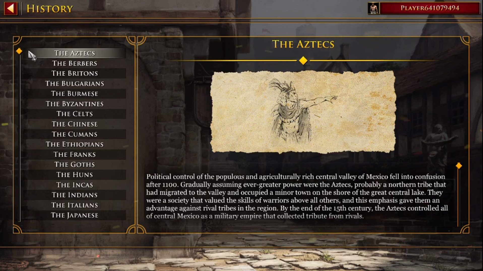
I prefer the HD history tab feels like you’re reading from a history book.
5 Likes
That new look is awful and hard to read over the transparent background…
1 Like
Nice find. 
I hope they will either revert back to old historical art look or move to this new digital look completely.
Though I do prefer the older style, nobody demanded an UI update but let them finish what they have started so that we atleast have consistency of the style.
3 Likes
This upset me a lot. The rustic classic style fits the game perfectly. There was no need to give it a mobile game look, that also happens to be ugly.
I guess the only thing we can make is to keep spamming our dissapointment for they to know.
8 Likes
They are ripping apart the HD look with the new UI but as a regular game I’d say the new UI is great.
The new one is better in that case.
Too small and cluttered. Bad UI design here
I think the new look that was found by @PilgrimHYR is a lot better. The old look is cramped with too much bold ugly serif. The typography layout in the new found version is easier on the eyes with headings using different colors and caps.
Looking forward to it because I always felt the UI suffered in DE.
In the end it’s just a UI. The game is the flesh. The UI is just the ugly toe nail.
What serif are you talking about? If it’s the font, you have the option of sanserif in settings.
@xWHIT3W0LFx found it, not me. The new look completely ditches the medieval feeling (which was the identity of aoe2) and embraces a mobile game style. It’s a disgrace.
5 Likes
Am I the only one who experiences serious lagging when clicking Singleplayer - campaign/skirmigh or Multiplayer - host game and especially when clicking on the civilization window in the lobby?
Yes its really bad, only tested singleplayer. I have over 600 hours with with aoe 2 de. After the dlc/update, been incredibly laggy. Haven’t dared to test multiplayer. Only been playing the new campaigns tho, since update.
I felt like SP is waaaaay worse than MP since the hotfixes… dont know why, dont get why, but it is what I get
1 Like
The new interface uses up way more resources. I took screenshots of my resource usage before and after the opening the civ selection screen.
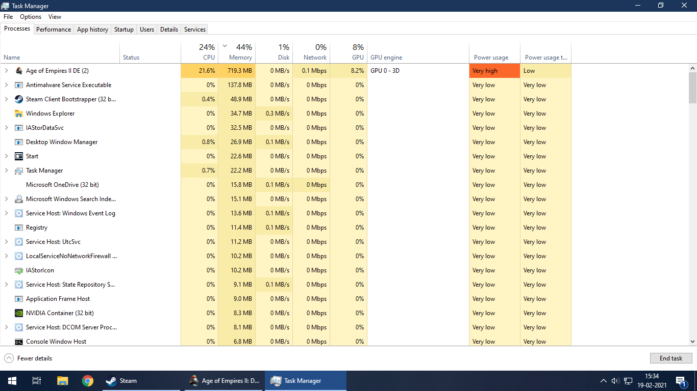

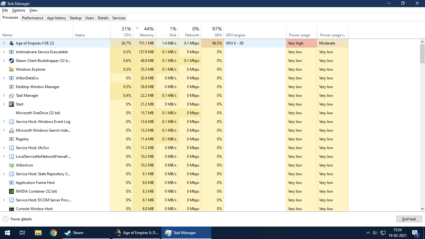
Why is a menu eating up 100% of the GPU (or any GPU for that matter)? It usually doesn’t get that high playing the actual game.
3 Likes
Man, the new menu and history tabs look like a ppt presentation one does the previous night to the project deadline, copying all the info in text boxes with a random “cool” font in less than an hour
3 Likes
I was simply trying to find where to go to load a multiplayer replay just now and spent way too much time trying to find it.
It should not be hiding/buried underneath the Single Player > Load Game area. It’s neither Single Player-related, nor a game that I wish to load, per se. I’ve played video games for a good number of years and video games have existed for many years, and “Load Game” has acquired a certain meaning. It does not mean, nor should it ever mean, imo, “Load a replay”
I first looked under Single Player because I thought I read here before it was under there. But I only saw, “Load Game,” which is not what I was wanting.
So, then I went to Multiplayer > Restore Game, thinking it ‘might’ be there, since there wasn’t any better button title under the SP or MP sections. Failed.
So, I looked under the gear icon in upper-right, because I remembered from before that some things were weirdly placed there. Failed.
So, I went back to Single Player, and on a whim, clicked, “Load Game.” Yikes, that’s where it was.
Very non-intuitive. Even now that I’ve done it once or twice, this will never feel like a natural, intuitive UI path for me. Hoping some strides can be taken to bring good usability and design sense back to the menu
1 Like
you must have a weak GPU
I think it’s the flying ember things
New content such as new editor units/buildings and eyecandy not pointless icons for profiles. And other superfluous things like confetti explosions.
2 Likes
I think he is referring to the comparison with AoC/HD: [Suggestion] Make History as readable as in HD
Yes if you’re talking about DE. In the original version though (that is HD and before) the look of the interface fit much more the game because it achieved the looks of a medieval “codex” (old medieval book).
Like xWHIT3W0LFx said:
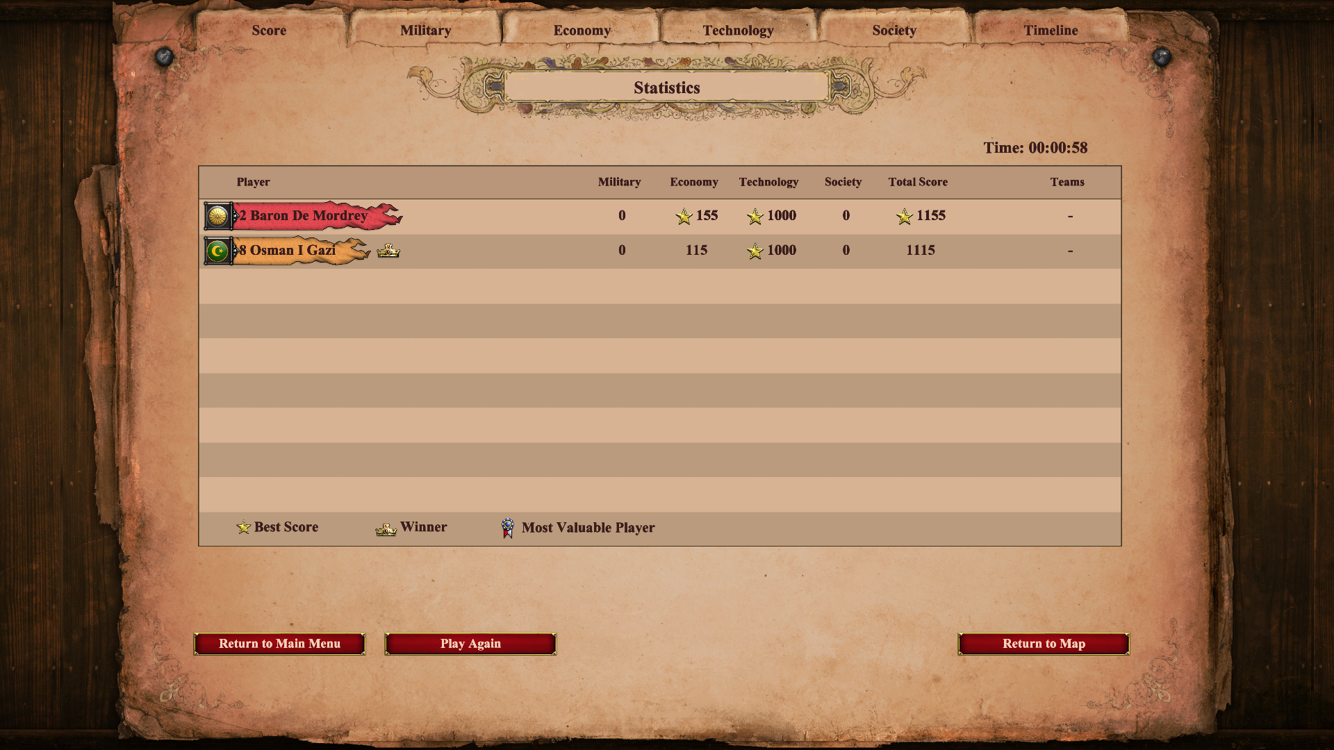
Also, let’s not forget about the scoreboard at the end of the game:

Now it really seems a mere excel tab, also less readable than before:
2 Likes