Or search in game for the mod ‘[Anne_HK] Old Main Menu’.
I enjoy using this mod for a while… Hopefully the devs put something like this back into the game.
Or search in game for the mod ‘[Anne_HK] Old Main Menu’.
I enjoy using this mod for a while… Hopefully the devs put something like this back into the game.
I would like the old interface to return. I know there is a mod to bring it back, but that is no guarantee that it will continue to work, as it is not a mod created by the developers themselves.
It may not be possible to create an option to choose between the old interface and the new one, but I think it would be respectful to hear what most users think about the new changes affecting not only aesthetics, but also practicality and general performance, in a negative way.
I do not consider the game needed an interface overhaul, since it was already perfectly clean and fast, unlike the new one.
Not a single change to the menu, way to go devs! So much for
As always, this includes input from all of you—the community—
Over 150 posts, over 300 votes, only 8% like the new menu but hey, let’s keep it anyway! At least you fixed a 2 month old game-breaking bug where you got stuck at the report screen and had no other choice than to ALT+F4 midgame.
Absolutely, they have to rework the UI and make it consistent throughout the game. The new bold font they use instead of the all-caps font isn’t really doing a better job at being readable.
Yeah, re-rolling maps is lot harder now, I mean you can’t expect someone to play the Vikings on a desert map.
As of January 2021, I have no problems with the New Menu interface and buttons. It was a bit difficult back in November 2020 when the change was made, but I am not thoroughly used to navigating my way through the menu.
I do wonder if all those players who commented above, complaining about the menu changes still think the same after 2 months later…? 
Let’s hear why Main Menu was “updated”:
*“The new Main Menu UI simplyfies navigation in many ways as possible with many ways to make easy to find the content You care about”
Source: Age of Empires - Age of Empires II: DE - November Update Preview
Summary: New Main Menu is downgraded for no reason. It makes harder to navigate and is less intuitive. The way it is right now is highly against new players.
I’m sure it’s not a very popular idea, but I’d love to have an option to use ‘AoE III-themed’ GUI. I love compact resource column next to minimap in left/right bottom corner.
Players often check out map and resources- seems like no brainer to have them next to each other.
The sad reality. We got used to it, not because it is good, but because we have no choice. (Well we do have a mod that brings back the old menu, but I guess few people know it.)
I, too, after trying the Viper Aurora UI, feels not too bad about it. But still, those clunky segue animations and extra clicks are just stupid.
If you have reported tons of bugs and see no fixes or even responses after months, you would understand that we didn’t stop complaining because the issue was no longer there ![]()
At least I still appreciate that they get rid of the ALL CAPS font. Well done.
@NeilugS I wouldn’t mind if minority are just saying the UX and UI terrible. See the replies are all constructive feedback here.
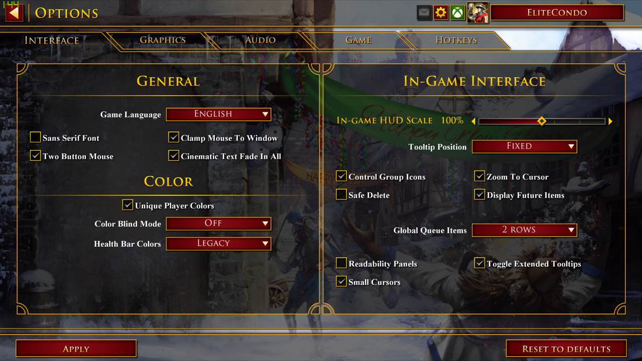
So, I’ve been playing around with the game files a bit and have come across a few interesting things. I found parts of the UI which are currently held in the oldschool paper design remade with the new clunky UI design and although they are not finished, they already look very weird and messy. This screens are currently hidden, I modified some files to make them visible.
I really don’t like where this is going with this new UI and I hope the devs consider to revert everything back to the oldschool looking UI. It just feels more and more like a mobile game and certainly doesn’t fit AoE.
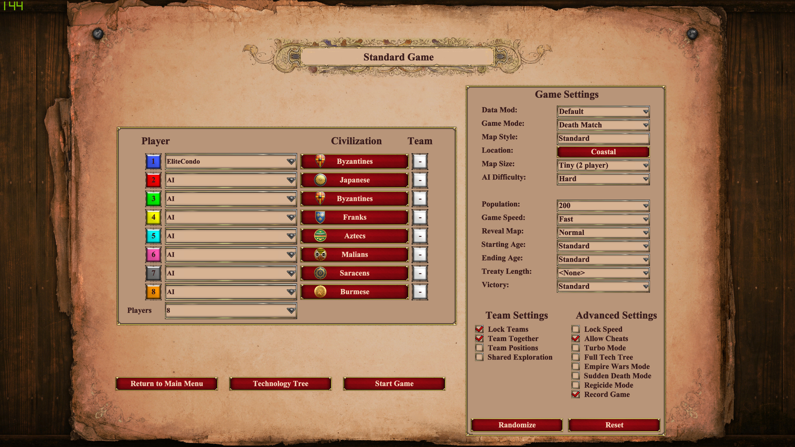
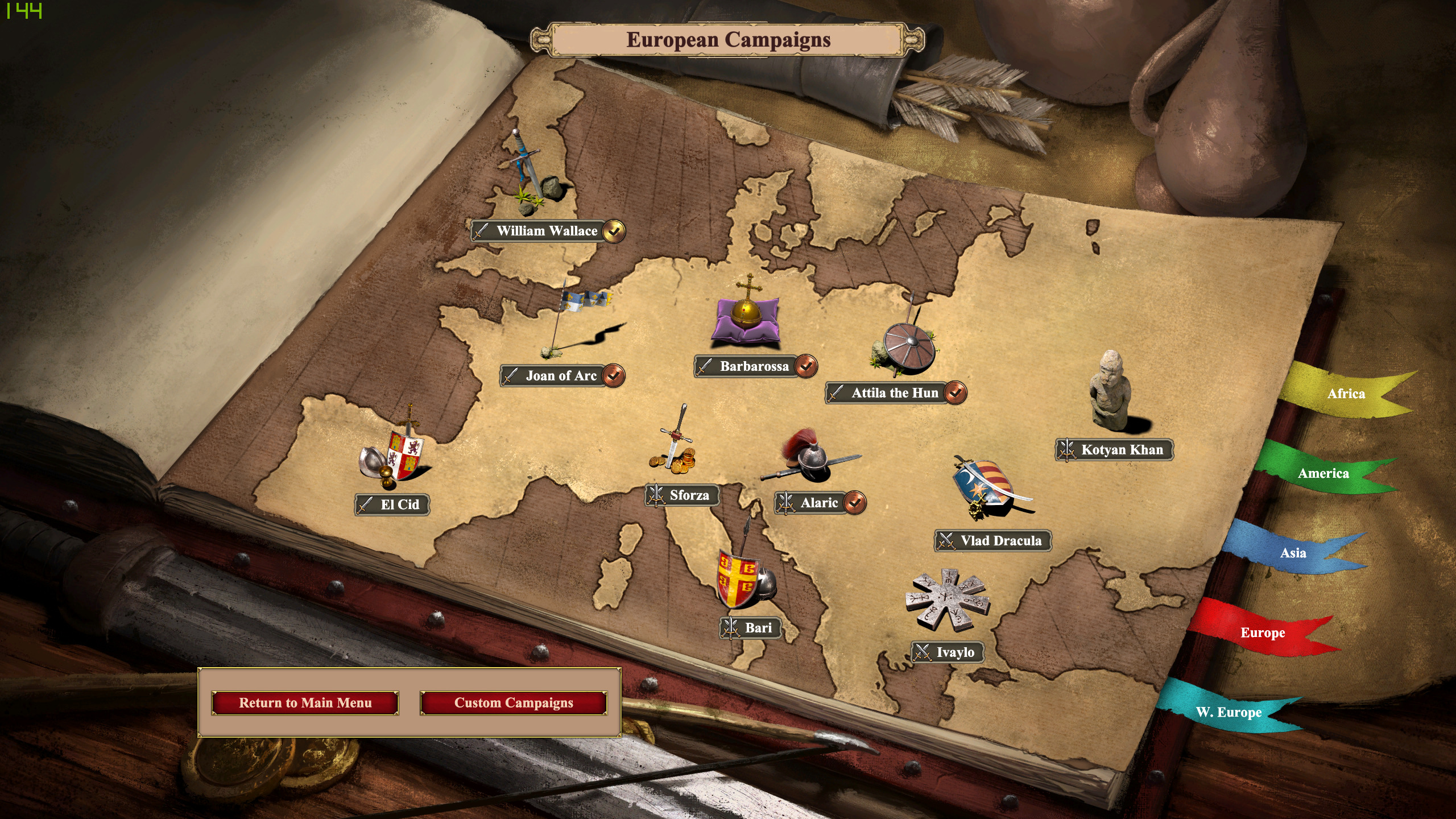
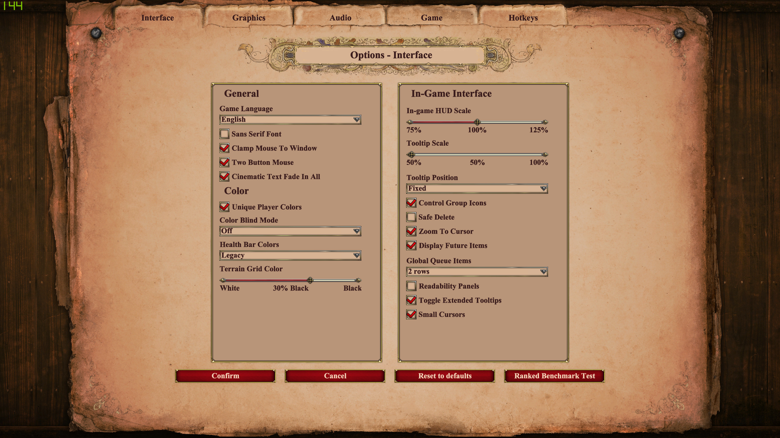
old look:
old look:
old look:
Oh, they did? Cool, I’ll have to see this later
Wow, that’s sad to see. Really hope that doesn’t happen. It also looks more like (reminds me of) some of AoE3’s menus; which I prefer AoE2 to stay far, far away from.
If the rationale for tossing medieval, papyrus, rustic UI design in favor of modern, slick, digital, mobile/tablet/Win10 design happens to be for Accessibility reasons(?), then they could put that design as an Accessibility option rather than convert the whole game to it for all users
OMG… Please tell us this won’t happen devs @GMEvangelos We had enough disgust.
I haven’t gotten used to the new main menu because I still use the old main menu menu mod. 
Periodically I check to see if the devs backtracked but no dice yet.
I wish the devs would stop making major user interface changes over a year after release and focus on creating new content instead. It’s not helpful at all to have to relearn how to do something in the game. If it ain’t broke, don’t fix it.
Great consistency. If one reworks the main menu, the devs should also have rework the entire UI…
New look is making things worse.
While I don’t like the new UI parts, I dislike it more when there are inconsistencies in style…
I want the game to have either the old or new UI, not both at the same time.
Exactly you either have to go back to old or move forward with new look on everything.
Not really, Soldeo. Save the slick, digital, mobile, 2020, non-medieval interface for online ranked match-making only, if need be. The rest (including SP, non-ranked, campaign, main menu, settings menus, etc.) can remain medieval and non-scifi spaceship-HUD in nature.
The menu identity crisis shouldn’t be happening, imo. Seems like the internal guiding charter for a Definitive Edition at the beginning should have been to (something like this):
There are so many ways the game could be updated in ways that are faithful to the original, and faithful to the soul of AoE2. That has been done in many ways already. To go on user interface tangents that help strip the game of its medieval character and charm (rather than embrace it) just seems very strange to me
And if the menu changes are being done for eventual Xbox console players(?) – to be consistent with some consolized UI – then give this interface to them, but leave PC players out of it, imo. I get the sense that PC players don’t want AoE2 to become a game designed for consoles, mobile devices, and tablets. Pretty sure Microsoft didn’t want that to happen when the DEs first started either; along with how Flight Simulator and AoE4 are said to be or rumored to be PC-centric, too.