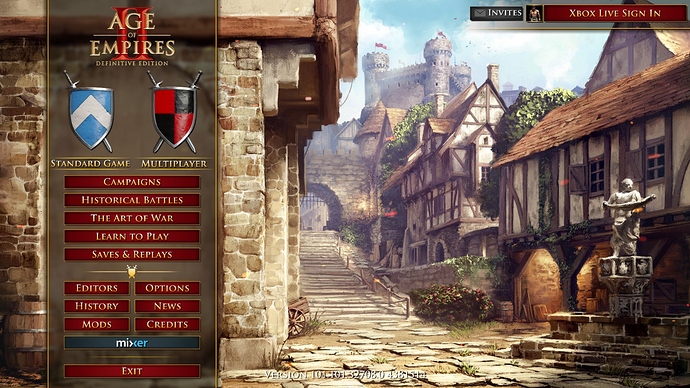
The new menu is seriously bothering me. Putting aside its ugliness (my subjective opinion), it is also deceiving. Seriously, if you want to find a replay, you have to go like “Single player -> Load game -> Replays”. This is absurd. The previous menu layout was almost brilliant. Please, give us back the previous layout - maybe fine tune it a bit if you want. Just get rid of the new one.
3 Likes
I find it very counter-intuitive. If you want to watch a replay of a ranked 1v1 you just played you have to click “Singleplayer” and then “Load game”.
Also, it requires more clicks now than before to enter into a ranked queue with this new pop-up concept.
3 Likes
Why is the History tab moved underneath the settings cog? Why do I have to click through a menu AND confirmation dialog every time I want to resign or leave a game? Were people resigning by accident? Where are the attractive shield buttons dividing singleplayer and multiplayer that the game has had for 21 years? The old UI was clear and laid pretty much everything out in front of you, If I was a new player, I think I would struggle to find the mod manager or spectate a game. Literally nobody needed the UI to change.
Also, Quick Play features huge “+” icons next to each player slot that do nothing when clicked. I took a single design class as an undergraduate, and even I know better than that. Don’t make things that aren’t buttons look exactly like a button 
5 Likes
There is a bug in the new UI where some radio buttons disappear if the language is set to French. Please check:
There are civ-specific units/sprites/graphics for fortified towers, stables (Aztecs), etc. That’s what adding content to the game is called. African monks are another sprite that should be added.
Looks like the developers haven’t played the game before rolling their updates.
The new UI is simply horrendous. I’ve been playing this game since 2003 and honestly, I couldn’t care less for flashy big a++ icons UI.
Imagine, if you were to drive a car, but and regularly the dashboard of the car keeps changing because the developer “could” potentially update it to his liking and he decides to move around the steering wheel; puts a square instead, and then shuffles the pedals for the sake of a trivial update. I know this is a poor example, but its that is how I feel regarding the UI.
Is it really that difficult to rollback the UI to its previous state. It is distasteful to a whole lot of players.
3 Likes
This new main menu should at least be optional. Personally I hate it and it doesn’t go well with age of empires theme. It’s flat modern user interface in non modern game which doesn’t even follow theme of game. Marbles have been lost. Just my 2 cents.
1 Like
Exactly there should be an option similar to AoE 3 DE’s HUD with Default, Classic or Definitive but for Menus instead in AoE 2 DE. So all parties are satisfied.
1 Like
The new civilization selection is very cool. I guess it is more informative for newer players. One suggestion could be when you click on the civ you get the new fullscreen civ pick, and when you click on the arrow you get the list of civilization. Thanx “We love this game”
I like the old main menu better BTW 
I kno why the community hates the new ui but i know some people out there who like this UI so i think the best idea is to make it optional
i can agree with u but where do u suggest to put em? most of the battles in there are around the balkans and anatolia( honfoglalas bapheus lepanto manzikert cyprus etc) in the nordic sea would be a place to put them in the europe page as there are a few campaigns( vinislaga york hastings argingourt and tours) but i think that in europe are way too much campaigns to add more there, so i think its better in africa
They should be removed entirely from the world map and instead they should only be accessible through the main menu like it was with the old main menu. A lot of people weren’t able to find them after the new patch because no one would expect them to be in the Africa section.
6 Likes
In their own tab, next to the 4 continents?
3 Likes
I agree with everything. The new UI is impractical, slow, CPU demanding, and overall unattractive.
I say make it optional so we can have the old-school UI back.
2 Likes
The most hilarious thing: There is a restore button… A Freaking RESTORE button 1111
You can’t even restore properly in this money grab version
1 Like
Great post. As a UI Designer, I thought from day 1 that the UI need major improvements (not no much the in-game hud, mainly the menus).
The game loading screen for example, is atrocious. A giant wall of text, all in uppercase, thrown at the screen. I would get fired if I make something like that.
I don’t think bringing back the previous menu (which I still think was a little better) is the solution. I would remade it from scratch, making it as similar as possible to the CD/HD one. Besides nostalgia, the effectiveness of that menu was undeniable (the fact that 6 year old me managed to play this game proves it).
I’ve been wanting to make a UI redesign for DE for quite some time, just for fun. Your post really inspired me to finally do it, so thanks for sharing this.
4 Likes
Just giving a quick update cause often devs think “eh let them use it for a month and they’ll get used to it”. No. It’s been almost 2 months now and I still find the new UI horrible. Hopefully you guys fix it in the next patch.
13 Likes
They can forget about me buying lords of the west before the old UI is back. Maybe that will send message across.
1 Like
next update… i still think the menu is nasty… still miss the old one… trying to hunt down MP replays and mods in general… ugghhh
1 Like
2 days till new patch. Fingers crossed.
Please, bring back old main menu 
5 Likes