I originally wanted to reply to this in another thread, but then felt the need to open a new thread.
Look at this. What a disaster. @StepS7578 I can’t believe you let this kind of unfinished feature into a release version. I gave you 4 feedbacks 20 days ago, in the PUP forum. You only fixed one of them. Since the beta forum is closed now, I have to repeat here:
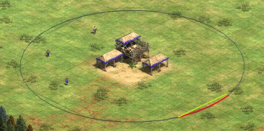
First, the indicator is not accurate! Look at a comparison with Age of Mandala and you will understand. TC range should be 4 line segments + 4 arcs. And the devs naively put a circle there. This is simply WRONG information.
Example: In the figure below the green segment (mandala mod) is the correct border of range, while red curve (official indicator) is false info.
Second, the indicator is way too ugly and visually distracting. Again look at how Age of Mandala did it. And with player color turned on, my own indicator doesn’t match my color (blue here), and it neglects the grid opacity setting (why?).
Third, you provide no option to turn on the indicator for TC only, resulting in a mess when there are lots of towers on the screen (as what we saw in the first screenshot). Again, this is supported by Age of Mandala.
I am so confused about the dev team. Why can’t you polish a feature before release? What are you pushing for? You don’t release patches for merchandise. If it’s about the freeze and crash you could do a hotfix first. And what is the point of PUP if a serious constructive feedback about a core feature of a patch is blatantly overlooked?
I agree that this feature feels rushed, but it’s not too bad.
The solution is to use the mandala mod, because now the discussion wether is it “cheating” is more obsolete.
Btw: Is there a hotkey to toggle/peak the range indication?
That looks like someone use MS paint. I think the range indicator needs more polish and the player color as OP stated doesn’t change the color it’s just green all the time.
To be honest and fair, you can totally dim those lines and de-colorize them so they fade in a lot better. As well, you can make it so the range indicators only show for a building when you select that building. They don’t look so bad when you do this.
As I captioned that screenshot above, though, I have a biased reason why I don’t want range indicators in AoE2 and didn’t want them, so showing them in a pleasing light isn’t my top priority Someone else can show the more faded look if they wish
As for your other points, I’m not sure what happened during PUP, but in the devs’ defense, it’d be hard to include everyone’s suggestions for everything right away
No. You could try putting an archer in the gap between the green line and the red curve as in my demo figure. You will find that the TC cannot shoot the archer. That’s why it’s wrong information.
To be mathematically rigorous, if your range is 6, you can shoot any object <= 6 tiles away. Your douche TC is exactly 6 tiles away from mine, which is still <=6. So the douche example doesn’t contradict my theory (and why it doesn’t prove your x.5 range conjecture).
This is a suggestion to the devs right? Because I have no idea how to mod it yet
Basically I reported all these and another bug, which they fixed after around 10 days. Then I reminded them that this should not be ready to be public. And I never heard back.
I know I know. They are a small team, they might had a headache with balance etc. But they don’t have to release rushed things.
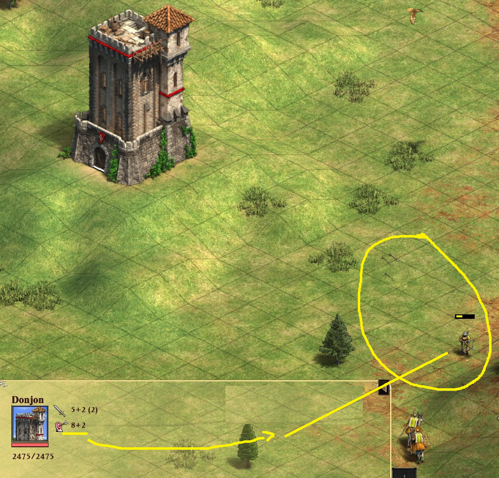
So I did, and… voilà! The game gives x,5 range for any x range. I don’t say it’s how it should be, just that that’s how it is. The in-game range indicator is correct.
For us with periods for decimal separators, when you say “x,5” you’re saying “x.5”. As in, an 8+2 range Donjon can actually fire at an archer 10.5 tiles away. Thus, the archer’s health is going down in the image you show, where the archer is within the 10.5 radius gray range indicator circle but more than 10 tiles away shown the by the gray grid indicator.
Thankfully you can limit the lines to only seeing the building you’ve highlighted, but yes, anything more than that is a total eyesore if you want to use towers in a rush, part of a push, etc.
No, sorry, you actually totally can make them more visually pleasing via in-game menu setting
The line opacity is tied to the terrain gridline setting. So try setting terrain gridline to about 38% Black. (This setting is, oddly, separated from the range indicator/gridline enable setting, over in the a settings tab to the far-left… I think “Interface” tab?) Also, disable the “Use player colors” setting for its coloring. The lines with this become a nice faded grey