I heard the devs explicitly saying on various interviews that they tweaked the colors and frequency of textures of units for ‘maximum conveyablity’ and that they purposefully aimed for lower fidelity detail for them.
They also said that the saturation is not going to be as we saw back in 2019 and that they decided to make the ‘important things’ on the screen like units be more saturated in comparison to their environments in order to stick out more and be easily ‘readable’.
So that they players can easier focus on them.
I want to tell the devs that this is NOT a so great change and although I do not understand all the technical terms that they use because it’s not my job, I can see and realize the difference and the changes that were made.
I feel like this is the reason that units stick out like sore thumb and raise all those voices of them being ‘cartoony’ and unappealing.
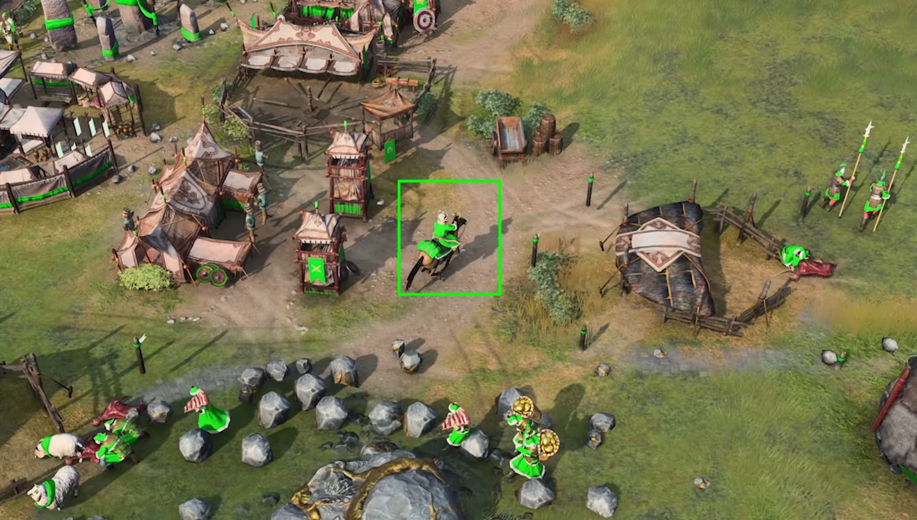
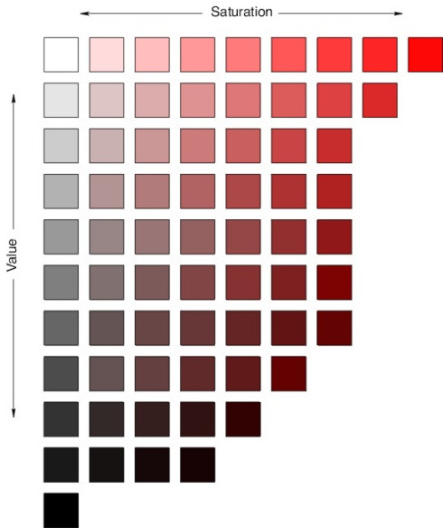
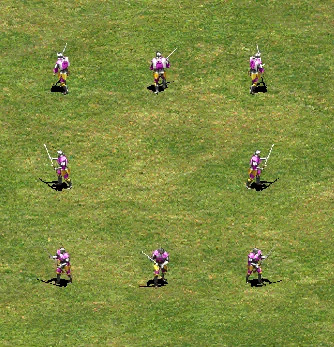
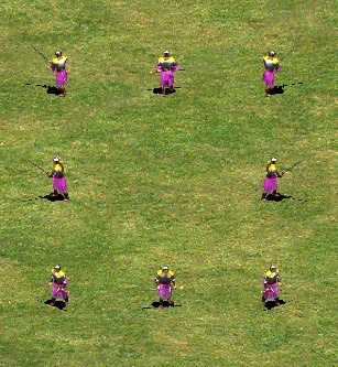
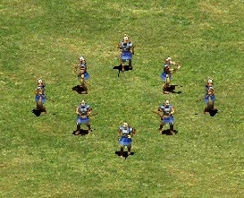
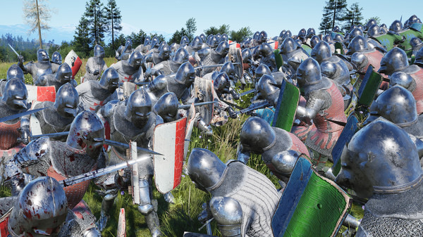
You can see below, that their player colors are indeed way too saturated and flat, do not look natural and are painted with too much of it. All of that, combined with the lower unit textures and scale that also looks changed from 2019 is what gives all those cartoony vibes.
As you see here, the rider has the same exact color as my little box around him. I too want to be able to recognize units but this is TOO much. It doesnt look good or natural. It pushes me away.
I want to say to the devs the unit colors looked MUCH better back in 2019, I had no problem to read them at all, and kindly ask them to reconsider their decision and revert them back.
The older colors would make it difficult to understand which unit belonged to which player though. I agree the old colors may look more realistic, but would be less helpful for competitive gameplay.
The problem with Age4 Is the “competitive” refrain. Stop with this, please. I only hear “competitive, readability, competitive, readability ecc”… Those stupid requests are the main reason to this Horrible Graphic, proportions and Building sizes and the funniest thing is the most of people Play only campaigns and skirmish. The competitive games Is a Little percent of the sole fanbase.
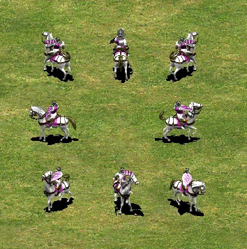
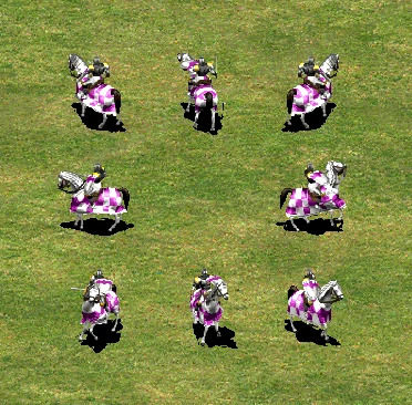
It’s not just the saturation, it’s 1) team color covers a larger fraction of the units now 2) textures are non-existent in the team colored parts. This, together with units being much larger compared to buildings, make units stand out too much.
Readability is important for competitive players, but most people are not. We either play campaign or casually with friends. We don’t need to recognize in a fraction of a second what’s going on since we don’t care about playing fast and improving our ELO.
guys, It’s player color exactly that I address in the post not the environment
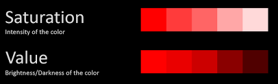
Saturation and/or brightness is of little importance, they obviously tweaked a lot of settings to achieve this result, not just one.
I particularly mentioned saturation as it was the devs’ exact words. That they want those parts more saturated to grasp easier and faster what’s going on when you move around the screen.
And yes, saturation obviously has something to do among other settings.
Those graphic choices have been probably suggested by the AGE Council but It seems that those suggestions have been not right After all because this game Is a mix of Warcraft, MOBA, Indie and AOEO but It doesn’t look as the next logical step of AOE Franchise.
For me, and i think for the most of people (Reading the reactions on web), the next chapter of franchise should include
next Graphic evolution but we could Admit that the actual gameplay looks very bad in comparison to AOE3de;
Immersion and atmosphere but the ugly animations, graphic and Building sizes don’t help.
Actually now that you mentioned it, they did mention someone Zack and zero empire who reviewed as they said those settings and things about readability.
Exactly. And about the building sizes, they have actually showed us better scenes on some occasions
But every time you see things like ‘footage taken in-engine’ something weird is going on. What’s incomprehensible tho, is by what logic do they first tell us that they purposively aimed for lower fidelity detail and textures in the units and then show us trailers with close up camera angles on them?
That’s like asking to be criticized on that exact thing.
The main problem Is that you can’t choice “lower textures” for an AOE game, and AAA RTS. You should develop with different graphic options in your mind.
The majority of the community most likely wants better graphics than what we have now, yes, I will give you that, but it is a tiny fraction that wants Manor Lords Graphics for this game. It would cut down the amount of people who can play the game, DRASTICALLY, plus, with the amount of units that will be on the map it would lag extremely hard. The game needs to be able to run on the largest map, with the most players, on the highest settings.
I’m tired of the word readability as if there is only one way to address that, such as huge chunks of bright, plain player colors.
Just look at AOE2, the best RTS ever where every single design is perfect, has great readability and can run on a potato:
Bright player color, but with stripes or other patterns, so that they do not cover the entirety of the unit.
Large chunks of none-player color. Would you confuse it with the same unit from the yellow player?
Large chunks of player color but with variations in itself, in other words, texture…
If you do not have the ability or the motivation to handle some style well, that does not mean it’s a bad style.
I’ve already explained (on the “merged graphic thread”) that i’m not asking for a Mannor Lord graphic but something between AOE3de (water and ships for example) and Spellforce3 (unit models).
Units are semi-readable but lose the readability the farther away you get
For me, good graphics have good readability and good graphics. Aoe2 DE achieved this almost perfectly, Aoe3 DE not so great, Spellforce 3, what the heck is going on??
Scalability only works if you have good optimization.
This is going to look like a completely different game on these specs, doubtful that a single dev can optimize the game that much
Requires a 64-bit processor and operating system
OS: Windows 10
Processor: Intel Core i5-3470, AMD FX 6350
Memory: 8 GB RAM
Graphics: NVIDIA GeForce 670 GTX or AMD Radeon R9 285
Those are the minimum specs and this should be the vision behind a game development. You should give to players with Low specs the possibility play your game in some way: those player Will not be interested to Graphic because they have not good dekstop. But there are many other players with a decent GPU (70% of players based on Steam stats have a 1060 graphic card that a good enough to play in Full HD resolution with a really good details).
Did you read the minimum specs for AOE4? It needed an integrated card and to reach this possibility developers have set graphic on Low textures but in this way you are hurting a Great base of fan base. You should develop the game with the maximum Graphic you can reach with the modern GPU and then optimize also for the minimum specs.
Thats it. I didnt know what was bad, but the lack of textures on team colors and also the larger team colored fractions look so bad to me. (Also big units look silly but i knew that.) Plz devs fix this, or make some graphic options for us to choose from. If it would make the game take too much memory space then make the other graphics options in separate dlc. For campaign and skirmish its a must, but i would choose the better, less readable graphics in competitive as well coz I dont care too much about my rank, just having fun. It seems so easy to make it an option, plz.