Ah, that explains why the scale in the first preview trailer looked so much better. Cartoony, but still made sense.
Which buildings did they have to scale down last minute, and why? What gameplay issues were they causing?
Ah, that explains why the scale in the first preview trailer looked so much better. Cartoony, but still made sense.
Which buildings did they have to scale down last minute, and why? What gameplay issues were they causing?
I doubt that they are going to change the building scale.
Upon close inspection of these screenshots, I agree that the original preview had buildings that were better proportioned to units.
I get that readability is important, but I remain unconvinced that scale needed to be sacrificed for that. If anything, I think the opposite is true. The similar scale and size of all the buildings can make it difficult to discern what is what. During gameplay, I think most people default to hotkeys anyways and barely look at the buildings.
Schlappi didn’t understood what Aoe Is: bright and realistic at the same times with a good immersion. Not Surprised to see all these people leaving the game. A Better Graphic, phisycs, Gaia, biomas and more would give many reasons to make casual gamers more interested to the game. What we seen are the Multiplayer games. As Always said, multiplayer and Eso are not the core of AOE but some people think the opposite.
Waiting for AOMDE for more fun.
Glad to see People Who like It. Everyone has different point of views.
I have a couple of issues with what’s written there.
This graphic stylization avoids any unnecessary detail that could inadvertently become an interface and instead provides a point of visual rest for the player to convey clearer movement and identification.
First of all, when I turn my brain off after a hard day of work and other problems, I start the match, fight some players and I rely heavily on keys and minimap to locate what I need. I DO NOT want more stress from the game if I come home from work, which goes directly on the offensive against competitive play in casual environments. Some maps are easier to track without it than others. The color on units makes them have low quality in any resolution because all I see on a knight is a colored horse with a big pike that charges at my units. I know crossbowmen are crossbowmen because of the weapon that’s the same size as the unit and the man-at-arms because it has a shield. The units are so invisible sometimes in base that I have to swarm them somewhere in order to make them visible for me unless they are in the enemy base or they are taller than the building itself.
So I raised the graphics, and everything went blurry or not well defined enough to make it pleasurable when enabling the anti aliasing, besides that it required too much of my mid range PC to even hold while other games of the same era hold on Ultra with no stress whatsoever. I have the game on lowest to enjoy the best frames for gameplay and the image is like the 2003 games.
Comparing low graphics with C&C Zero Hour from 2003:
They look alike, don’t they? And this is how the game look on max graphics, can you identify the villagers without spending time to look around? If you did it’s probably because of the white skirt of the settler:
We aim to show the player a rich and colorful cinematic tapestry of an era worthy of spending time with. We visually reward those who enjoy building and defending as well those who enjoy conquering and destroying.
Not really, conquering and destroying is more preferred by the current mechanics and as I’ve seen on the forums and while playing on quickplay, most people play to win, not to play the game. And it’s visible that the visuals can’t compete with a game from 2006 in terms of good optimization for great performance on high graphics because take a look at this:
Paraworld, developed by SEK and released on September 25, 2006 works on ultra on low end PC’s, the campaign is memorable despite it not being HD and the creativity went off the charts for almost everything it presents. Mind you this is basically an Age of Empires but in the dinosaur era. Therefore I believe the current graphics neither on low or high could compete with this style and detail.
And this is the lowest graphic it can have on units:
The detail that is revealed in structures, foliage, water and terrain is mostly expressed through hue variation leaving the style to feel richer and more painterly without feeling cartoonish.
But it is cartoonish, and extremely simple, it’s nowhere close to reality which counters the argument of amazing graphics. Because its cartoonish it should have less details to look more silly and child friendly so that people don’t take it seriously. If we’re looking from a realistic graphic point of view, it would mean MORE DETAILS, because realism comes with a great deal of detail combined with a beautiful HD view optimized for everyone to be able to enjoy. Which means that the previous styles of Age of Empires are considered bad and eye hurting after following with a through analysis of the text.
I wouldn’t consider this eye hurting and if I would be considering it as such, it would be my personal problem that should not disqualify the necessity of beauty in visuals that give a game, the feel that it has and is represented by. After all the important people stay not because they win a lot of games, but because the game gave them memories through its gameplay and visual potential.
But then we have this horror:
As a passionate map maker, I took this personally. You can see such edges near forests throughout the Rus campaign. And you can see what type of impact it might have on players also to see such things, IN THE CAMPAIGN of the MAIN GAME. The reader of this might think it’s just one, oh no, no-ho-ho, there’s more but this post would get too big.
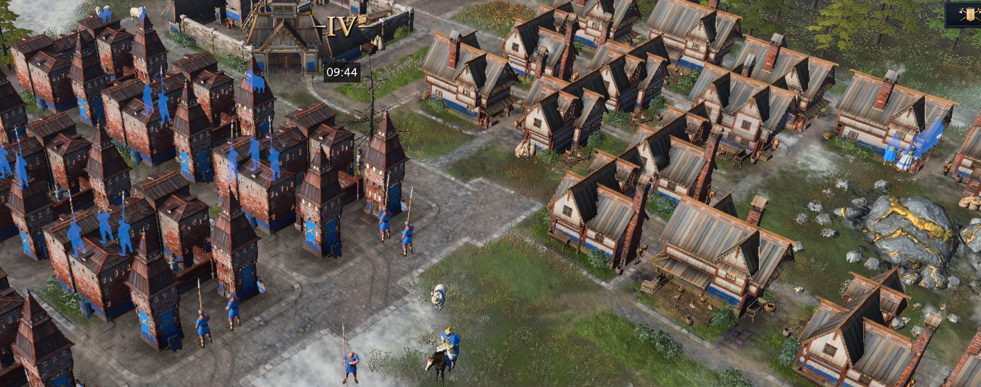
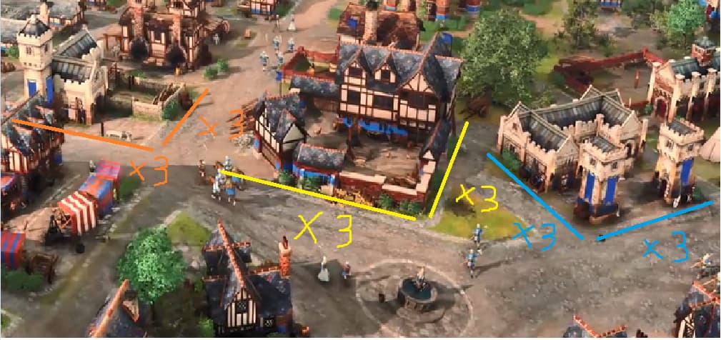
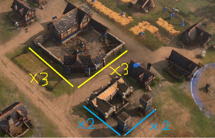
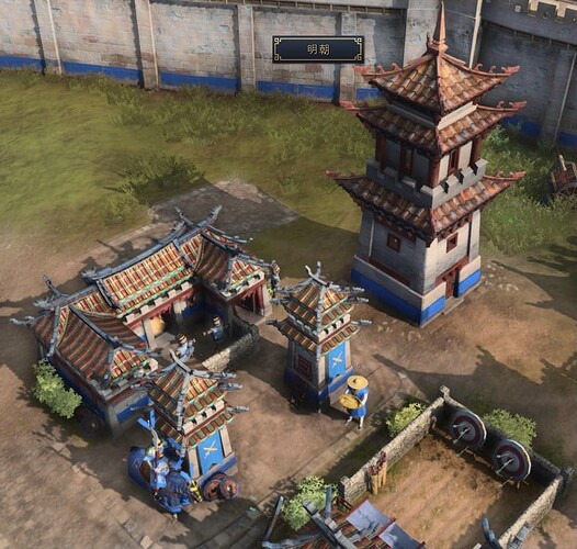
All the production buildings (barracks, stables, archeries,… etc) was reduced. Before beta, they was as big as an urban center as you can see here.
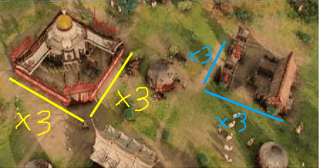
After changes, production buildings seens less than half of their old size.
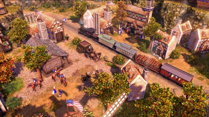
And now we can see images like these.
Shrinking the size of units while keeping their pathing size seems to be an executable plan to achieve your goal.
No, because many buildings are unproporcionate with the rest of buildings too.
Solución would be rework visual for all the buildings that have been reduced.
This complaint about building vs unit proportions dates all the way back to the closed beta. Nobody listened to us.
Scale doesn’t have to be 1:1, otherwise a keep would occupy half a map. But at the very least units should feel like they fit through doors (AoE II and AoE III did a way better job at this).
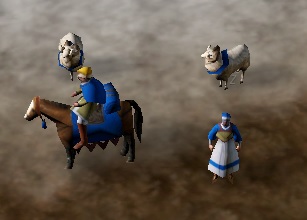
On top of that, nothing has been done about the frozen, non-animated horses and chicken in many buildings. Either animate them properly or remove them altogether. How come berry bushes have frickin’ butterflies but the horse in the stable is static?
I’m sure nothing about this is changing so this thread is a wasted effort.
There are many things that are waiting for a change, for example the ruins of the buildings still do not disappear. Stuff like this shows that they’re not focusing on aesthetics at the moment, let’s just hope that when they do they’ll listen to the community and change these things.
Ruins being permanent is ok with me. It’s a tie in to Company of Heroes in which the map started as a beautiful green area/cozy colorful village until it gradually turned into a grey, destroyed war zone. Even more than that I wish corpses also remained.
The other aesthetic bug that hasn’t been fixed and probably will never be is packed siege units not following terrain inclines. They always lay flat which causes them to either sink into the ground or float.
Active chicken and horse: it has been realized as early as “rise of nations”.
The reason why aoe4 can not achieve this so far is really difficult to understand.
In aoe2 and AoE3, although the characters and buildings do not follow the proportion of the real world, at least they will not feel “incongruent”. Players can easily create all kinds of wonderful scenes through the editor, and the characters will not appear abrupt when standing next to the buildings.
Aoe4 can automatically generate beautiful scene details. This design could have further carried forward the fine tradition of aoe4 series, but it was completely destroyed by the strange architectural proportion.
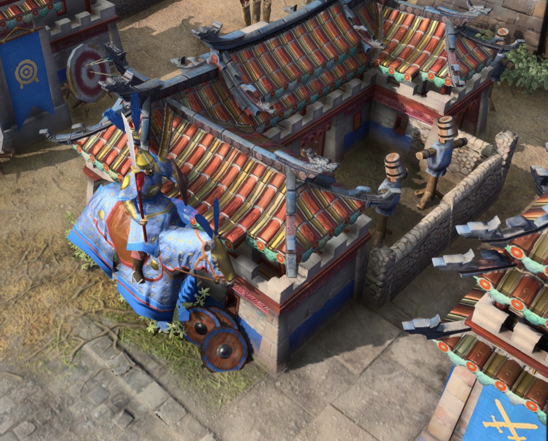
In aoe4, the ratio of building doors and windows to people has been very exaggerated, resulting in a very obvious strange impression. The height of doors and windows is below the character’s waist line, the head of infantry is flush with the eaves of the house, and the cavalry is casually higher than the house, which is ridiculous.
I know some people will put forward the case of “Warcraft” to refute me, but you should know that the painting style of Warcraft is a cartoon style that does not pay attention to proportion, and the orthodox sequels of AOE series, including aoe4, are realistic style, so this strange architectural proportion further deepens the “incongruent”.
I would say it’s the same reason why they simply scaled things down without changing the models, rush for the release, unfortunately many design decisions including those one mentioned by you make me not feel I am playing an aoe when I enter the game, but I guess in the end it was intentional to grab players from other RTS games, unfortunately it’s not my style.
I appreciate the attention to detail, such as the butterflies and moving lumber camps. The lack of Gaia in this game is a departure from previous age games.
This needs to be revisited. Devs are too silent and stubborn about this.
Honestly, when it comes to building scales, AoE1 is the worst offender of it because the building scales of that game is the most unrealistic whereas at least here in AoE4, the building scales aren’t that small but the building scales in AoE4 is still an issue to address.
You’re right. This does need to be revisited because we can’t be having unrealistic building scales.
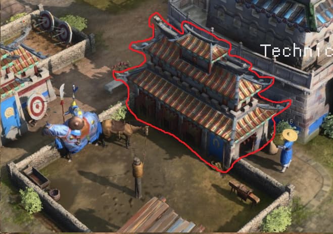
Please, show me one building in aoe1 with a worse escale that this stable.
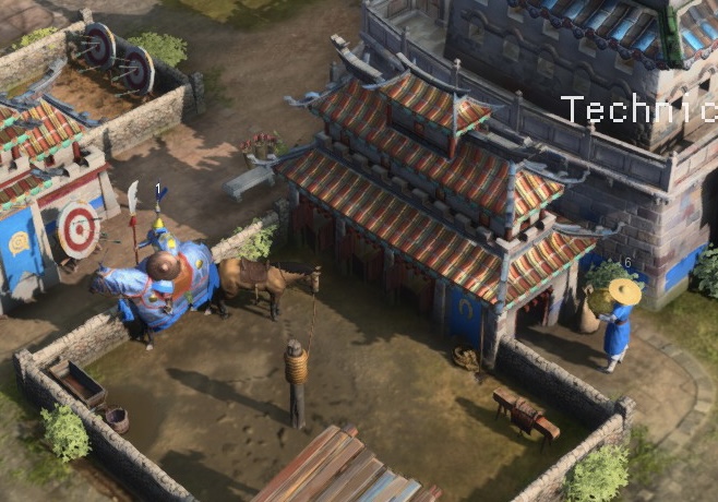
lmao that horse comparison
Honestly this image sums my issue up.
Production buildings were obviously not MODELLED to be at this size. If you look at AoE3 for example, buildings like Houses are modelled as really small houses, but proportions are kept in check. We have the contrary with AoE4, with buildings designer to be bigger, just scaled down for the sake of some Professional Gamer ™
Look at these towers. No sane artist would do this out of their own volition. Some executive must have made the decision based on some player’s feedback, overruling the developing team completely.
The proper way to have taken the feedback would have to been A, remodelled these buildings with the new scale in mind, or B, leave it be, because the game should appeal to casuals who want to be immersed as well.