-scale down units so that, if not completely, then they better match the size of the buildings
-increase the number of possible units
-graphic redesign (which shouldn’t require much because it’s not about a large number of buildings) wonders that serve to level up the age of the Deli Sultanate and the Ottoman Empire primarily in order to get a more logical shape, details as well as other textures that are especially problematic in the Ottoman Empire due to the reflection (roofs)
-increase the variety of vegetation and animal life, which would increase the visual dynamics and lead to a change in tactics
-introduce a normal map editor, a good part of the players would spend most of their time creating in it, especially those uninterested in the competition
-add more civilizations at regular intervals through paid DLCs. Having a limited number of civilizations made sense until 2010, not really today, also, all the polls conducted here show the desire of the community for exactly that (especially the poll I published half a year ago)
I wanted to present this here in order to hear your opinion on each point individually, also if you have more ideas feel free to write them below
5 Likes
That makes microing units in battle difficult.
3 Likes
I mean something similar to AOE 2 that is proven to work
1 Like
Yeah ur right that’s rlly frustrating
1 Like
I’m one of those who also put a lot of hope in the visuals, it’s sad that this game that had so much potential is taking the wrong direction. You are also right (in the links) that some buildings are terrible in terms of proportions and everything else. I bought the game when it cost 50 euros and honestly it didn’t live up to my expectations, I hope they do something about the proportions, but even though they advertised themselves as someone who constantly maintains a connection with the community, I honestly don’t see that, I hope they change. Size of German castles Delhi landmarks it’s all so off…
2 Likes
I was very hypped before released. Now I keep waiting to see if they fix the visual to buy it.
3 Likes
I think the sad part is that they have literallly put in zero effort since launch to rectify any of it. No new animals, no changes to the water, to atmosphere, to lighting. No plans to even touch any of it, and no acknowledgement from the developers that it is an issue.
You know what that means? It means they are satisfied and won’t budge because the game runs on a shoestring budget. Any actual money flowing into the game is seemingly going towards things like DLC which will return money as well.
So, GG. The sad part here is that microsoft is supposedly behind this, yet you’d think that’d be a good thing. Turns out, either they aren’t putting in enough resources, or the developers handling this fumbled the ball.
Neither of which is good.
6 Likes
Actually no, they haven’t charged for the new civs yet. Any money they’re putting in is being wasted on pro players in tournaments. It is a waste because these tournaments do not increase the player base one bit.
5 Likes
If I recall correctly, the new civilizations were planned to be paid DLC.
Just because they didn’t follow through, doesn’t disqualify them from the criticism I noted above, since again, the base game is in dire need of updates that are not related to mechanics.
I don’t have figures for whether tournaments have been useful or not. I know they help keep the game relevant, but there is only so much you can do with popularity. People getting their hands on the game itself also need to be impressed.
4 Likes
For starters unit ui needs a improvement they can make it like aoe3 ui every information you can see without bringing mouse on it
2 Likes
That’s just speculation by some people, we don’t really know if that was the plan or they were going back and forth on how to do it or if free was always the plan or what.
1 Like
it seems so, especially if we take into account things related to the graphic design or modeling that should not require many resources or affect anything else (gameplay), we have seen more changes since the release on aoe 2 and 3 than aoe 4
There are some major issues, that needs balancing out and can easily be fixed! here are some:
Ottomans:
-Needs to have a limit on the number of free units. Cap it at 30 or something. Unlimited is just unreasonable.
Delhi
- Put a limit on the number of scholars to 6. I just played a 3v3 Delhi elephants with 30 healers and it was unstoppable and ended the game on its own. 20 crossbows vs 1 healer and it kept getting healed before the next volley, no dent to that army was possible.
- increase research speed slightly or reduce cost of scholars, but keep them limited.
HRE
This needs to be nerfed. Their eco and soldiers pick up speed so quickly and then they’re unstoppable.
China
Good AOE siege with the bee’s nest, probably needs some nerfing too and something similar to other factions.
Generic stuff:
Bring an auto queue button.
I like the game and do enjoy it, but it’s so unbalanced that it’s putting me off from the game…
At the moment players need to avoid certain situations or the game is over and theres nothing you can do to stop it. Delhi with invincible healer numbers; HRE accumulating bonuses; or surviving Chinese siege build up. I get wanting to give unique stuff from each faction and different play styles, but each faction should be able to defeat each other (no matter which age), even if it’s slightly more difficult but not unstoppable. At the moment it’s rock, paper, scissors with factions and you have a narrow window before it’s over.
1 Like
Trebuchet is almost as high as a castle.
And please change the icons, especially for the units. I want to see how the units look like to have a “better connection” to them.
In the Techtree would be a good start :-).
Bad:

Good:
7 Likes
I feel slighted that Relic or maybe World’s edge? decided that what Age of Empire players really needed was simplified logo styled icons. Not only was this never a feature in past games, even CoH3 stuck with charming icons that at least has personality.
Are they out of touch of something?
Another thing to pay attention to. Notice how much space the actual figure is taking in that square? For some reason, they’ve decided to use the least possible amount of space. Like, its just a chopped man floating.
Past icons needed colour and dimension to properly convey differences between them. I don’t know how they figured that they would get away with “Let’s make the background orange/green and give them a vague yellow shape”, with the only difference being that shape itself. So much potential information is lost for the sake of modern graphic design, as opposed to being proper UIX for a video game. One that has history of having icons that ooze personality. Were Age players not who they were targetting?
4 Likes
I totally understand wanting more “artistic” or colorful icons, but overall the AoE4 icons actually convey more information than those of the previous AoE games.
That spearman icon for example shows which level of spearman it is more clearly thanks to the pips. The bakcksmith icons actually convey what the upgrade does and which level of upgrade or is, unlike the AoE2 icons.
It’s definitely possible though to create icons that convey this information and are more “charming”.
4 Likes
This is just factually wrong.
What you describe is matter of presentation. AoE4’s style limits colours, dimension and space–this limitation does not convey MORE information. Designing a messy icon with too much information is another problem entirely.
There is no reason for every icon to be the same 2 colours, and be flattened out with no depth. There is no reason that they should only encompass less than half of the actual box that they reside in. These things do not give MORE information.
1 Like
To be clear, I am not saying the icons are better. Or that the they are not dull. Art style preference is totally subjective.
What I am saying is that the statement that they convey less information is totally false.
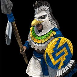
Compare the icons shown above and what INFORMATION they convey:

So this is clearly an infantry unit with a spear and it is the first of four levels for that unit.

This is clearly an infantry unit with a spear and a cool looking eagle costume.
That’s it, that is all the information they convey. The 2nd one may look much nicer, but it actually conveys slightly less relevant information.
For another example take the blacksmith icons:

This is clearly the 2nd level of an upgrade that is armor against ranged attacks. The icon shows exactly what the upgrade does.

What is this? Presumably something related to archers. (Yes I know it is actually armor FOR archers, but the icon does not convey that clearly to someone without prior knowledge)
This does not mean the AoE4 icons are “better”. But they do not convey any less information than the icons in the other games, and in most cases convey slightly more information. I am sure this could still be done while also making them more colorful.
Ideally we would get UI mods so people could change them to their preference.
4 Likes
What you’re trying to say, which was not said, and which is core to your point, is that you are speaking about mechanical information, and strictly neglecting to mention that pictures can contain more information than that. Though both showcase a spearman, one of them has much more cultural information imbedded into it. That is often what many people mean when they say that AoE4’s icons are devoid of personality. This matters as it shares the very same space, competing with information that is at display.
Like I noted in another comment above, presentation is another matter entirely. Take your blackmithing examples. Although AoE2’s arrow and leathery background convey some information, it lacks context to easily, properly express that it is better or worse than the other arrow upgrades.
This does not come down to style but presentation and design. You could for instance easily have the very same mechanical information as AoE4’s upgrade, by showing 4 separate levels and still convey personality.
3 Likes