The BIG problem of the proportions (and the solution)

Before to star the post. I already know that proportions for many of you are a irrelevant topic. But for many of us are important and in AoE4 the proportions ara bad because a bad gestion of devs.

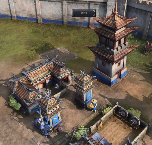
The firs BIG PROBLEM. Barracks and in general production buildings.

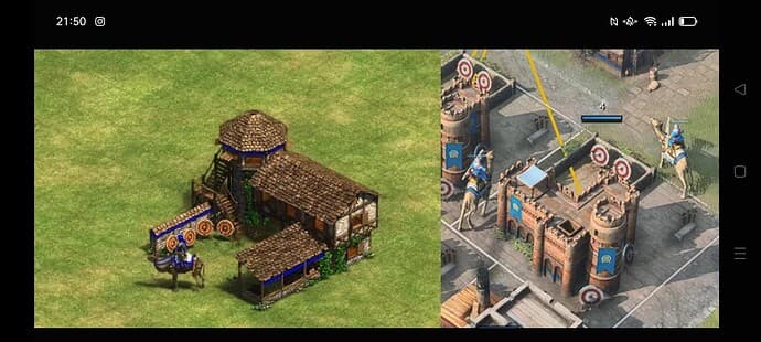
As you see in this image, in the alfa barracks was as big as Urban Centers.
imagen

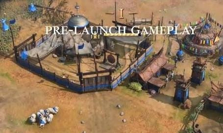
I can understand that for gameplay reason devs could think that they were too big and reduce their size but… please, if you going to make smaller a building that in origin was designed to be bigger, REBUILT IT PLEASE, dont change their escale in five minuts and leave it so.
imagen
That size is ridiculous and dont say me that is so for playability. This building is so unproporcionate because was designed to be bigger and now that they made it more little.


If devs make it smaller, they should also reworke it to give it a new appearance according to its new size so that it does not look disproportionate. (For example, it does not have to have two towers, if you have made it half small, remove one but keep the other the same size to maintain proportions)

So in Militar production buildings should be modified for their new size. Playability is not affected and people that search visuals is happy.

Second problemm, general proportions.

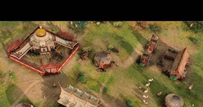
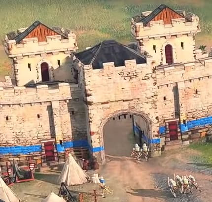
As you see, units have been done bigger to improve playability. Ok, perfect, but please don’t just do this and go.
imagen

Proportions was 100% perfect but this damaged playability. I can understand that units size was improved but doing only this is a bad work.

I am not talking about implementing realistic proportions again, but simply the houses, urban centers, etc … you would only need to make the doors larger so that they would not visually stand out!!! Just that, nothing more.

My last message is for the develeopers.

If you really want to do a game for ALL the comunity, you should fixe this issue. For the release date is impossible, but this problem should be fixed in the following monts post-launched if as i said you really want to doing a game for all the comunity.

If you wanted to do a good job, you wouldn’t abandon the part of the community that cares about visuals.

26 Likes

im just saying something . Aoe scales are always bad and that is a desing choice.

For the record :

If you didnt knew a 4k visual pack DLC have been spoted on SteamDB , we dont know what thing it contains but clearly they do care of visuals.

As i understand the people that dont like scale i must remind you that this is a RTS and not a city builder.

2 Likes

“AoE scales are always bad and that is a desing choice”

Sorry but no, imagen This is only at level of AoE1.
As you see here the escales in AoE2 are much better. If it was a desing choice hadnt buildings correct and buildings ultra-unproporcionate. As is said in my POST the proportions in AoE4 are not a design choce, there are bad decisions in a game that was designed to have correct proporttions.

PLEASE STOP TO SAY that correct proportions are only to city builder. Please stop to repeat this fallacy.

13 Likes

From a game dev point of view, making a bunch of new models, un-wrapping Uv’s and creating textures, as well as adding in animations if wanted/needed takes a long time and is not something you can just do in a few days before the release when the game is already in polish phase and the team is in crunch mode.

The scale is not as big an issue than fixing bugs that could potentially break the game. Besides, the scale looks different in pictures, then when you are actually playing the game. Even in other RTS games, scaling always looks a bit disproportionate.

Just my 2 cents :smiley:

1 Like

As i said, i know that this is imposible before launching. And not would be neccesary doing this from 0, only cut out part of the military buildings instead of brutally shrinking them in size.

1 Like

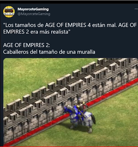
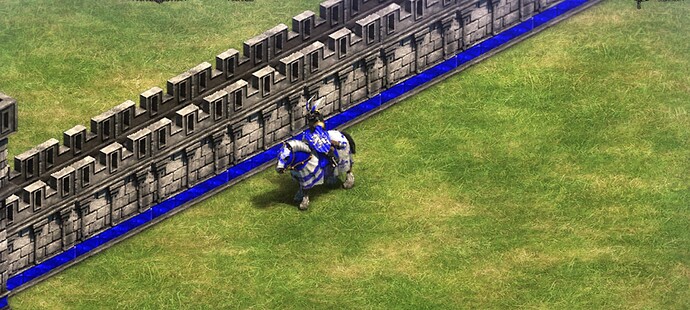
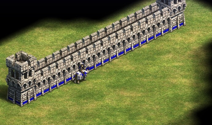
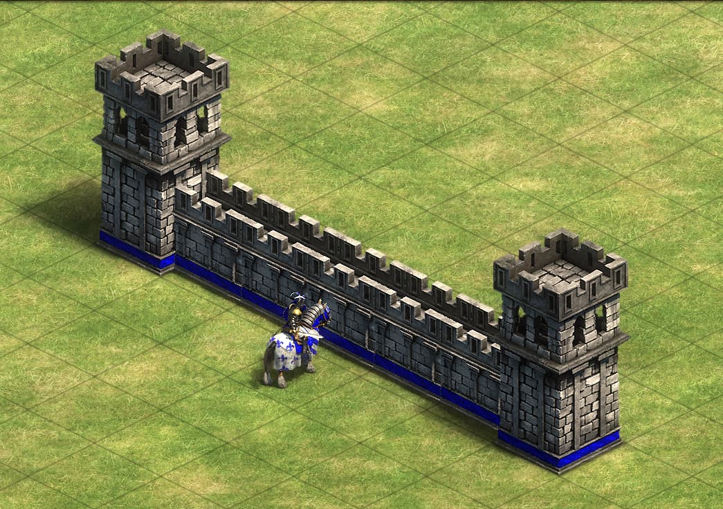
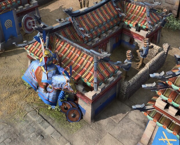
yeahhhhhh, the horse is the same size of the wall , really good scale indeed…

i think no rts have correct proportions , the ones that do have a “good scale” , dont have the perfect ones.

so yeah.

Keep this up , as you can see this is no end loop . if you want to play with better proportions , go and play with mods.

2 Likes

Yes, you must take the stone wall to take a comparison with the MANY buildings with HORRIBLE proportions of AoE4.

And this is the Stone Wall, not fortified wall. Fortified wall is bigger and has a correct proportion.

1 Like

since we are cherry picking , i must use my gold photo , you did use one cherry pick , not comparing units with walls buddy :slight_smile:

In my opinion balance is the important here, a rts that aims to be competitive for sure cant have realistic proportions for readability issues. On the other hand a unit being taller than a building it’s not balancing, it’s pushing to a extreme side that can ruin the aesthetics of a game for a lot of people, as you show , the unit on aoe2 is clearly not realistic, it is as tall as the window of the building , but it’s not as silly as aoe4 where it’s as big as the building, i don’t think they will change this but i totally see why for a lot of people this is a deal breaker, not for me despite thinking it looks bad. The guy above showed that the wall proportion is better in aoe4 , but that is it, and the reason is logical too, now the walls are accessible by the units and therefore needed to be bigger, and in my opinion it looks much better now, that being said why not adjust the buildings on a reasonable manner to make them look at least as good as aoe2 then?

2 Likes

Wow good find on the previously bigger barracks, the mini towers make a lot of sense now!

2 Likes

I would just keep in mind, that the proportions in a screenshot look different than in-game. Proportions look better when actually playing on your own monitor.

Ironically, the walls are the only thing that looks good in terms of scale in AOE-4. Can you imagine that wall scale in AOE-4? Does the scale that AOE-4 has at the moment hurt the gameplay?

I understand that we are not all in agreement, and that the scale should not be 100% real, but a balance can be achieved to make it look good.

3 Likes

OMG! Have you ever played AoE2?

This is not how the game looks like!

Please stop bs and open AoE2 for a look!

If you don’t have AoE2, you can simply Google it!

2 Likes

yeap, aoe2 has always have disproportional units and buildings for readability purpose. It is a feature not a bug.

When you zoom in it does look disproportionate.

but I think you mean when you zoom out you don’t notice it as much

especially not so much with fortified walls

3 Likes

I don’t think anyone notices it in zoomed out AoE4 either . Cuz I didn’t .

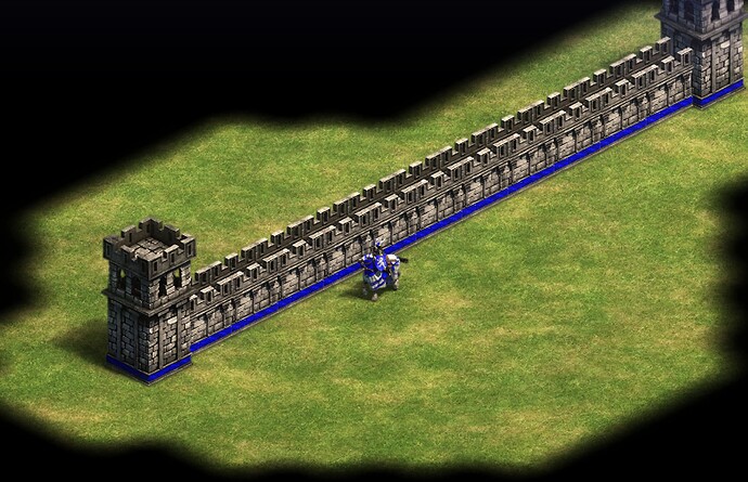
Yeah I know pictures have already been posted, but this is from the Age II: DE scenario editor like 2 minutes ago. It is how it looked, its just not something you focused on and made an issue out of when you were playing Age of Empires 2.

I completely agree here. Proportions aren’t the biggest deal to me, but I agree its ugly. I’m assuming they realized people will need to build lots of these production buildings, so they needed a smaller footprint, which I agree with. However, they seem to have just taken the models and scaled them down instead of making a new model that filled the smaller space better. I don’t expect this to be something they do last minute, or even at all at this point, but if they’d reworked them earlier on, that would have been much better imo. There’s always the hope that these were placeholder models for the betas while they were reworked behind the scenes I guess :grin:

Edit: This actually made me want to go through and just compare other buildings in AoE 2. Basically, it was very inconsistent. For example, Siege Workshop has a Mangonel disassembled laying outside, and it is a perfect match in size to Mangonel unit. The barracks seems to have decent proportions, maybe a slightly small door. Meanwhile, the university and archery ranges look like hobbit homes, and the stable has a tiny door but horses that are too big :joy: dont get me started on some of the wonders…

4 Likes

Yes, the proportions in AoE2 arent perfect, but this image going to show… are very far to AoE4. See the comparison.
imagen
Yo must to see in detail some buildings of AoE2 to know that their proportions are not perfect, but when you see AoE4 the first thing that you see is that the proportions are horrible.
They could also leave the old sizes of the barracks but giving them the option to improve them by adding new production queues. Thus it would not be necessary to build so many.

In any case I hope they fix post-launch this HUGE visual defect (I know that before-launch it is impossible due to lack of time)

2 Likes

yeah , and we are literally sharing cherry pick photos , he posted the WORST screenshot for Aoe4 , the comparison of units between units and military buildings = bad , then I had posted my cherry pick .

We are in a forum , you Clearly know why people cherry pick photos .

In fact I played aoe2 for a long time. And clearly it looks like that.

That it’s a stone wall and it’s not edited.

So go back and google it.