Yep, far preferred for me. I made a thread (‘The HUD’s not my fav’) commenting on the ‘bright yellow/gold’ aspect of everything. Simplistic icons were touched upon there, but I didn’t want to get into it since I already typed a lot. I’m glad you did ![]()
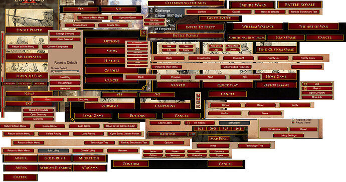
I have a feeling every menu button in AoE4 will be bright yellow, too… akin to AoE2:DE’s red/gold button infatuation:
Colors play an integral role in many humans’ ability to quickly identify where to click in a UI. When every icon (or button) is the exact same color, and a highly simplified 2-D graphic (i.e., traffic light) like in AoE4, and the same size like in AoE2:DE, it really doesn’t help.
Thankfully, online bank statements understand the value of color by making at least credits appear green, and certain debits/withdrawals red. When everything is one color, nothing stands out; it’s harder to locate certain transactions… you have to read through practically everything… every time.
Very true
