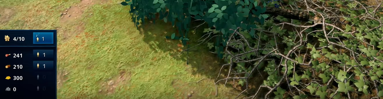
Is this HUD block:
Really better than this?
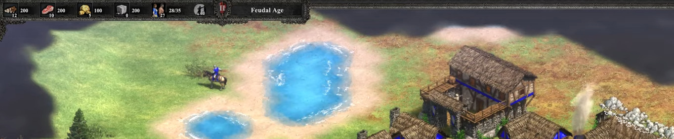
In my opinion, a giant block interferes with your view of the gameplay area a lot more than a thin banner across the perimeter; and it’s more distracting, too.
Can someone point me to the UI/UX white paper, case study, focus group findings, or PhD thesis that says using one color for all buttons in a HUD is the best thing to do since iconography was invented? It’s been trending, so, surely there’s some studies saying the removal of color is beneficial to designing an easy-to-use interface.
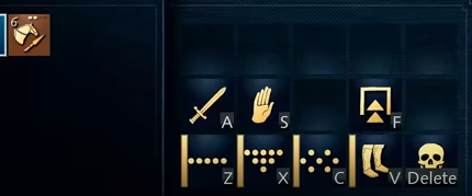

![]()
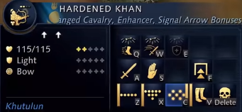
![]()
![]()
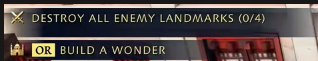
For a game where finding the buttons or info you need quickly so you can move on to the next task; and for a game where how much (or how little) you can see in the viewport at once directly impacts your ability to efficiently see and do things… I don’t see the benefit of using one color (bright yellow) for every icon, or covering up large chunks of your viewport to show things AoE2 did with far less intrusion.
- Surely, they realize having colors helps the eye and brain more quickly and easily identify things, otherwise the food, lumber, gold, and stone icons would all be bright yellow, too, right?

And the perma-, non-stop front-and-center icon at the top showing what age you’re in… a perpetual beacon of light… a distracting HUD island, is unnecessary, imo. It’s a little much. I’d 1000% rather have a low-key icon cozily nestled in an existing UI area somewhere. I can’t remember the last time I forgot what age I’m in; I think it has been years and years. Or if I have forgotten, I just check the beautiful age icon in AoE2… situated peacefully in the thin banner, with pure, quiet confidence.
AoE4 ‘age’ icon:

I know the “one color for every icon” fad is meant to give some sort of cohesive theme or atmosphere, akin to Michael Bay’s orange and teal movies… it makes things look kewl, so to speak. But when we’re talking about a user interface and user experience, the absence of color is counter-intuitive. At least it is for me. It takes me longer to find what I’m looking for. I mis-click every so often. I have to give more brain power to a task that should be near-100% intuitive and without thought. In AoE2, I immediately know what the food icon is and where to find it , or the house, or the wall, or the market, or the dock, or certain formations, or etc. because the icons are meaningful and aren’t simply 2-D (flat) single-colored icons. With AoE4, I promise you the icons will always require more thought process for the average user if there is no option to bring color to them. (And by color, I mean intuitive color that makes sense for what they’re trying to symbolize, rather than some arbitrary colorings.) I play games for an escape… not to fumble over the UI and apply my mind power to UI clicks as I try to play the game.
Bringing 3-D graphics back into the icon fold would be another step in the right direction, usability-wise, but I won’t go there now 
I’m still planning to buy the game. I’m excited for it. But wish the UI were different, and hope there will be options