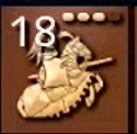
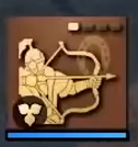
UI icons = Traffic Signs?

Nope they are not, they are lazy and soulless. AOE 4 is not a browser or Gmail which are task completion Software which has universal purpose in human society . It’s a videogame for entertainment purpose, that is themed around historical Middle Ages. AOE 4 is also used by a group of niche RTS players and it’s not gonna have core regular audience that will span across the planet.

Modern doesn’t mean it is good. Icons are there to communicate as OP as showcased here, icons here in AOE4 doesn’t work unless they have a tool tip. Icons should convey the theme and approximate topic by looking at them. These icons don’t do that, thus they are useless.

AOE 4 is a game that will be purchased by users to have entertainment experience and these type of icons are doing opposite. Gmail and Browser are free and their experiences wither away after few mins when the task is done.

Those applications use standard icons, like close, send, drop-down, Check mark which are not thematic and they convey immediate actions. In AOE 4 icons are thematic as action on what it does comes after the unit is produced and when the user can actually see the unit/tech/building and them in action in real time (Real time Strategy).

Clicking on the icon to have an effect is a well known fact to user, because the tiles are like buttons, thus icons are not doing the job, but the styling of the tile.

Thus setting the expectation and a theme for the upcoming user action will be taking, is very important. Detailed icons also add more to the human memory than generic same looking icons.

Flat type style is meant for generic actions and generic actions are less in this world, as contextual action are more in this world, but rate of usage of generic actions are always higher. That is why such actions use simple icons like an X mark, down arrow, Plus, Minus etc.

Stop being a blind fanboi and start demanding from your entertainment products. It’s a game where you pay and play for hours, by taking time from your life, so start demanding experiences. Companies and devs are not your friends.

Detailed icons need creativity, imagination and here even though the designer has done abstraction and simplification they have failed at it, as AOE is not an open ended narrative like Pablo Picasso’s painting or a Cave Painting from Altamira.

AOE icons are meant for communication. In a APM heavy game, nobody has time to contemplate on the meaning of an abstracted icon.

Things one doesn’t like and that can be done in a better manner needs to be called out and brought to attention, even if it does not make any change.
3 Likes

some people would really do good to intern in a games company once. all I have to say there.

3 Likes

but to get nto your critque - how on EARTH can you say the age 4 icons dont show clearly what they do, especially if compared to previos age games? I am sorry but u can not take you seriously if you say things like that.

It also seems you dont get the general setting of Age4 isnt medieval, but current times documentary.

1 Like

Documentary is a style used for narration and is only for the campaign. Lol this is a game themed around Europe, Asia, Middle East, Latin America during Middle Ages.

Look at the icons of previous games and other games and compare it with AOE4 and tell what they do and find out yourself.

i dont get what you want to say with your second point. in age 2 for example, I dont really see from the buttons alonwhich upgrade does what or works for which unit. Age 4 easily.

Also the game is themed as a modern documentary because of the campaign, yes. but it still is.

I don’t follow how the icons in AoE4 tie into this documentary theme people seem to be repeating.

1 Like

they are ruining this game for the sake of “readability” the new relic tendency.

To be fair this UI looks good for a starwars game lol… Not sure what is happening with RTS devs these days, but in past UI was a way to show your the race/civilization culture you were using, like age 2, warcraft lll, dawn of war, company of heroes etc… also to much blue is not that good for you eyes, I really don’t like the blue colors and futuristic icons, I think that for a medieval game you need a medieval theme, you know like common sense.

IMO, readability = remove everything that you love for thigs that you really don’t care

4 Likes

Yep, far preferred for me. I made a thread (‘The HUD’s not my fav’) commenting on the ‘bright yellow/gold’ aspect of everything. Simplistic icons were touched upon there, but I didn’t want to get into it since I already typed a lot. I’m glad you did :slight_smile:

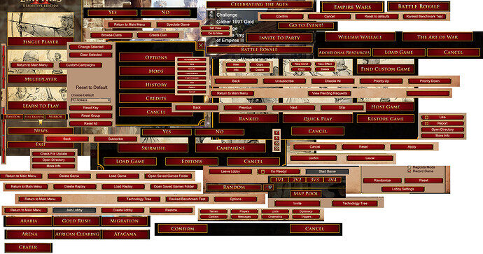
I have a feeling every menu button in AoE4 will be bright yellow, too… akin to AoE2:DE’s red/gold button infatuation:

Colors play an integral role in many humans’ ability to quickly identify where to click in a UI. When every icon (or button) is the exact same color, and a highly simplified 2-D graphic (i.e., traffic light) like in AoE4, and the same size like in AoE2:DE, it really doesn’t help.

Thankfully, online bank statements understand the value of color by making at least credits appear green, and certain debits/withdrawals red. When everything is one color, nothing stands out; it’s harder to locate certain transactions… you have to read through practically everythingevery time.

Very true

1 Like

i think they made the icons more detailed since the fan preview.

here are new icons
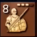
spearmen
royal_knight

old icons
old_cav
old_spear

some of the old icons were also detailed
old_khan

I think liked the old icons but it sounds like other people here might like the new detailed icons.

2 Likes

That would be so cool if we had a civ specific UI that was made in a style of the civs culture!!!

5 Likes

The last Age of Empires game had this, so I figured it was guaranteed. It’s disappointing, because that really helps with clarity and immersion.

3 Likes

I think they can keep the icons as is because I really like them. But I want the UI background to be different for every civ.

1 Like

Me neither. Historical documentaries do not have unit icons at all.

Only the campaign intro shown so far have a “documentary” theme but that had little to do with the game UI.

Digression: manless cannons certainly do not fit into a “documentary” theme, but people seem to ignore it when arguing for that.

2 Likes

This actually looks much better. Hope what we’ve seen are mostly placeholders.

2 Likes

These are still miles behind the colorful and well crafted icons that the franchise has been creating.
And I’m afraid nothing of what we have seen so far is placeholders. In fact, I think I heard Quinn Duffy in an interview saying there are no current plans for changes on the UI.

2 Likes

did you read my previous explanations?

I did make one where I specifically mentioned in detail (at least I think so) how the theme in general fits the style of documentation in modern times, like golden edges and simpler iconography, etc. Documentarys would seldom use specific Elements from back inthat time when explaining stuff. they tend to show more modern recreations/depictions. And their UI in generall is edgy and simple. There may of course be outliers, but Iwould say ajority of documentaries do use a stylized, nedgy and pretty neutral design

a UI generally should have all usable buttons in the same coloring if they have the same function. Which all menu buttons have, so going out of style in a game would be unfit imo

there is different kinds of documentaries. I see this one as a generalized one, and more generalized ones may very well focus on the important part of units and battles,showig the schematics etc. details like guys on cannons may very well be ignored here. And the display may even be done similar to a game of chess in some ccases. But it may make sense to include them.
However, modern documentaries may not have a UI in the sense of clickable buttons, but they often use iconographyx, because there is no videofootage of history. and if they do, they tend to use more modern colors. they certainly do have some parts of UIs though, for example the lettering, when translationg or accumulating points that were made in text.

Says who, where? Please point me to the research paper or time-motion study analysis detailing this UI epiphany

So “Launch Game” and “Back” should be the same color just because they are clickable buttons? The,“Build House” icon should be the same color as “Build Barracks”, as “Change marching formation,” as “View idle villagers,” as “Build Market” just because they are clickable buttons to interact with the game? Sorry, I just don’t buy it.

And one quick point of clarification: any button, just by its very name ‘button’, is ‘usable’… otherwise it wouldn’t be called a button. It would be an icon or something. As soon as something is called a ‘button,’ it is usable. Therefore, you’re saying every button in any UI should aim to be the same color. I know for a fact from experience this philosophy is flawed. Not only because of trying to navigate AoE2:DE’s sea of red buttons, but also Maya software changed their UI to make most every button the same color; and then, later, most everything in their Outliner panel the same color. Trust me it hurt usability

coloring, not color. that is quite a difference. and believe me, there is unusable buttons. they are usually grayed out. an example would be internet connection is gone, so you cant play online - the button will then be grayed out and therefore not in the color scheme of the general UI, thats what I meant.

Regarding your other point, there is an argument to me made regarding specific colors for specific types of actions, like something “negative” as cancel or back being red-ish, while confirmation is green- basically intuitive colored UIs.
However, this is from a usability perspective. there is however also a) other ways to change buttons than just Color and b) also the general design perspective.
Imagine Age 2s main menu, but suddenly the confirm buttons are on a green background - that would make sense from a UX point of view, as confirmation and green fit well. However, from a design standpoint, I doubt that would fit well.
It seems you have a problem with the design focused UI- however I would like to see how you would have changed age 2s buttons to still fit the theme and be more intuitive?
Would you use thematic groupings, and if so, how would you code the colors?
Keep in mind the color shouold be able to still fit the theme.