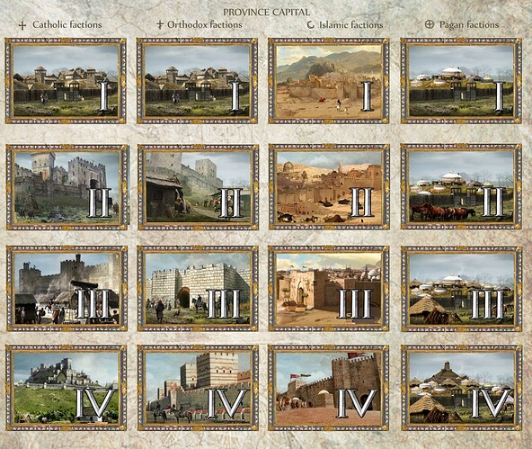
AoE2 has similar icons, the great difference is that AoE3 has more diversity between civs but market, arsenal and church have nice icons that say to you that they buff in seconds. The same for deck system, every card look properly.
I want that on AoE4.
I don’t really like the new interface in the sense that it doesn’t reflect the theme of the game and is too basic and modern.
After in the old games, they also had their faults, the unit icons under black background were not very beautiful unlike those of the technologies
just speaking of my own preference, I love stylistic ui and painted icons, and I enjoyed having civ specific ui in games such as StarCraft and total war. I find them to be immersive, warm and welcoming.
the current ui looks cold and unfriendly, and while it wont prevent me from playing the game it is disappointing.
the theme of the game is not medieval,its a modern recreation/look on medieval times.
Although it is not ugly, it looks more like a prototype than a final version. More life should be added to the icons, and the interface should have the style of the medieval status quo.
Just keep in mind that most of these pollsters are non beta players. The look of the UI vs its practicality determine the overall appeal of it. But omg did I hate the UI.
It took a little bit of getting used to, but I actually like the icons.
I like the icons in aoe2 as well though for the most part.
Personally I do not like the icons in aoe3. Some of them are too busy. I’m sure if I played more I could get used to them though.
Did you dislike the look or the practicality? Because I loved both.
If only we had a big choice.
The interface really has a problem, it does not always read well, that is, clearer icons are needed, but in general, the style of these icons suits me personally.
Changing it to colorful and colorful pictures will look quite contrasting with the minimalistic rest of the details.
Let’s take a look at the interface in TW (after all, everyone loves TW),
in Medieval 2 we can see multi-colored pictures of units that are generally not striking, since the interface itself looks very colorful, it is not made in any strict style.
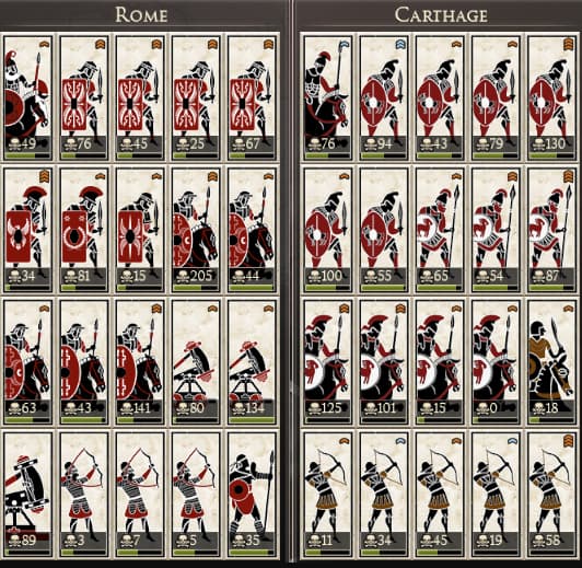
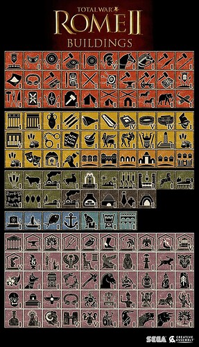
And here we see the interface of Rome 2, as you can see it has become more minimalistic and made in a single austere style, and similar colored icons like in Medieval 2 would give a sense of contrast. That is, the interface itself uses 2-3 colors, while in the middle you would have colorful and multi-colored pictures that would catch your eye, such a design would look rather tasteless.
Instead, we have the same minimalistic icons that simply convey information.
And this is precisely the problem of the current interface, the developers have chosen a strict and minimalistic interface, but some icons do not convey information clearly enough, which is why you can get confused in the icons.
Like, uvas improved armor, well, draw a cuirass or chain mail, so that the player would immediately intuitively understand that this is something about armor, improving ranged combat? Draw an arrow, melee improvement - sword and spear, and everything is on the same principle. If the interface is minimalistic, it should be as clear as possible at a glance.
Humanity is slowly turning into robots isn’'t it? We used to appreciate art and detail, but now we try to minimize everything to its core.
The UI does look as if they worked with software designers on it, and not artists, but it’s serviceable and honestly I never really paid attention to the icons in any games I’ve played (I use hotkeys anyway).
A lot of people really loved the pictophraghic art style used in Rome 2. Really good example. You can tell instantly what kind of units these are ingame. And they had a nice archaic look to them which suited the setting.
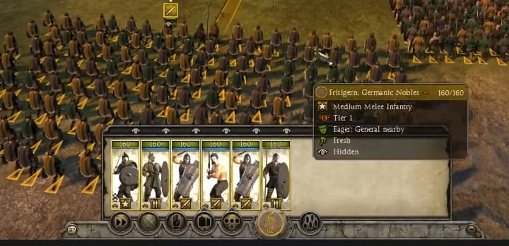
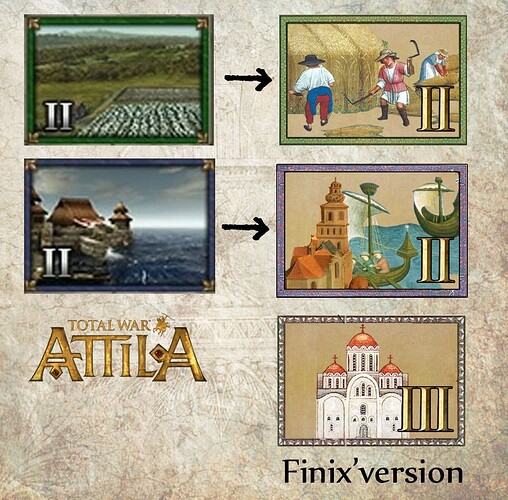
In the next game: Atilla total war, they switched to a realistic screenshot of the units instead. This wasn’t as well received as they actually made units harder to read.
They actually added better UI for units in a DLC.
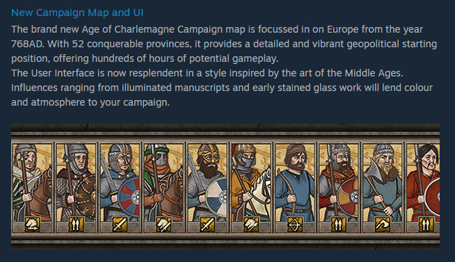
Worst case UI will be one of the first things people will be able to mod so there’s at least hope there.
Is this sarcasm? Almost everybody hated its bland design, which is why every title after it used detailed models again.
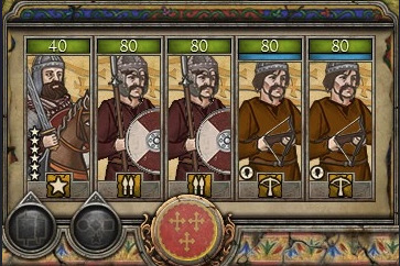
One of the best Unit Card Mods for Rome 2 looks like this:
They switched because of the negative reception. Atilla was not received well because it was Rome 2.5. They turned an Expansion which had requested features like family tree and immersive UI into a fully priced standalone game. Also the optimization was inferior to Rome 2 and Thrones of Britannia.
As you can see the Charlemagne DLC contains stylized but detailed Unit Cards.
Idk what circles you were in, but there were lots of reddit posts and forum posts about people hating the new Atilla UI.
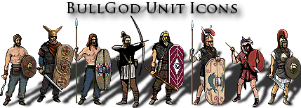
BullGod unit icons are great! They are still super stylized and aren’t just 3d renders of the units. Which is really nice. They went for a nice little pixel aesthetic that looks really pretty but also doesn’t clog the UI with unnecessary detail.
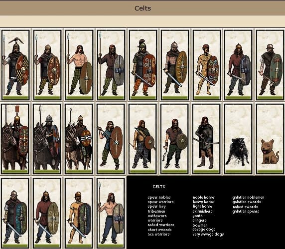
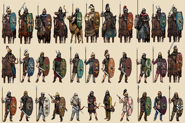
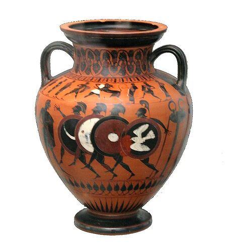
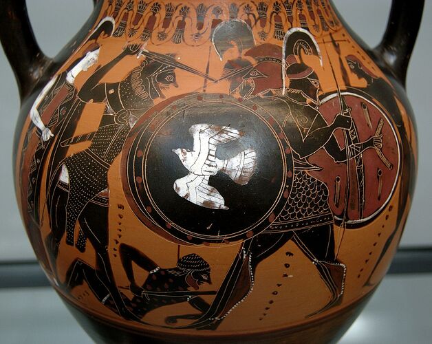
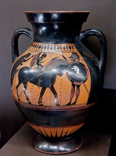
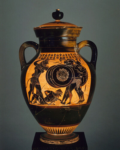
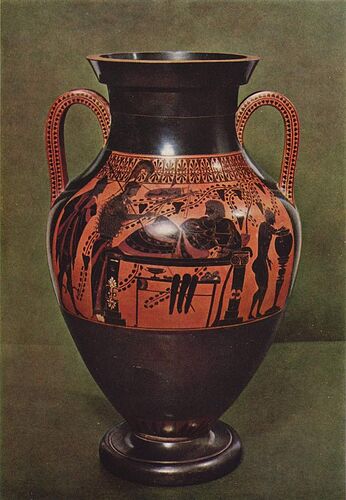
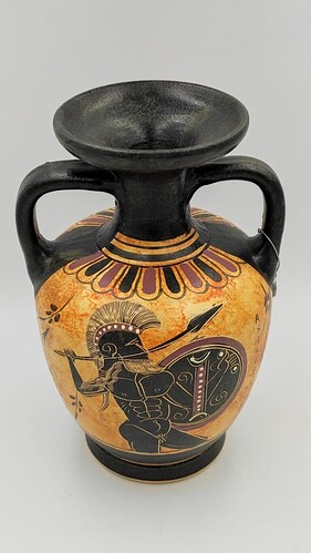
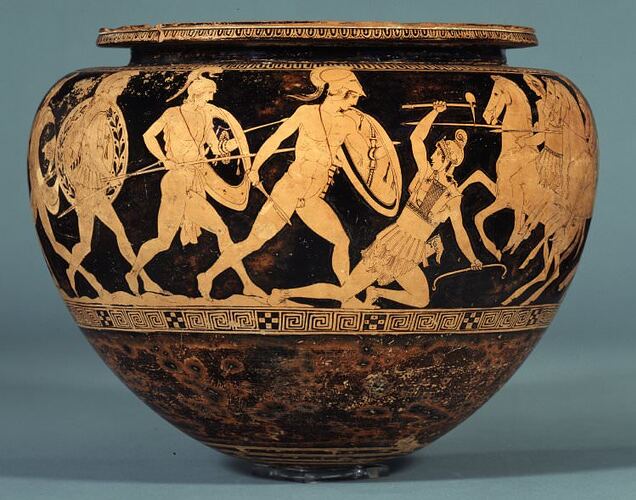
Actually, that was not at all Total War’s take on minimalism. Their icons are purposefully designed in a way to resemble the artistic painting on the ancient Greek amphorae. It’s a design that consciously tries to fit within the atmosphere of the game, unlike the golden figures in AoEIV.
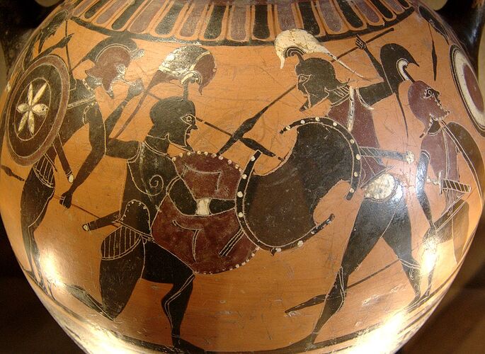
To be more specific, those icons are directly inspired by the melanomorph style (Black-figured) that came to dominate ancient Greece for quite some time.
The finest figures are given grace and poise and often illustrated in the moments before actual movement which is exactly what Rome 2 is doing. These postures basically marked out black-figure pottery as the zenith of ancient Greek vase painting.
On top of that, in their real-life form, they were also not painted wholly in black as certain color conventions existed, such as purple-red for clothes and accessories or white for women. Amazingly enough this is also what Rome 2 does and changes the color each time depending on the banner’s color of each civ.
I mean, maybe not everyone is able to appreciate such historically inspired details that much but it was actually a great attempt from CA’s side to create something that artistically conforms with the spirit of the game and fits in nicely while also being aesthetically pleasant. I understand that anyone who is not aware of these things may come to the conclusion that it was a modern minimalist take but it really had little to nothing to do with that.
I’ll give you some examples to see it better by yourself.
In terms of readability, they were not really an issue since the same-type TW icons do not stack like they do in AoE but get grouped next to their other same-types.
Let alone, that you basically only see these units when in a battle or when recruiting. You do not have eco management, unit micro or any other hindrance as in AoE.
I agree that AoEIV’s UI and icons have issues but the Total War parallelism is out of place here.
I would happily welcome an analogous to TW’s attempt to create icons that fit in the game’s Medieval atmosphere. Even them actually have more color and aesthetic than the boring monochrome golden figures that we currently have and look alien to the Middle Ages. They really take away a lot of joy, besides the practical concerns that people have.
–
PS: Just for encyclopedic purposes, the black-figured pottery style was later replaced by the reversed red-figured technique (red figures created by painting their outline with a black slip background)
I didn’t follow that exact discussion, but I was there from the start when Rome 2 launched on the official TW Forums as well as TWCenter. Almost everybody wanted more detailed unit cards, not necessarily 3D.
Eh that’s fair. Personally I really liked it. And the example you brought of BullGod was also a really good solution too. I just dislike the unit cards being a 3d model. I feel they should be artistic and easy to read.
As another big fan of the TW franchise, I can attest there were also a ton of people who loved the new icons although I’m aware that some didn’t. Pretty much everyone that I knew who was aware of the ancient Greek black-figured pottery embraced that new design the moment they saw it. Those who had no idea about it, usually hated it with all their might. To them, it looked bland and arbitrary indeed.
For modders these icons are like god sent, because thanks to them you can just cut one unit icon head and paste on other unit icon head and you already have new unit icon. It made quite easy for me to make new unit icons by just swapping some details.


