I love the Finix version as well although not so much the original. I see it and immediately think of an older epoch like the Middle Ages. This is what great icons and art style in general should do in my opinion. Convey the spirit of the game, add to the overall atmosphere, besides being practical. Rome 2’s icons do that to me as well. I see them and quickly think of antiquity. They really conform with the setting. But when someone is not acquainted with that style at all, it becomes harder to feel the same way.
But okay, de gustibus non est disputandum they say 
Shogun 2 and Charlemagne are good examples of “historical and immersive” + identifiable.
Rome 2 is a bit controversial because it is less identifiable. I personally have no trouble distinguishing unit types but sometimes unit tiers are hard to identify, especially for those Greek factions with 5 hoplites in a row.
But again, bad implementation does not equal to bad design principle.
As I have been saying everywhere. The problem is not the graphics themselves. It is the absence of immersive art.
Im pretty sure that at some points UI mods will be created for those who want to have a different look and feel… so this isnt very much concern to me personally
If the best thing we can say about a design decision is that the playerbase can fix it after release, then there’s truly nothing good to say about it.
Meanwhile, the game is releasing without mod support, so buckle up. Those horrible icons are not going anywhere for a while.
I think UI is a very subjective topic. To me the UI looks fine, usable, clear what is what, layout of things make good sense to me, UI does not take up un-necessarily large amounts of space. For those who do not like the UI, there will be mod support to create their own UI… so everyone can be happy in the end 
I just want to thank all people posting these compilations and comparisons of GUI graphic elements 
For an RTS fan, seeing so many buttons for researchable technologies is very … erogenous. If that’s the right word.
I love the style of IV’s GUI. It had problems but the style itself and readability honestly didn’t bother me at all. More than that- scale, spacing, information included and presented was the problem (not enough of it!!).
I can’t say anything about beta, but just from the screenshots floating around I’d guess vast majority of button art was clear to understand and I guess only few buttons would have to be chcecked, once, to know what they represent.
And I would not ask for overhaul, but I still wonder if unit portraits are a ‘must have’ here. I like them, but I’m sure they have… some reasons outside of cutting work for 2d artists.
Unit portrait is just expected, just like resource list, ability to use RMB or minimap.
I suppose it could be the right word. ![]()
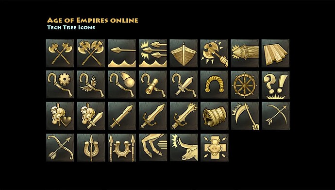
Interesting that all the icons posted in this thread were from all the games except for Age of Empires: Online. While I will have to caveat this that the units and the buildings had colored portraits, the technology icons have the same aesthetic as the AoE4 images posted above. Maybe the AoEO icons are a little more detailed, but I can definitely see how the below icons could have been used as an inspiration.
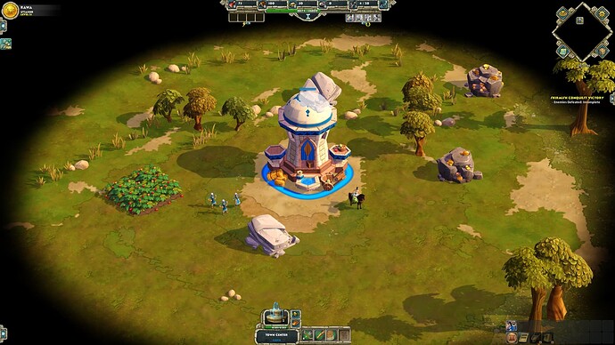
Honestly I never wondered about them in AoE:O. There are a minor element and kinda get lost when you think about general UI design and visuals and how stylized it is. Even more never had any issues.
I’ve studied graphical design for a bit - and when done well by professionals - they can be much more universally unsefull and timeless than ones trying to depict things in more complex/realistic/detailed/etc. way. It’s also much easier to change, update, give small touches to something created in this style, than using minatures of in-game models, sprites, textures.
OFC there are downsizes, like with everything. If there is something that is losing out is the atmosphere - more abstract elements may be slightly immersion breaking, but let’s be honest- these are RTS games, not RPGs, and at the end of the day icons are still abstract, functional elements of GUI, not part of worldbuilding, heh. But arguments like that can be made, sure. For something that might focus on multiplayer- it might be better to have clear and easy to read set of icons that are obvious without hovering mouse - ‘sword and plus signs (or arrows pointing up) - that means sword hit harder! Me like!’.
Overall I’m more in a ‘grimdark’ camp when it comes to tone, but I have to say general GUI in that game is super well done. Screenshots taken while playing on QHD resolution, and for me scale, compactness, layout etc. is just fantastic. I guess I’d call it ‘sharp and tight’.
The AoEO tech icons seem to read quite a bit better. I can’t recall anyone saying they can’t understand them. It’s also helpful that the icons in AoEO for units and buildings are all in color, so you instantly know when you are looking at a tech icon or not.
It’s also worth noting to any non-AoEO players that the grid of icons depicted above are from a set of extra icons we found left over in our research and are not all used in the game, so a lot of those above are very similar alternate versions. The actual icons in the game are quite distinct from each other.
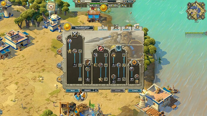
If anyone wants to quickly see how they look ingame, you could head to champion.projectceleste.com, which has the tech trees for all seven civs. It starts with Greeks but you can change from there.
Me posting those icons wasn’t trying to claim the tech icons in AoEO look too similar to each other (i.e. all the icons look the same that you can’t tell them apart). What I was trying to illustrate was that those icons were representative of the style in AoEO (as you can see in the tech trees you linked in your post) and how you could see how they are similar (but not exactly the same) as the AoE4 icons.
I know. I was anticipating the blowback. This isn’t my first rodeo.
I think that due to all unit icons having the same brown background color they will be hard to differentiate in the heat of battle.
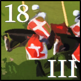
I just made a screenshot from one of the knights in the 100 years war trailer and threw a filter over it, would replace the grass with a type specific (infantry, ranged, cavalry) background color. What do you think? This is just for reference, I have no artistic talent lol.
Let’s take a look at good RTS Unique UI for each race/civ
That’s art, readability and details that produce more inmersión… age IV UI looks like a star wars or a futuristic game.
Details, details, something age IV doesn’t understand
I feel like they did it intentionally because the level of detail in their icons is actually more than the unit itself. Maybe if they had icons of the actual units, the graphics are so dam simple that you’d have to rely on the descriptions of the units to tell them apart rather than the look. They did mention that they intentionally simplified unit graphics to make it “pop” from the background.
So I assume they would have tried the icon thing but realised themselves how simplified the graphics were, and so resorted into these kinds of icons. Just speculation though lol
Seems plausible.
But I would have preferred if they went the “paintings” route, since they want to convey the feeling of a live historical documentary.
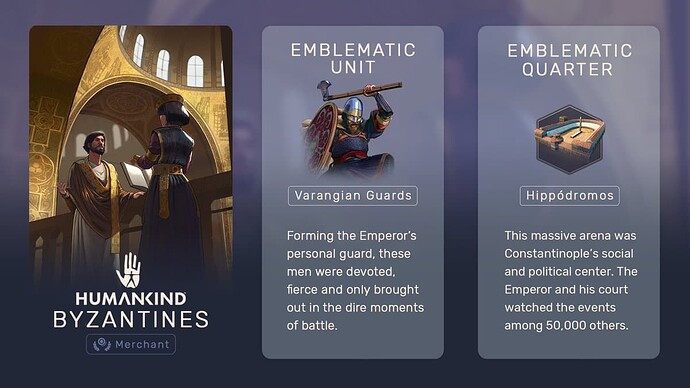
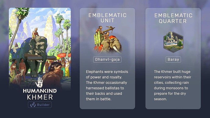
Humankind’s unit icons for example are gorgeous 
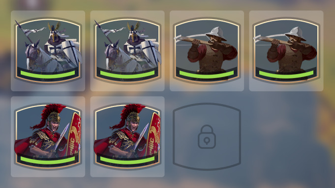

man that is beautiful!!! Cartoony graphics may have been more acceptable to people if they went ham on the details like that!! 
Devil is in the detail. And attention to detail separates good craftwork from great work. As I’ve mentioned I like IV’s style, but at the same time I love exquisite, detailed GUIs tailored for specific factions. And there is certainly a way to match both worlds.
Even the laziest thing like adding a gradient, civ-unique 2nd color (of a combination of few new colors) to the basic blue-brass/gold scheme would do a lot to simply prolong the time before all games start to look the same and boring and game appears as devoided from personality and content.
The design stays the same, icons for techs/units shared between multiple civs- also. So for the most part it just works for 2d designers and artists. And compared to… well anything, coding, 3d-modeling, doing voice-overs, designing civs, it’s a relatively cheap and fast way to add a lot of personality to the game.
GUI is like the front doors of a home - that’s where first impressions are being made.
With that general style I don’t think completely unique civ HUDs would fit, but there are many ways to improve to current situation, that are better than what we have now- nothing. Or rather everything (the same).
