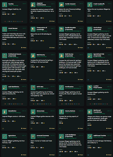
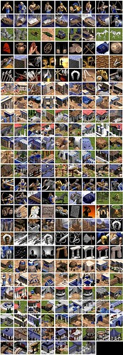
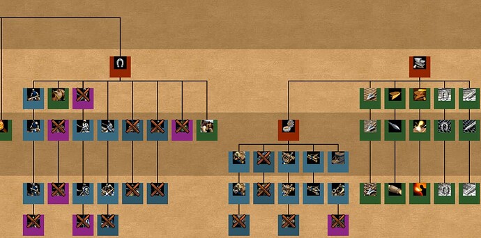
Is not only about the unique civ UI (that can be optional), I would be ok with just 1 UI but at least the UI matching the game and time period, look at the ones I posted, they match perfectly, but If I look at AGE IV, it doesn’t look like a UI for a medieval game.
The funny thing about icons and portraits is that, a lot of the times, they would make units cooler than they actually were. With older games, there wasn’t actually much to see–Units were pixelated or very polygonal, and often times, you recognized them by their vague overall silhouette, shape, animation or colour alone.
What icons and portraits would do, is portray them in a better, higher fidelity light. It would help your imagination close the gap between portrait and unit. By seeing a zoomed in version of what is suppousedly meant to be there, in its best light, you could better visualize the units themselves in your head. The power of suggestion is immensively powerful and AOE4 has taken the decisive negligent act of ignoring this.
The reality is, a lot of units are just mundane in many older games. But, all of these small details adds up to a better experience. With AOE4; what you see is what you get, and what you see is still a low-poly model. There is no way to get around that with games. So when you associate those models with icons that look like nothing themselves, you’ve just skipped out the opportunity to present them in their best light.
No imagination at play. No immersion. No interest. Just basic generic knight with nothing to represent them.
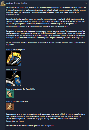
Paladin Upgrade icon
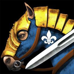
Paladin icon
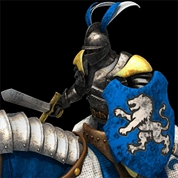
Elite Royal Knight ugrade icon

Elite Royal Knight icon

The two upper ones helps your imagination connect with the unit better, and inspires you to use them. It looks and feels cool. Whereas with the Elite Royal Knights, you get a vague sense of what is going on. Colours are stripped. Form is stripped. There is no dramatization, just a very hollow iconographic representation.
Placeholder UI needs to go.
There are studies on the loss of quality of peripheral vision, when I see a replay sometimes I don’t use the caster mode and I pay attention to the global tail, which, by its icon colors, I can tell if it is producing a unit or a technology, so I fully agree with that classification, and with the direction that the game took with Eric Wrobel, this is based on studies on the Gestal, on how the brain optimizes things. What you are requesting is for simple nostalgia for your past games, not for efficiency, it is your right but that is the way things are.
I have reduced the image and it is easy to know that green is a technology and brown is a unit, with your colors you cannot easily distinguish them.
What you are pointing out is a nonissue with my suggestion. These two things can exist together, what makes up the design features of AOE4’s iconography does not contribute to readability. Say both of the bottom icons had brown backgrounds. You would not be able to tell the difference between the two, as they lack even more points of reference that would help you distinguish between the two, such as colours, perspective, spacing.
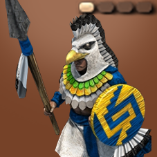
In this image you can see that you can in fact have both.
This is basic design, so I find it disingenuous to suggest there is any supremacy with the current icons, when the very thing you are praising is not even part of the icon itself. As with my example, that background colour can easily be implemented with a more interesting icon.
Again. Current icons have even fewer points of data to distinguish each icon by. There is no colour to the icons. There is no perspective. They don’t even take up the entirety of the icon’s space. It objectively gives out less information for a player to recognize it by.
Also, I don’t appreciate the claim that I only like these for nolstalgia. It is needlessly reductive.
I have reduced the image and although they have a green background, I get confused between the two technologies
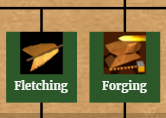
Meanwhile here I also shrink the image and I can recognize the technologies by their particular silhouette
this is the ancient egyptian alphabet, each letter is a particular silhouette, which makes it easy to read
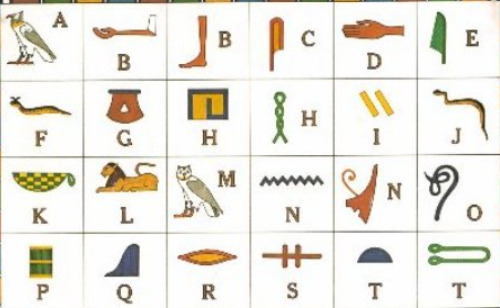
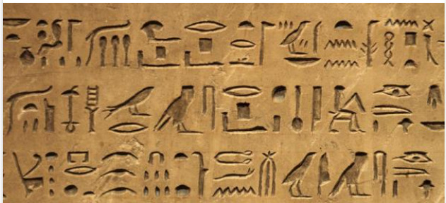
I think you’re confused about what I am suggesting. My point is not that we should throw away symbols for the sake of random chaotic images. Actually, can you reply with an image of what you think I want?
Because as I have stated in my past comment, my criticism comes from the stylistic choice of the icons, of which have no perspective, colour and do not use the allocated space well. I think icons can also have personality in the form of culture represented through those things, which becomes so much harder to do with only silhouette, which is what AOE4’s iconography resorts to.
I also fail to see the reason of you posting egyptian hieroglyphics as a point of comparison. You say “it is good to read”, is this you practically saying “your icons are not good to read”? Because that is again, disingenuous.
If the logic is that we should strip everything to the bare bones minimum for the sake of readability, you can simplify a lot more than that. But, moreover, readability can take form in many ways, and by neglecting to utilize visual data such as colours, you are heavily limiting the visual communication at play. Icons like the one I have presented above has multiple recognizable points of reference that makes it stand out. The ones you posted share 2 identical colours and only vary in shape–the lack of contrast and lack of differences makes them too similar. You cannot contest this point genuinely by pretending less is better, it is not.
There is also the overarching point that icons should represent things well. Simplicity can only go so far in portraying culture, personality and immersion. It is OK if you do not care about these things, however, to suggest that icons should be simplified to their absolute minimum so you can detect differences in a nanosecond instead of two nanoseconds is just silly. That benefits too few people in the playerbase who cares about the visual presentation of the game. Also, the very people who play at the levels of caring about how long it takes to recognize an icon, do not operate on recognition, but muscle memory. Or are you telling me that you still spend 3 - 5 seconds looking for a blacksmith? If so, I would argue it is because AOE4’s icons suck.
It simply is not acceptable to have cardboard cutout icons that function worse than the icons I have presented.
readability benefits new players, and their learning curve, like grid hotkeys and not aoe2’s deprecated hotkey system but that’s another topic

If I hadn’t suggested readability, you might never have posted that image in brown, because I bet it’s just for nostalgia and they would have been fine with the image attached by the person who made this thread, where I don’t distinguish units from technologies.
Finally, who should you convince, and if this is a priority, it is the developers, good luck
In case of Paladin, it’s also easy to recognize as the unit uses the portrait with the ingame render whereas the upgrade uses a stylized icon.
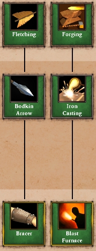
On the left is “fletching”, it affects the attack and range of ranged units (and towers/castles) and therefore the icon literally uses a fletching. On the right is “Forging”, it affects attack from infantry and cavalry hence you can see an anvil, a hammer and a sword on the icon (tbf with reduced size, it’s difficult to see the sword but you still can see hammer and anvil). Since you posted Fletching and Forging, let’s post them in their original size from the game + their upgrades:
And for the sake of readability in the game, let’s set the HUD scaling to the lowest possible value (75 %) and look at the Blacksmith
While both icons have the same colour tone, I still recognize Forging as the Melee upgrade and Fletching as the Ranged upgrade as the first row in the Blacksmith is Melee Attack + Infantry Armor + Cavalry Armor and the second row is Ranged Attack/Range + Ranged Armor.
AoE 2 DE uses grid hotkeys by default, so do the other DEs + you can change the hotkeys to your liking in AoE 2 since its original release.
As @TheAchronic brought in the Paladin, let’s quickly come back to it and look at the Stable ingame:
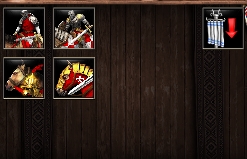
Paladin is an upgrade to Chevalier and like in AoE 4, upgrades are always in Row 2 of a production building, so it’s not too hard to distinguish. As a neat feature on top, the icon colours itself in the player colour I chose - as I’m red, both unit icons and upgrade icons use red.
Edit: to not let it always be AoE 2 v 4, let’s bring in AoE 3 as well. Here’s the British Barracks:
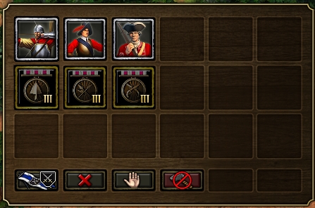
Row 1 are the units, Row 2 are their upgrades. I’m currently Age 2, so the upgrade icons show “III” to indicate that they become available in the next Age.
i respond to op only here, a small correction, aoe4 icons have precisely 2 colors, traffic signs typically have 3, so its technically worse
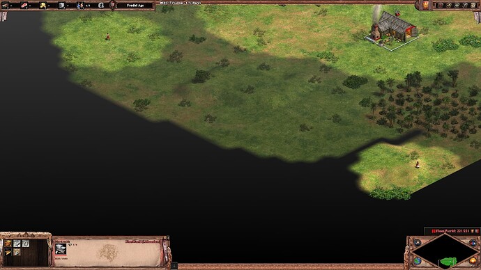
@FloosWorld
The point is that if I see, with peripheral vision, the four in a global queue row, I don’t know if they are units or technologies unless I stop to observe them well.

funnily your defense per usual failed to get my point, 2 colors per icon vs 3 in a traffic sign normally, the unit vs tech difference is a fair point tho, but its still really stale looking next to originals imo
Except you do as in the Age Games, Row 1 is always unit and Row 2 is always upgrades ![]()
friend, I mentioned what would happen in a global queue

Units appear as stacked whereas techs appear as individual. If I research multiple technologies within the same building, the queued tech would appear in yellow. In the screenshot below, I research the Crossbow upgrade, train 9 Halbadiers out of two Barracks (5 in one and 4 in another) and train 1 Mangonel
I will finish by mentioning that it is the designer of the web page, who intelligently put a colored box behind it, because he knows that without it it is chaos, just as it is
The webpage designer just adapted the colours the game uses and trust me, once you’ve played 2-3 games, you’ll immediately get used to it ![]() I think it’s just as clear as in the other games.
I think it’s just as clear as in the other games.
But I’m curious - why do you think that it is chaos? Have you played the game?
let’s bring old technologies to the table.
Let’s do it!!!
Do you know why EVERY old game have wierd generic hotkeys? Cause no overlapping was allowed.
anyway aoe4 icons are shit. and more ######## is inability to fix it with mods.
I’ve just bought a new keyboard and it’s AMAZING. FULLY remappable. they gave me a few keycaps for wen & max. And different color for Enter and Esq.
If i want i can change Keycaps however i like.
oh boy… you have no clue… launch the game and learn what this magic colors stands for.
@TheRaff0 who should you convince, and if this is a priority, it is the developers, not me ![]()
you get out of every corner and get into this serious topic for developers. I have no desire to convince you. You’re just wrong.
