Or just include the civ overview on the left as well where the colors are explained:
1 Like
Agreed, and can’t believe the UI has gone this long without an overhaul. Call it a ‘retro’ UI setting, if need be, but since I won’t buy the game until icons are revamped, it is what it is. I might not be the only one not buying because of this
Reminds me of AoE2: DE UI where all buttons are red. Even the “okay” and “cancel” buttons are red, which promotes misclicks .

In the AoE4 beta, I spent more time trying to figure out what icons were, and misclicking, than I should have. Stone walls and wood walls are both gold. Which is which? Resource icons were all gold and I kept having to pause and figure out which one was gold vs. wood vs. whatever. I can’t remember now, but I’m pretty sure all that’s still the same… but admittedly, I haven’t been keeping too much track
1 Like

Age 2 has that tool as well, it exists as a mod ingame. But anyway, hotkeys weren’t the driving topic of this thread and even with them, the problem with the icons remain.
2 Likes
Yep, we should become hotkey wizards to compensate for the poorly designed icons, from a usability perspective ![]() And to distract us from the boring gold-silhouette monotony of them all. (My opinion only, of course)
And to distract us from the boring gold-silhouette monotony of them all. (My opinion only, of course)
For what it’s worth, I use hotkeys for a good number of things in AoE2, but I still look at the trays of icons a lot so I know what techs I’ve unlocked and such. The two aren’t mutually exclusive. Plus, I don’t want to learn hotkeys for everything.
Imagine if stoplights were like AoE4 icons. I tweaked a photo I found online to help us image this:
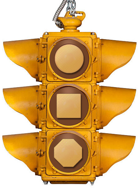
It might just be me, but I’m glad traffic lights actually use colors ![]()
5 Likes
The funny thing about this is it removes what colour the icons in IV have. So it’s not really making any point at all, except to demonstrate that, too often, criticism of the icons in IV has to misrepresent them in order to make (attempt to) a point.
How so, exactly? I sampled the actual icon colors using the eyedropper tool in Photoshop, and even added highlights and drop shadows like the icons. I feel I paid great respect to the existing icons, all things considered. No misrepresentation here… the icons speak for themselves. And I didn’t add backdrop colors, if that’s what you’re referring to, because they’re a crutch mostly needed due to the monotone icons. I know they provide some notable benefit, too, but their inclusion just deflects from the main issue at hand, imo
2 Likes
He means each colour of the stop sign should be represented by a different colour coded icon, such as technology (greenish), military units (orangeish) and buildings (blueish). This is a fallacy however, or at least ignores what I brought up earlier in the thread, which is that you can have interesting icons that also utilize this easily mappable colour coding. They aren’t mutually exclusive.
People will use every fallacy in the book before admitting that they just like the simpler look. They lack the graphical knowhow to have the discussion yet insist that a mishmash of design principles makes them correct when applied inappropriately.
1 Like
But I wasn’t talking about what you brought up earlier in the thread.
I was saying that @Darkness01101, like others, had to resort to a misrepresentation of the icons in order to criticise them.
I’m fully capable of admitting that I like the icon design. But that’s about as relevant as pointing out that people opposed to them dislike them. There has been some occasional constructive suggestions about the icons, but the fact remains that a lot of the arguments against them rely on exaggerating their flaws often to ridiculous extents.
I’m also casually interested in exactly what fallacy you think I was invoking.
Bonus points for suggesting I don’t know UI and UX. Might have something to do with my occasional lack of interest in your arguments. An inability to not insult people who disagree with you isn’t something I find that offensive anymore. It’s just boring.
2 Likes
The first half of my comment was trying to clear up the misunderstanding of the example of the trafic light.
The other half was not directed at you, but others others in this thread who kept bringing up colour coding as why AOE4’s icons are good despite the fact that no one is rejecting the usage of colours. I was reiterating the point that, that argument doesn’t make sense.
So I remain disappointed in that you think I keep insulting you, despite the only part of my comment in relation to you being an attempt to help others understand what you said.
Moreover, there is no insults being thrown around. Ignorance is a big part of many topics, discussions and opinions here. I’m doing my part in attempting to clear a lot of it with my own expertise, and I don’t care about being gentle in expressing that.
This wasn’t made clear in the slightest. This was compounded by accusing me of relying on a fallacy, and then talking about how people use fallacies generally.
Not that you have, at any point, specified what fallacy. Seems to be an application of the fallacy fallacy, but hopefully you can clear that up for me.
With regards to not being gentle, and bearing in mind your lack of clarity, this is on you.
Sure there are. You’re assuming your expertise automatically trumps that of others’. I’m very careful, generally, to make no appeals to authority (which again, would be a fallacy, and people love calling those out - not you specifically - just across the Internet in general), but you’re here positing your opinion as a direct outcome of your experience. Which would be fair, except you then generalise a bunch of other posters (which may or may not include me) as “lacking the graphical knowhow”.
Opinion isn’t knowhow. There are many ways to crack a nut open. If you want an actual discussion, past the usual screen of hostility that we repeatedly keep on having to deal with (you and me), we can have it here, or we can have it in a DM.
You have opinions on the icons, and opinions on how to make them better. But I have seen no qualitative analysis of the existing icons. You’ve just brought them up in another thread. Again, that isn’t a demonstration of expertise. It’s opinion. Saying something is “anti-AoE” isn’t a UI or UX argument. Not by itself, anyhow. Not without further explanation.
Age IV’s icons are intentionally consistent with the gold motif that runs through the entirely of the in-and-out-of-game UI in the game. This ties little things like player banners together with the out-of-game UI and other things besides. I have in the past said it’d be nice to have more colour backgrounds, instead of the three or so we currently have, but in terms of the stylistic approach, I simply think people just don’t want to interrogate it with any level of nuance. They’ve decided they don’t like it, and that’s it.
And that’s fine. Opinion is fine. Opinion is valid. People hating the current UI and the icons is an entirely understandable opinion to hold.
But you’re talking here about expertise, so I want to reach out in good faith and have that discussion. Because, as it goes, I have expertise too. I’m not here to knock yours. I’m here to understand it, and put fowards what I think is a good case for the icons in IV, and that case extend to the UI in general (even if there are a lot of improvements that can still be made, especially to the UX).
I’m not here to blindly fanboy the game, nomatter what some think. I like the game, and this comes from liking a bunch of the choices the devs have made. That doesn’t mean I think it’s perfect, or that it can’t be made better. I want this game to be better (and I believe you do too), and I want faster patches and timelier communication. Those last two bits are probably my “most important” wants right now.
1 Like
You don’t have to convince me that background colors are helpful and desirable, based on my Aug 2020 thread for AoE2, which is pretty much the same idea as AoE4 icon background colors:
But that, I feel, is a different discussion anyways, and only helps a tiny bit. Large groups of icons all share the same color backdrop. The root of the icon issue in AoE4 for most, from what I can tell based on years of discussion, is the gold 2D icons everywhere. And no amount of background colorization will fix that.
I’ve given many thoughts on this topic over the years in the forums, beta, and surveys. At this point, since we’re still in a land of 2D gold-colored silhouetted icons, I thought a traffic sign graphic might help. Sometimes visuals help communicate better than words.
While you observe, apparently, an inordinate amount of misrepresentations of icons, I’m still waiting for a good UI/UX reason for why the current icons are the greatest way to make them. Sure, some players may prefer them because they’re sleek and modern-looking, and that’s fine. But from an actual usability and gameplay standpoint, they’re not that great, and are a devolution from AoE2’s more immediately recognizable icons… or other UIs that incorporate colors, for that matter. And don’t fit the Medieval setting very well.
The Age franchise rewards quick clicks, and the efficient/effective management of your empire. The less time you spend trying to decipher the UI and fiddling with it the better. How is it a good thing to spend more time looking at the UI than necessary, simply because every icon is colored gold and is a simplistic 2D stylized silhouette of things?
From an old thread, I gave these mockups. Wood, food, gold, and stone icons all colored gold:
![]()
And a 2D stylized silhouetted variation thereof, to try and help make up for the fact that they’re impossible to know what they are since they’re all colored gold… just like what AoE4 has to do for all their icons:
![]()
(Note: Since they’re all econ-related, they’d all have the same backdrop color, so that wouldn’t help things.)
I don’t know about you, but icon colors help me more quickly identify what they are. Thus, less time fumbling over the UI:
![]()
Anyways, I’ve given plenty of reasons why the gold icons are inferior over the years. I think I’m entitled to make a traffic light at this point. And that light wasn’t even misrepresenting anything, tbh. Besides, since the traffic light icons of “Stop,” “Slow Down”, and “Go” would all be the category of “Traffic Management”, they would all be in the same group category, and would all get the same background color in the AoE4 world. Therefore, my mockup still doesn’t misrepresent anything ![]()
I have a variety of points in the following threads/posts. I think my main issues w/ the gold icons can be summed up to a handful of things, scattered across these threads and others, I’m sure. You’re free to view or not view… but I’m not trying to misrepresent anything. If I ever exaggerated(?), it’d mainly be due to being in disbelief that the ubiquitous gold icons were ever even a thing, and because they have been the only option for players for so long.
And I’d like faster times in and out of the UI, with clearer intuitive communication (by their art design and coloring) as to what the icons actually are. And these are probably my “most important” wants for the UI/UX right now ![]()
Please help me understand how monotone 2D icons with flat-colored backgrounds (no matter how many color variations you add to the backgrounds) are better and quicker for AoE’s RTS gameplay than simply having more informative and colorful iconography? And if you concede monotone 2D/colored backdrop icons are slower for the human brain/eye to intuitively process or positively identify than what is proposed (even by microseconds), then why does that artistic “theme” (for the sake of having a theme) have more importance than actual RTS gameplay?
Would it not hurt… and wouldn’t it, actually, be good to make the UI/UX quicker and more intuitive for the vast majority of people to use?
For players who cannot see the full spectrum of colors in our world, I have a feeling the AoE4 icons might actually be quite good. I’d think silhouetted representations could prove quite informative for them, and, so, the icons should definitely be kept as an option (assuming this is the case and they want them). Or feel free to even keep it as the default UI for cohesive ‘artistic theme’ purposes, as well, if desired. However, according to Google and Bing searches, a large majority of the population can see all the colors of the rainbow. Because of that, I have a feeling incorporating more color and 3-D depth to the icons (to, say, be more like AoE2), as a 2nd set of icons to choose, would help most players use the UI more effectively and efficiently… and also give them a more pleasing and “of the medieval time” experience, all around.
Logging a ton of hours to get the right muscle memory down to overcome the UI’s shortcomings shouldn’t be what we need to do. But if that’s the desired requirement, then it’s all good. I’m okay with waiting 2, 5, or 10 more years until I buy it for a $1 or $2 during a Steam sale. I’ll probably comment on the gold icons from time to time, though, unless and until there is an option to have AoE2-like icons, simply because it seems like such an easy deal-breaker to overcome.
With all the AoE events/challenges over the years where a bunch of profile icons have been created as rewards, it seems like cranking out a bunch of new icons to actually benefit gameplay would not be that big of deal for their talented design team. A fair amount of work, sure, but hopefully fun work… and with 8 hour workdays, a lot could be done in a week or month, imo
3 Likes
Well, I guess @TheAchronic doesn’t want that discussion on expertise after all. Disappointing.
But this is a really good post @Darkness01101, and despite how much we might disagree I really want to thank you for it. It gets into what I wanted to discuss with The Achronic, and since he skipped my post, but liked yours here, hopefully I can provide both of you with at least an understandable argument, even if it’s not one you end up agreeing with.
I don’t have access to large-scale, statistical data, but the complaints about icons are varied in my experience. The lack of background colour variation, the flat-ness of the overall UI (the icons are merely a part of this), the stylised bas relief approach to the icon contents themselves, etc, et al.
Your issue specifically is the bas relief, and honestly that’s the part I think is the strongest. So here we go.
I have no idea what reasons you’ve given over the years, sorry. I still don’t think it justifies a reductive mockery of the icons, because if all your other arguments haven’t made change, what is a traffic light thing going to do? Honestly, what is going to achieve? ![]()
But let’s take this further. Each light in a traffic light conveys a completely different state. They’re more akin to the different types of background colour than what each of the contents (of an icon) represents. Because traffic lights (in Western countries) overwhelmingly only have the colour. Red / amber / green corresponds more closely to regular / military / upgrade building background colour split (blue / brown / green).
To focus only on the contents of the icons, in that they’re all the same colour, is like focusing on how some green lights have split directional masks directing the traffic in a particular direction or lane. It’s not a good analogy, because the traffic lights don’t represent the depth of what any icon in Age IV is attempting to represent. Green is go. Green in Age IV indicates a research / upgrade building. The icon then indicates what building it is. Both work “at a glance”.
And notably, many countries handle these arrows in a variety of different ways. They’re often still arrows, but the presentation can change quite a bit.
I mean, I’d never claim there’s a single greatest way to make them. I’m sure people with the right experience could draft a UI style that both fits the existing direction of the game and looks somewhat different to what we currently have (though again, similar things like banner art and whatnot would also need to change).
I also disagree AoE II’s icons are immediately recognisable. I think they are for people who play the game day in day out, forever, but that’s the same as any game. AoE III people are also going to have their own preferences (even if III is closer to II). And then we have Online, with the people who prefer how that approached its own stylistic design. Online might have been an unpopular game, but we definitely have people who (rightly, imo) praise its own internal consistency.
But I really want to know is why. Why from a gameplay perspective are they not great? Why from a usability perspective are they not great? Is it because of the next paragraph I have quoted here:
Is this why you think Age IV’s icons aren’t usable; or aren’t good for gameplay? Or are there other reasons?
To answer this specifically, there are two arguments I can put forward. Let’s get accessibility out of the way first, because you also concede that the iconography works for people with colour vision deficiencies and the like. This is important.
It’s not good to ignore these demographics when making a modern video game. This isn’t something video games made even a decade ago, nevermind two decades ago, really stopped to consider much. Making a game just for a majority immediately caps your sales at a specific ceiling. Speaking from a business perspective, that’s not good for business. The “sell” there is convincing your investors that the dev time required to aid accessibility will result in a measurable RoI. But also in terms of market perception, accessibility is being opened considered more and more. So it’s important for perception, too. Nevermind that arguably it’s a good thing to do for any potential player of your game, just from an inclusive perspective.
The game already has integration with existing (Windows) platform features:
Which is something the iconography at this point needs to align with (unless they add, or modders add, something like an optional icon set which you suggested near the end of your post).
But beyond that, the second argument is about the UI being “quicker and more intuitive” with AoE II-style icons.
I disagree.
Colour isn’t synonymous with information. Colour can aid describing a particular thing, but too much colour can obscure the intended meaning (just like too little colour can also obscure the meaning).
In my mind, that’s why they went with the combination of coloured backdrop and the bas relief style of unit portrait. It’s also why I agree with people who want more colour variations (though maybe the reason why they’re stuck with so few is because the game doesn’t have.
A UI is meant to be holistic. It’s meant to carry through. Replacing the ingame icons means you suddenly have a gap with these ones:
And these ones:

And even these ones:
What I’m trying to demonstrate is this was considered throughout the entire game. And I don’t think all the choices they made were perfect, or can’t be improved on. But I consider the style valid, and appropriate for conveying information to the player.
And no, I don’t think they’re slower for the user to understand. I have argued in many, many threads that the icons in AoE II (and even III) aren’t always helpful to new players. Existing franchise players who have played the game for donkeys years? Sure. But that’s an ever-reducing demographic. The amount of people who played AoE II twenty years ago (for the record, that includes me) will only be going down.
So we have this tension between players who are used to a very specific set of icons, and the new, consistent design the devs have tried to make for IV. And I understand that tension. I keep calling it preference, but that doesn’t mean I think that preference is invalid. It’s a real challenge for the developers to satisfy that preference and also build a modern game that can carry the franchise forwards successfully.
But I think in UI terms, the new design is far superior. They’re far less busy. They convey exactly two things - the colour associated with the grouping (military, research, etc) and the unit themselves (typically focusing on the headshot and the weapon they carry).
The part where I think they’re weaker is with some of the research icons. I think the armour and armour-piercing / damage upgrades could’ve been done better. But then again there are a bazillion ways in which I think AoE II or III could’ve done their icons better. The difference is they were released years ago. I understand why they went with the iconography they did. But they’re not suited to a modern UI. They’re suited to satisfying the preference of veteran players.
I think that problem could be solved in different ways. There are many ways in which the “feel” of the game could be enhanced for franchise veterans, without throwing out the new iconography that has been developed for this game.
You need this kind of memory for any game. Everyone was new to AoE II once. Everyone was new to AoE III once. Online, Mythology, etc. I don’t understand the lack of willingness to adapt to a new entry in a series, released 16 years after the last mainline (non-remastered) release. Honestly, I never have. AoE II isn’t the pinnacle of UI and UX in video games. I sincerely believe we shouldn’t copy things just because that’s how they were then. Nothing will ever get better, in that case.
I have nothing against an optional AoE II / III style icon set. I don’t think it’s going to happen until modding is opened up, but I’ve got nothing against it. I simply think this argument is rooted in preference, rather than any kind of UI or UX principles.
I’ve also got nothing against TheAchronic’s suggestion of blending unit images with the coloured backdrop and pips we already have. I think personally it’s still too “busy”, but I’d live with it. It’s just - again - I think it’s rooted in preference, and not UI design.
I also don’t think the UI (and especially the UX) in Age IV is perfect. But I consider the icons specifically more defensible than most of it. The game setup UX, for example, is far weaker and much more in need of a revamp.
1 Like
Yes, I think that each game has its characteristic UI and you have to get used to it and that’s it…
1 Like
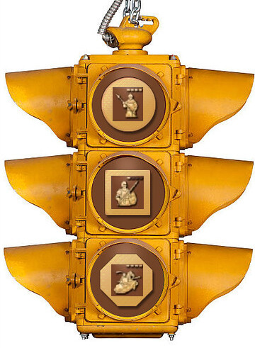
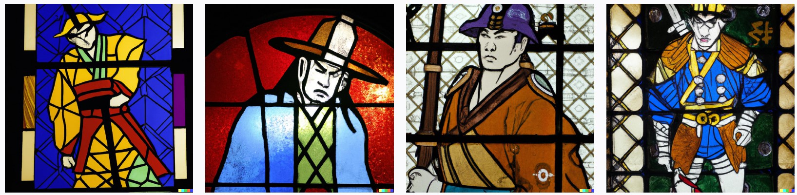
Something like that perhaps? ![]()
English
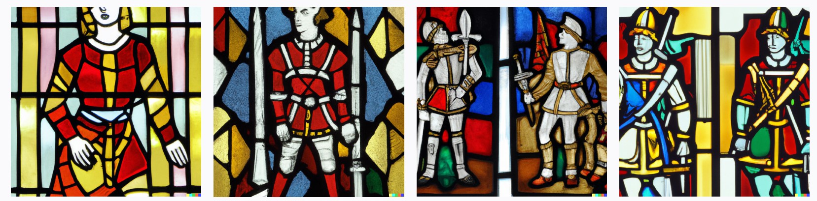
French

Holy Roman
Aztecs
Byzantines
Mongols
Chinese
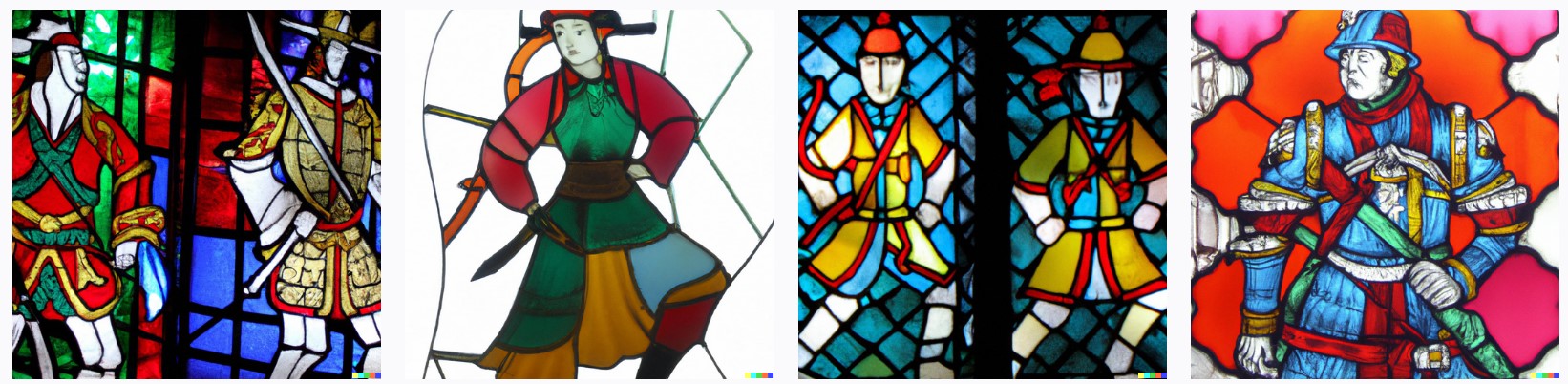
Abbasids
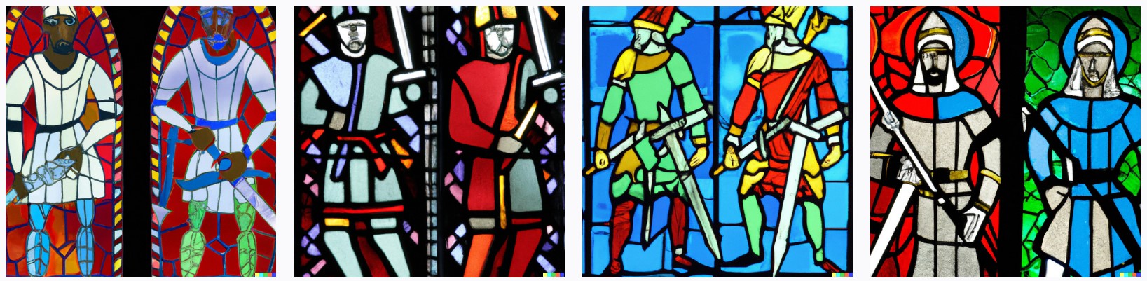
Norse
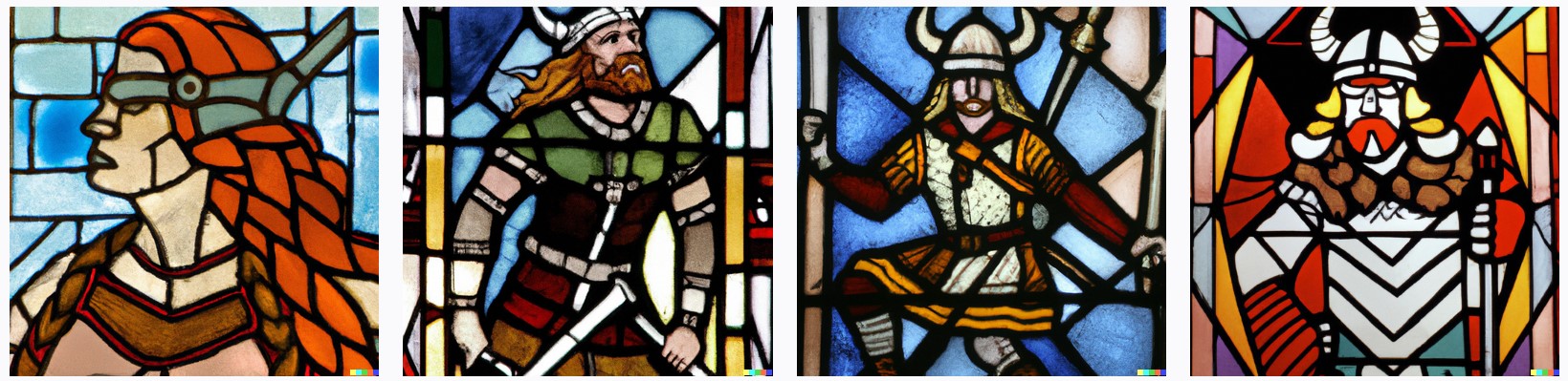
Japanese
1 Like
Thanks for your thoughtful reply, @GorbMort. I don’t have time to respond more fully right now, but will try within the next handful of days.
However, I’d like promptly remove any ambiguity about how you think I might feel about accessibility options, or how you might make others misinterpret how I feel, based on a paragraph in your post.
The way you wrote the following can be interpreted in a couple different ways.
- One way is that you’re just speaking objectively about the topic without judgment about me, which is fine.
- But the other way is that it’s like you’re trying to suggest that (a) you think I was somehow advocating that I don’t want accessibility options in the game, or (b) that you think I feel the game should just be made for the majority, or (c) that you think I’m clueless or unsympathetic about the demographic, or (d) that I’m somehow ignoring this demographic or wanting to, or (e) some combination thereof. If it’s any of these, I have no idea how you arrived at that conclusion based on my post.
To help show you I’m aware of this already, and that I am and have been an advocate for better accessibility options and designs, I dug up some of my old posts, as just a few examples…
From Nov 2019:
From Sep 2021:
From Apr 2021:
I’ve also made posts giving visual design ideas for those who can’t hear or have troubles hearing, which I hope are someday implemented in the AoE franchise.
I hope that helps remove any ambiguity you might have been feeling about my thoughts on accessibility options after reading my earlier post. I just wanted to clear that up so I wasn’t erroneously misrepresented,
With that out of the way, I’ll try to respond to some of your other thoughts in upcoming future days. Thanks again for your reply!
1 Like
I’ll admit, it was the impression I got by combining your “be good to make the UI/UX quicker and more intuitive for the vast majority of people to use” line with the later paragraph about “players who cannot see the full spectrum of colors in our world”.
It looks like this was simply about additional icon sets, and I appreciate you taking the time to clear it up regardless.
I just wanted to highlight that this is a necessary consideration for developers making modern video games that wasn’t really a factor (at all) when making the original AoE II and III.
1 Like
No, I think part of what I was trying to say is that I think it would be atypical (on average) for a game to design, intentionally or not, only one HUD option, when that only option impedes the usability for players who don’t have color vision issues. I believe the vast majority of players can see all colors, so I don’t understand (from a usability perspective) why all the icons in an unchangeable UI are monotone.
I still strongly feel that the ubiquitous simplistic gold icons were mainly just a result of a simple design decision to fit current UI trends, and to give a gold theme across the game (and eventually this website). And the UI/UX of this trend is, inherently, less than ideal, imo. The accessibility component was likely factored in for the default UI, for sure, but I don’t know how much. Maybe the thought pre-launch was that all players would find gold silhouettes better and more usable than classic AoE UIs and multi-colored icons – like it was truly felt all players would find them better and quicker than the old icons – I don’t know. (I know AoE:DE games and AoE4 give a number of accessibility options via the menus, though, and that’s great! I don’t ever remember seeing that in games many years ago, so it’s great progress.)
I still also think the existing AoE4 UI should be kept, if desired, and kept as default is fine, since it fits their theme. But giving a 2nd option that players like me can choose would be wonderful. If a 2nd option isn’t being given simply because it doesn’t fit their gold theme, then that would be unfortunate, as it sacrifices usability for aesthetics. And also sacrifices immersion for thematic aesthetics, as many have pointed out before.
Simplistic UI “themes” happen a lot these days in websites, wikis, apps, devices, PC productivity software, and the like. Often with just one or two colors. It has been a trend for quite a while. Seems like the trend got its roots with Windows 8 or around that time – the “metro style” interface, as some called it. Maybe it happened before that, I don’t know, but I feel that is about the time the world starting shifting toward this simplistic design more and more, and now it’s evolved and is everywhere, including AoE4. I can’t tell if it’ll be a passing fad, or has it been deemed the ultimate in UI design, so we’re now stuck with it forever?
As with everything, there are pros and cons. But as a visual person it really negatively impacts my ability to efficiently and effectively use a UI when colors (and depth) are stripped away. Simplistic, monotone UIs force me to sometimes look over similar icons every time to try and find “which one of these similar icons is the one I’m looking for”, until muscle memory kicks in. It’s slower than ideal and requires too much brain processing power for an action that should be (and could easily be) intuitive. The brain processing power and time taken to pick the right icon is what’s annoying because I’d rather focus on the game itself; not worry if I’m picking the correct icon.
And since the icons are boring to look at, I remember tech researching becoming a whack-a-mole experience for me in AoE4 where I’d just upgrade one boring icon to the next boring icon as fast as I could when they’d illuminate while not really caring or reading what the techs were. I wasn’t emotionally invested in the units or the techs because the icons mostly stripped away the immersive connection I felt between my button clicks and the game world. Rather than feeling anticipation for the tech or upgrade to finish researching to see a cool artistic graphic come to life, it was just blindly clicking buttons, not caring what they were or what they would become. UIs shouldn’t make you feel disassociated from the game. Maybe if AoE1 and AoE2 had been designed with cold, monotone, disassociated buttons I wouldn’t care so much. Unfortunately, though, the bar was set at a higher level, imo, than the 2D monotone icons that AoE4 has.
For AoE4, it is what it is. The gold theme has been with us ever since the earliest trailers or reveals; there were slight hints of the color theme to come. I know I’m probably over-analyzing things, but I’m just sad it became what it exclusively did, with no ‘AoE classic UI’ type of option to choose. I don’t necessarily want an exact copy of the art style AoE1/2 had for icons… just something that brings back color and 3D depth
2 Likes
They could have done so many things. Sad to see that the UI was left as a placeholder, much like many other things in this game. It is clear that Relic cannot be trusted with development of such an IP. Remind me to not purchase a product from this company again.
With the introduction of the Console edition and following the same style of their PC UI, it is clear they have no intention on correcting any of this. Shows how much they care.
2 Likes