NOTE: Please, don’t bash me because “graphics don’t matter and gameplay is above all”. I know this, I’m not here to discuss gameplay. Also I’m not here in a complaining manner.
I’m rather giving some feedback for the devs, and to see what you do you think of it or maybe it’s just me.
Hi Age fans!
So, if you’re out of the loop, we’ve had a great Age fan preview event where tons of new info, images and gameplay videos were revealed. If you missed it or want to watch again here’s a recap with all the videos:
https://www.ageofempires.com/news/afp-recap-2021/
Now, what I want to discuss with you is particularly the Units art-style of the game.
There is a thread already discussing the art style of the game. But I want to point out specifically to Units and its animations.
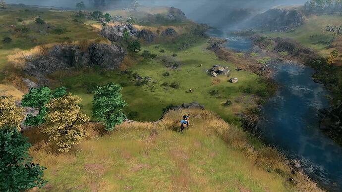
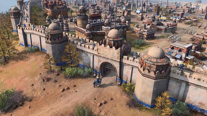
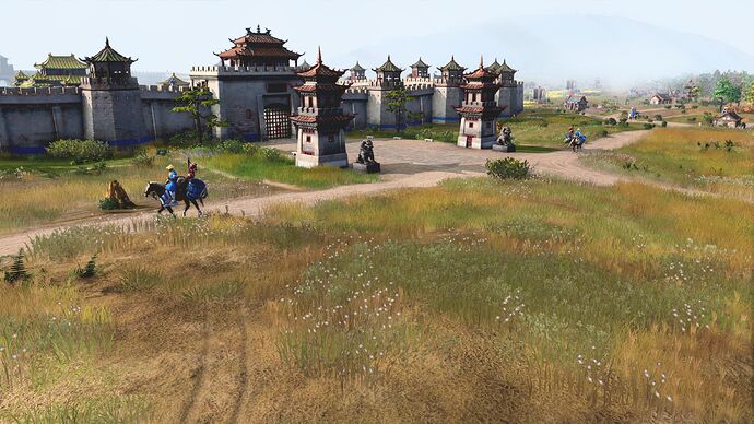
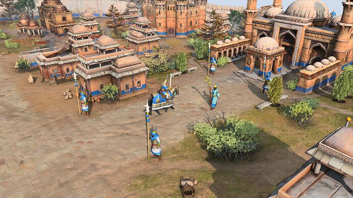
In my opinion, they seem out of place. When you take look at the enviroment and buildings art-style, the game just looks gorgeous. It strikes a perfect balance of stylized and realistic graphics, here are couple examples:
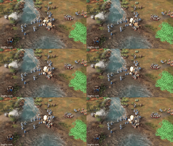
Even water and boats look awesome:
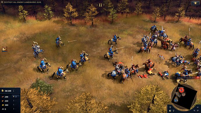
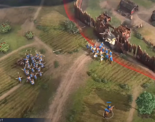
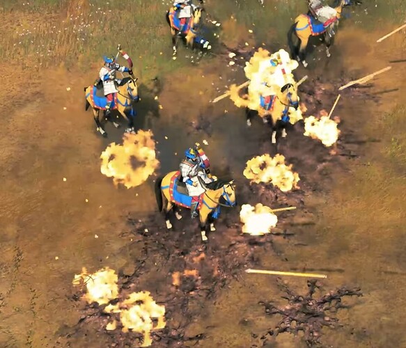
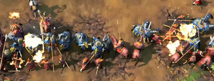
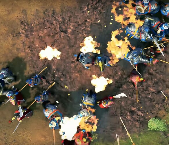
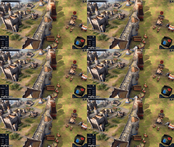
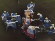
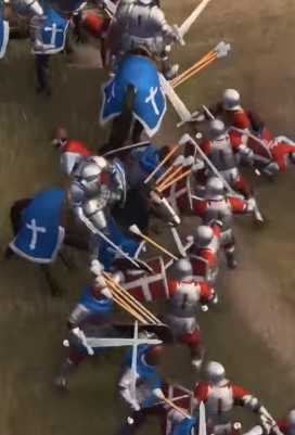
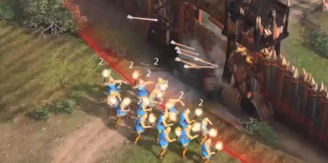
But then there’s the units, that are way too stylized and clash with the enviroment so hard that they end up becoming like they’re from an entire different game, like they were meant for a mobile type of game.
When I first saw them in the old X019 trailer, and then the screenshots, I though they looked cartoonish because I was looking at stills, and that when they were in motion they’d look a ton better.
Unfortunately, they don’t.
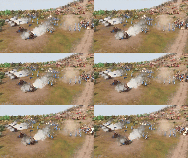
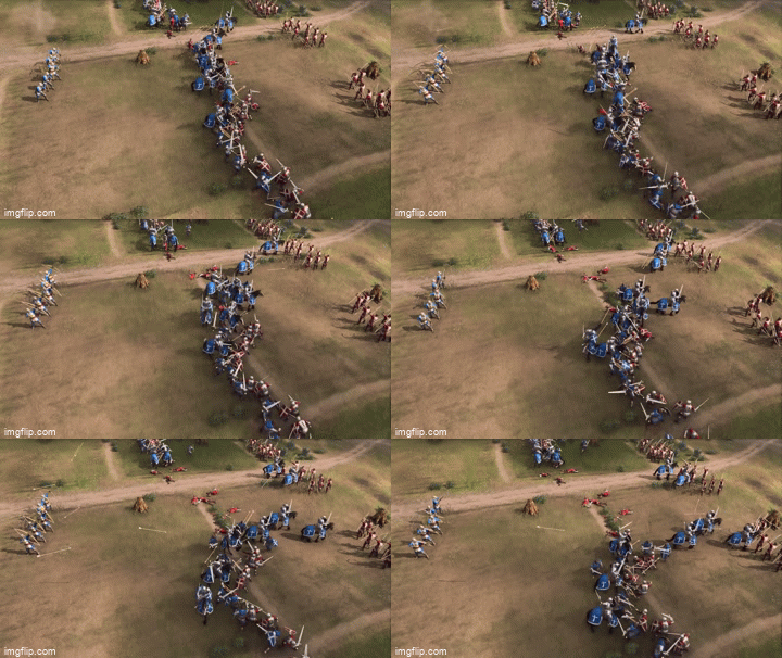
And animations don’t help at all. When they battled they looked really rough animation wise. Not to mention the weird arrows and bowmen.
Also, I know readability is a major factor, and key in RTS games. But I still think we can get good readability with the units, without making them so much cartoonish.
