Hello everyone!
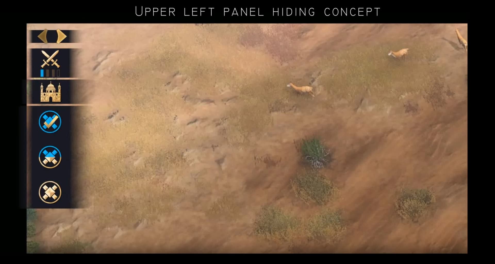
Recently, I came up with a concept for hiding an in-game upper-left panel and posted it on aoe4 subreddit. Originally, I wanted to post it here, but I was only able to register just now. Perhaps some of you have already seen it before.
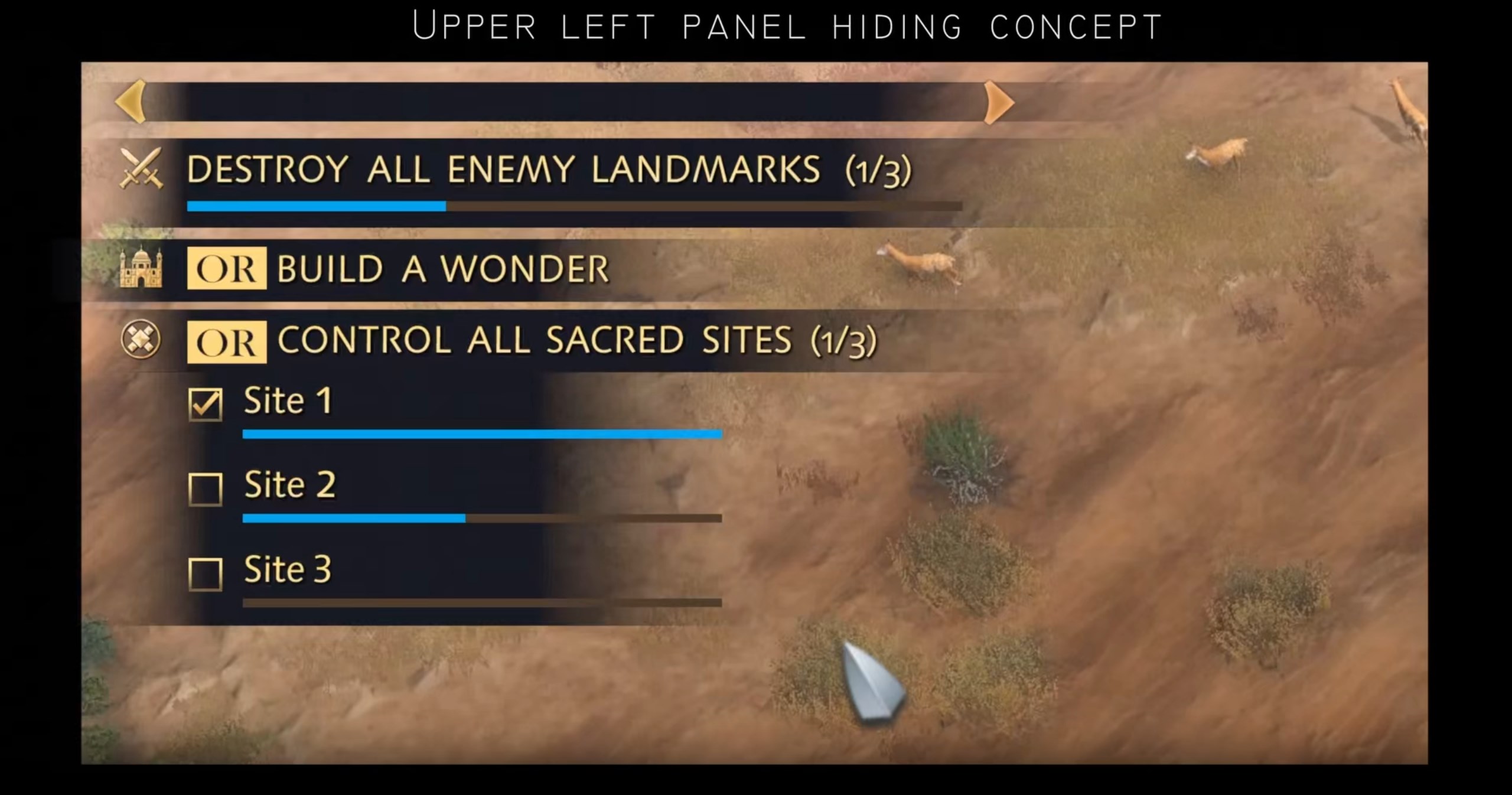
The concept is quite simple - I added a small button to hide/reveal additional information and redesigned the original design to be minimalist, leaving only the essentials.
Overall, the concept needs to be improved for team games, but for 1v1 matches, this feature will save a lot of screen space.
I see this as a must. I’m very in favor of minimalist GUI and show to the user the minimum information using the minimum objects, for example, with icons as you did.
Last time I saw/played AoE4, the HUD elements were huge and taking up way too much screen real estate. These particular elements you’ve built a solution for were particularly annoying, for lack of better word. As was the giant icon in the middle of the screen telling us what Age we’re in.
If the game someday lets us hide giant UI elements like this as part of the base (un-modded) game, I’m all for it for if/when I ever buy and play AoE4 again.
Allowing us to choose much smaller font sizes throughout the game, and use different fonts, would also be appreciated very much
Maybe. But then again, refining this shouldn’t be necessary. People have complained about these details taking up space since launch, so even without your example it should have been vividly clear that it needed a redesign.
Your proof of concept does that undeniably. This just goes to show that they seemingly don’t have an active workforce improving important details like this on this game besides for assumingly DLC. So it’ll remain like that for a good while I suspect, maybe even forever.
Maybe it would be nice if the info auto-expands for a few moments when an objective updates, and auto-collapses after, rather than always have to manually control. But I agree having manual control, too, is a must.
Personally, for my auto comment here, I’d more enjoy the message to just appear briefly and disappear rather (quick fade in/out) than scroll in and out from the side of the screen, but now it’s just getting to personal tastes stuff and wishing to see multiple mockups in action to land on which ones I’d prefer most
There is already a notification that pops up separate from the victory conditions in the top left when someone gets all sacred or builds a wonder or kills a landmark.
So I don’t think it needs to automatically maximize if a player has chosen to hide it (in this hypothetical world where we finally can minimize it).