Is cool that we can scale the UI, which is why I make it 75%. I prefer minimalistic UIs that block less of my game; and that’s why I don’t want it bigger. 75% should just be fixed to have crisp fonts/graphics and more font options in-game. Not an unclear request. I’ll make a bug report, per @Julix3748’s recommendation above.
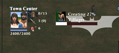
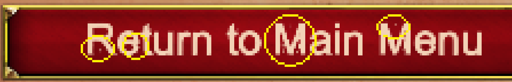
No page or UI element seems safe from the font issue:
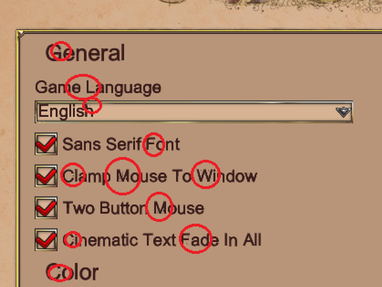
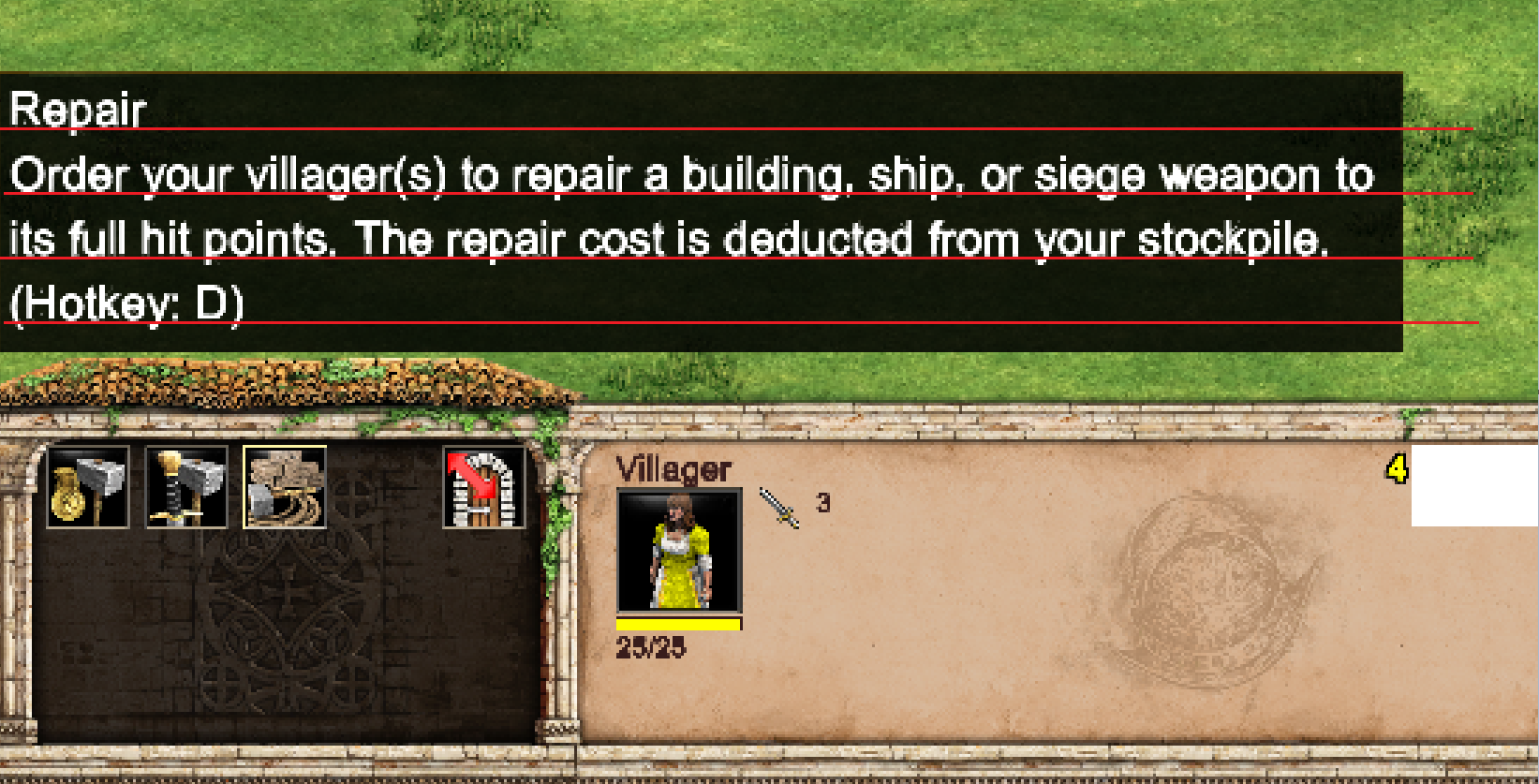
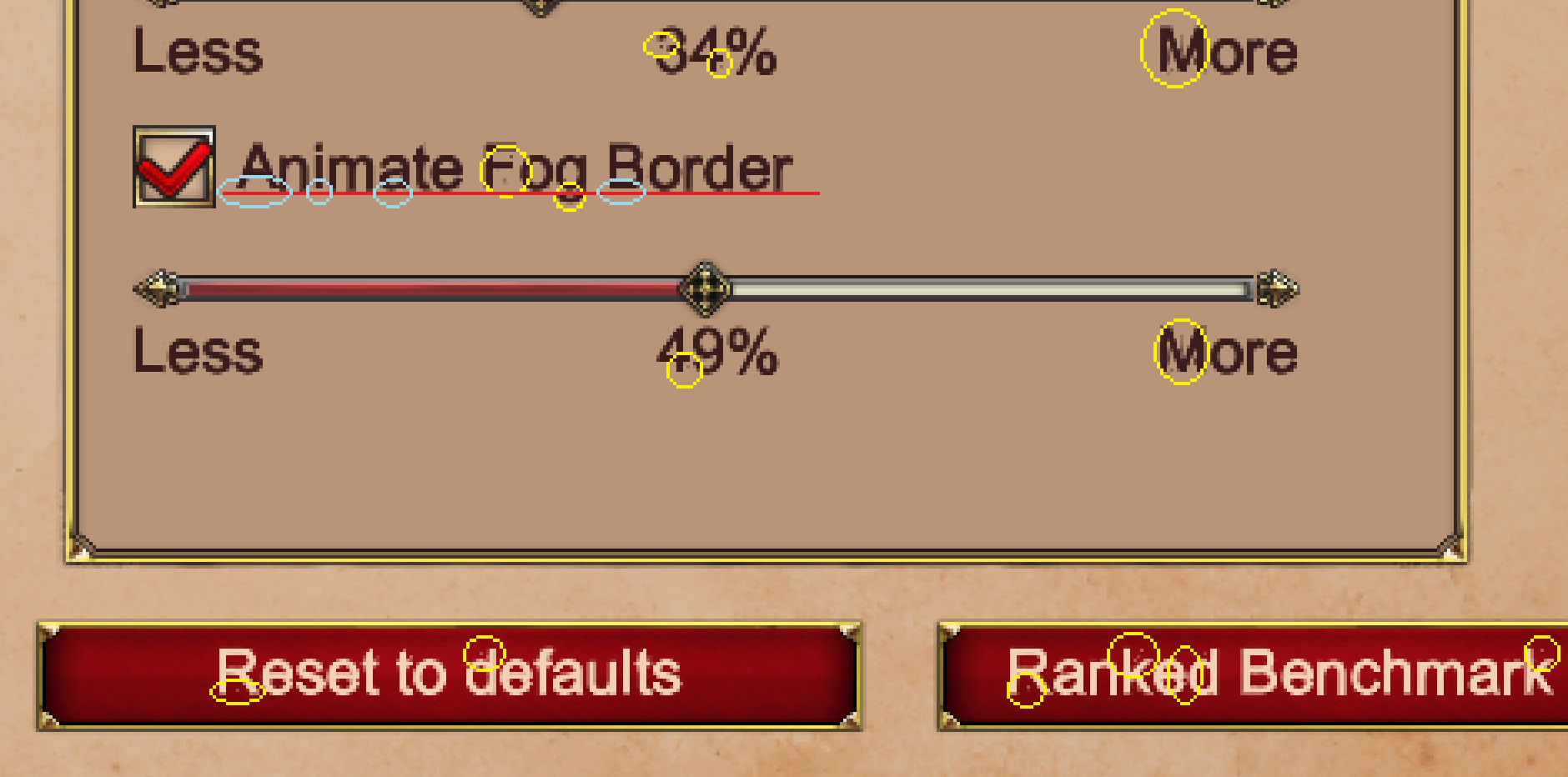
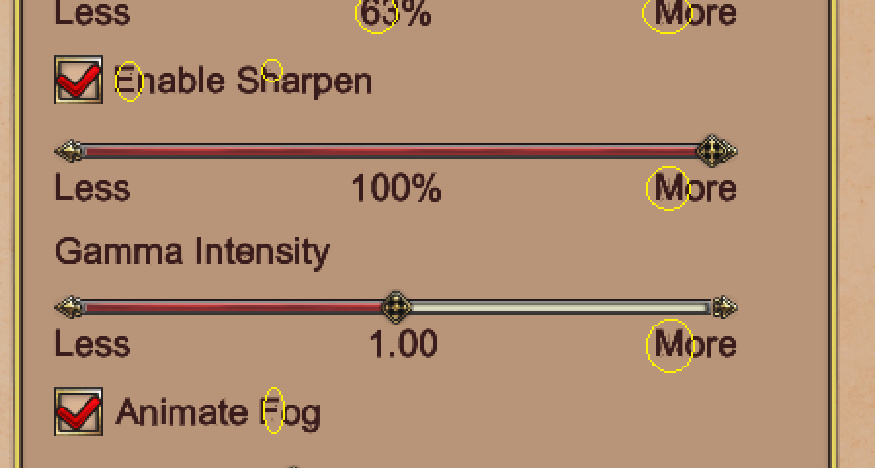
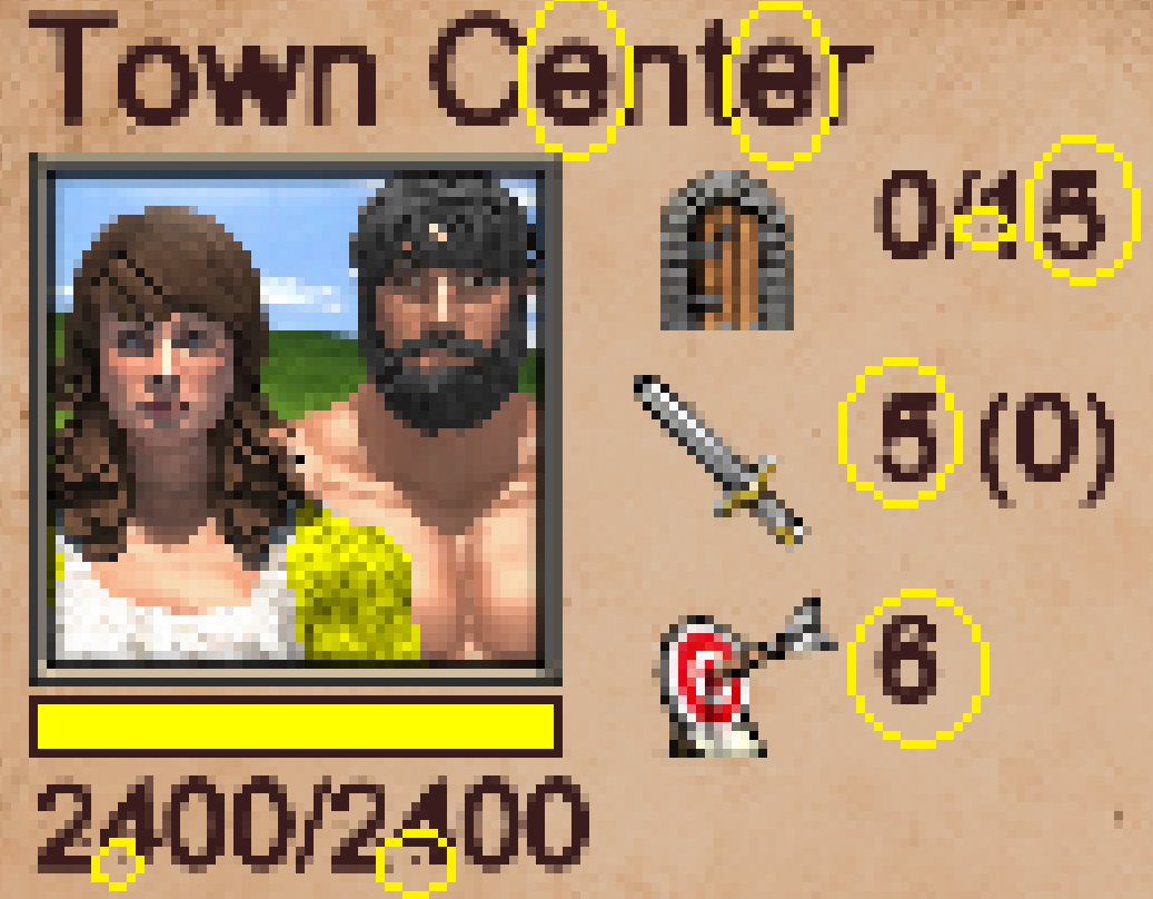
Another issue I notice with the font is a meandering baseline for the text. Some letters go farther down than others, causing an uneven foundation for the lettering. Check the wandering “full hit” wording here for just one example of many, for instance:
Sorry I pick up on this type of thing, but it feels like a lack of quality when I see things like this. Am I able to play the game? Yes, sure. But adding a level of polish to the fonts/text sometimes fairly soon would be great, so it feels like quality and polish in all areas. If this was on part with how the font/text looked in AoE2:HD, then I’d be more understanding. But it’s a step backward with this stuff. I also don’t need or want bold fonts everywhere
You have the answer man, don’t go that low with the scale, the fonts were done thinking for 100% size any lower i’d recommend you to modify the files, cause that ain’t an issue that everyone is having, also it seems you are running the game with a different resolution than ur desktop. see there is not blurriness one my game. the same for any other font the game they look clean.
Nope, man. I’m going to file a bug report because it’s what I want the UI size to be. Will let devs decide if they’re cool with a sub-par, “just barely good enough”, could-be-better font face when the UI is set to 75% zoom; and even for menus that aren’t tied to the UI zoom, which we have no control over.
I tested 100% and 125% UI zoom and font is, indeed, a little better. But it still shows issues. Regardless, like I said, 75% zoom is what I want, thanks. You’re free to use a big UI if it suits you better, enjoy it.
Yeah , that’s not optical adjustment. Something’s definitely wrong there.
I’m having the same problem too with the serif font. Both fonts break when lowering the UI scale. I suppose the scale implementation is not that elegant.
I’m being carried away here, but I sense this may even be contributing to performance issues.
It doesn’t matter what kind of font is used if you are downscaling it that much it will look blurry and bad, the only solution is reducing or increasing the font size in the files, the devs are not going to help you, cause they are not going to change the font size affecting others, you can:
1.-using normal scale or
2.-modifying the files by urself and finding the best size that suits you
In fact why the devs allow to downscale the UI that much if they know it will break the fonts, it is their fault in that matter.
Well considering all the game breaking issues that they haven’t fixed and for how long they have been, this in particular doesn’t seem to be affecting most users, i am just being realistic and giving you solutions but you are free to wait for a fix
Game-breaking issues isn’t the only thing they work on. Surely, you’ve seen all the new profile icons, event menu arts, cheat code implementations, civ balances, new civs, town center trophy arts, event decorations, and everything else they’ve worked on, right? Also including a menu redesign/overhaul, auto-scout implementation, hotkey updates, and QoL changes, etc.
I’m willing to bet over the next year, they will continue to work on more things than just “game breaking issues”
You don"t know that it doesn’t affect “most users.” Just because others may not (yet) notice it or take the time to post about it, doesnt mean it doesn’t happen for a lot of people, or everyone. Can you go create a single-player game against like 7 AI, each set to ‘Random’ civ, and take a screenshot of your match-creation lobby, then post the unedited full-size screenshot here? Just want to see it. You can hide your name, of course.
PS: They’ve probably made 4K/UHD updates and fixes, but that doesn’t affect “most users.”
It is not the resolution, this guy is downscaling and upscaling in order to get those blurry fonts, he thinks is due the font but it is actually the rendering effect while downscaling or upscaling the UI that makes it unreadable.
FoughtBird1976, don’t listen to this guy. He’s just making assumptions and jumping to conclusions on things he knows nothing about.
Please stop doing your absolute best to trivialize the issue. You sound like some Marvel superhero sent here to defend the Fortress of Imperfect Fonts. It’s obvious you think the devs should spend zero time on this, and you’re entitled to that opinion. Good, you’ve made your wishes clear; is it really necessary continue to try and do as much as you can to deflect developers from looking at the issue/concern or taking them seriously? Or trying to make it look like I’m doing this on purpose just to be difficult?
Hey, man, take a look at the following screensnhots. What? The issues even happen on menus you can’t upscale or downscale?? Wow, interesting. Impossible. Wonder why that would be. I must be doing upscaling or downscaling somewhere just to be a pain? I mean, that seems to be your go-to knee-jerk conclusion without intelligently conversing with me first, so it must be true. Thanks bro, appreciate it ~
Just because you might have low or sub-par standards for quality, doesn’t mean everyone does. Or just because you think you know everything, doesn’t mean you do. You’ve stated your piece; do you really need to keep harping on how you think I should just live with it ‘as is’, or put my UI zoom to 100%, or that I’m doing it on purpose to be difficult? There are hundreds if not thousands of other threads you could be posting in. No need to comment in this one anymore…
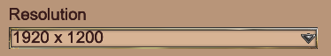
So far only you and other guy complaining and both of you downscaling/upscaling the UI to lower or higher levels than 100% and using the weird 1920x1200 res, while thousands of players can read the fonts just fine.
No one is defending anything, you need to learn to solve your own issues, change that unusual resolution since it is also not helping you, the devs are not going to help you, or maybe who knows, more support of resolutions when the first 4k tg players appear pray for it
Oh, welcome back to this thread It’s been a long while. Do you give instructional courses on how we can solve our own issues? I’d sign up right away. And on mind-reading, since you do so well at reading dev minds. I’d pay for that Please let me know right away so I can enrich my life and learn how to change settings on my PC, too!
By the way, 1920x1200 is far superior to 1920x1080. You, too, can be more productive with more screen space, and see more in games. I hate 1920x1080 monitors now, tbh
Guess what?? I made a bug report on this. I’m sad you haven’t posted over there yet to remind devs that you don’t care about quality
Actually, I play at 1920x1080 and 1366x768 (native monitor resolution in both cases) and the issue is still there, so the “non standard” resolution theory is wrong.
I have two theories:
(1) Fonts are implemented as images instead of vectors. I really hope that’s not the case since nobody does that since the 90s.
(2) The UI scaling itself is messed up. Maybe the entire UI is scaled after being rendered (just like downscaling an image in any editing software). The program does what it can to distribute the same information in less pixels, but minor errors are inevitable (emphasis on minor). If this is the case, then the game engine isn’t going a good job scaling the UI smoothly. That process can be improved, or maybe there’s a better way than just scaling after rendering.
Of course these are just my assumptions. Hope the devs don’t laugh at me so hard if they happen to read this.
That’s awesome, Zokaru22. Thank you for the thoughtful reply!
Yeahhh, that’s exactly what I was meaning earlier but didn’t know how to say it. (When I said it seemed like maybe fonts have a fixed, non-dynamic resolution, so it seems like it’s zooming in/out of a JPG image.) You mentioning vectors makes perfect sense and is a good example of something that would retain its quality
 see there is not blurriness one my game. the same for any other font the game they look clean.
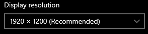

 pray for it