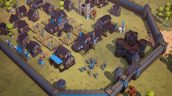
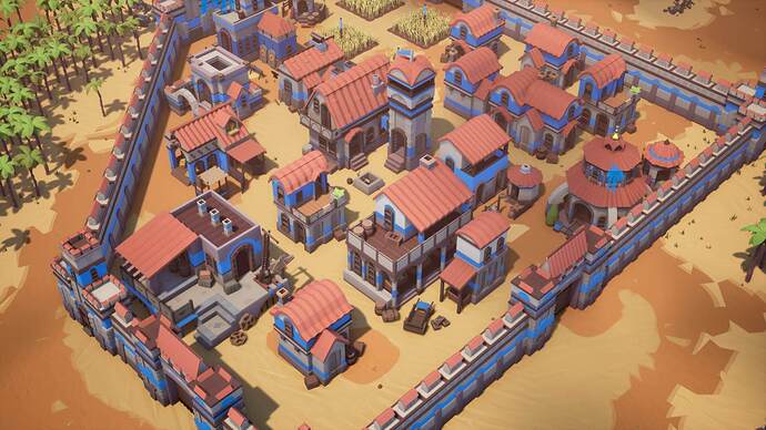
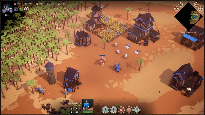
About buildings size, please devs

Hi everybody, I only want to beg for more accurate unit-building proportions.

In the past, when I played Tzar: Burden of Crown, I hated unit-building proportions, since the buildings were too small. When I played AoE 2 for the first time, I loved one thing, and that was the unit-building proportions. I don’t care if they are larger or smaller, but please make buildings as proportionate as possible to units.

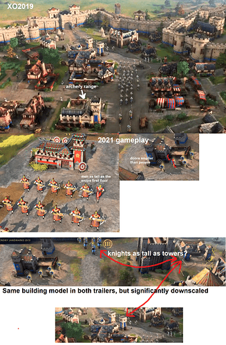
For example, if you see in the gameplay, whwn elephants attack the castle, they are attacking the air. This castle has a hitbox bigger than the castle itself. If it was bigger, its proportion towards units would be more acceptable… that would be awesome.
Please compare the house doors with the soldiers, or barrack towers with soldiers.

Many of you may think that it sounds silly, but for people like me these details mean a lot. If you cannot make the sizes fully proportioned, at least make them a little bigger.

Remember, I’m not talking about sizes, I’m talking about the building-unit proportion

Sorry if my English isn’t perfect. English isn’t my mother language.
43 Likes

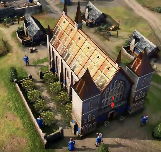
I have the same complaints like @Tapiseiro … e.g. in the trailer you see workers building an abbey. The entrance and the windows of the building are that small, it looks like they built it for Lilliputians. The scaling does not fit at all.

13 Likes

I’ll counter here by saying would you rather prefer that buildings are to scale and units are so small they they are too hard to see, yet alone select? Buildings in all of the Age games are not to true scale and the reason is limited space and the focus should be on the units. This is an Age game, not Sim City.

26 Likes

But keeping it similar to an AoE2 scale would also be a massive improvement.

8 Likes

@anon63664082 : I know you will always will have to make compromises w.r.t. scaling. But compare it to AoE2. There I can imagine that people can enter those buildings, in AoE 4 the people even do not fit inside the entrance doors…

19 Likes

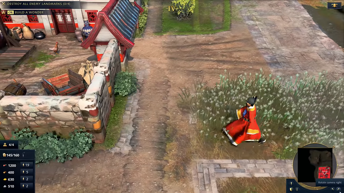
If you look at the screenshot carefully, walking units cannot possibly walk into houses without hitting their head.

5 Likes

But the scale in AoE2 is much metter than in AoE4. I dont want 100% proportional. But yes more. One thing is people being slightly taller than doors… but doors being half as tall as people is too much
There’s no need to be a Sim City to have good (or average) proportions

8 Likes

The unit sizes should not get smaller in any way, but I could like some buildings to be slightly bigger.
The walls for example looked way more impressive in the first trailer. It could be the angle of course… or even the lights…
I really dont know if they actually treated their own game very unfairly with badly produced trailers… and in reality its better.

Oh and AoE2 is not a very good example for proportions, there are even units bigger than boats

Screenshot_21

16 Likes

Boards are another world. But proportions in AoE2 are much better than AoE4 (in some buildings, not all).

5 Likes

Completely agree! In comparison to the proportions of AoE2 unites. AoE4 have far too large units for it’s buildings and some hitboxes for the buildings seem oversized. Hope to see this changed for final release.

7 Likes

totally agree with the title. Please change the proportions of units and buildings back to realism. For example how it is on aoe2.

Otherwise its just not fun to play.

11 Likes

I’m not sure you guys understand how realism with building and unit scale hampers gameplay when you are trying to micro units. It’s one thing to say tweaks need to be made to scale from select screenshots which may not reflect actual gameplay camera angles. It’s another to play the game for yourself and then judge.

14 Likes

The building proportions looked nice and realistic in the 2019 xbox on show trailer, why was this changed so much? Its downright comical now :grimacing:

27 Likes

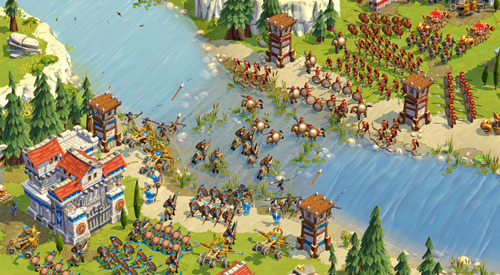
Because they are aiming it to look like AOE Online
image

3 Likes

The buildings are larger in AoE online than in the trailer for AoE4. If they were aiming for AoE Online graphics, than you would be getting a much different game

1 Like

I watched again preview of AgeIV… “That’s how mafia works”

+6 Gold

1 Like

The game at this point reminds me more of Empires Apart than AoEO. And that was just a tiny indie studio without budget, without anything.
Even AoEO has some charm in that pic. It was a straight forward cartoony bright game and never tried to hide it. Here we have something that tries to cater everyone and ends up catering nobody

11 Likes

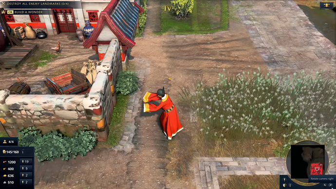
the chinese will have unique unit called the imperial office which will go around and tax building and get gold from and this is how chinese late game with gold would probably work out, they should give 50% of your villagers deflecting to the enemy team side lol.

they really should scale units

5 Likes

Well I believe this is new merchant mechanic ( The building looks like a Market ). It looks like there are gaia markets on the map, so even in 1v1 player can trade.