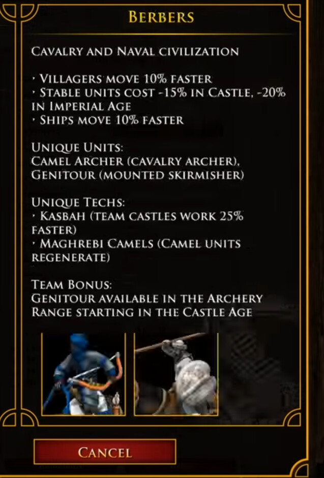
I kindly request that the font/text on the civ screen be made more user-friendly.
It’ll be a bit of a chore to scan through info finding the important info and differences between civs if the font/text choice looks like this (screenshot from the vid). ALL CAPS, no indents, huge letters, lines wrapping, all the same font size, all the same font color, no text formatting (bold, underlines, etc.), and capital letters being virtually the same size as regular letters.
It’s a good recipe for a poor user experience.
The font size could probably easily be cut in half to help readability. Using upper case and lower case letters would definitely help, too; as would better distinction between headers and sub-content.