Big poll for y’all to choose exactly what bugs you. Let’s see what we like and dislike the most.
What do you like?
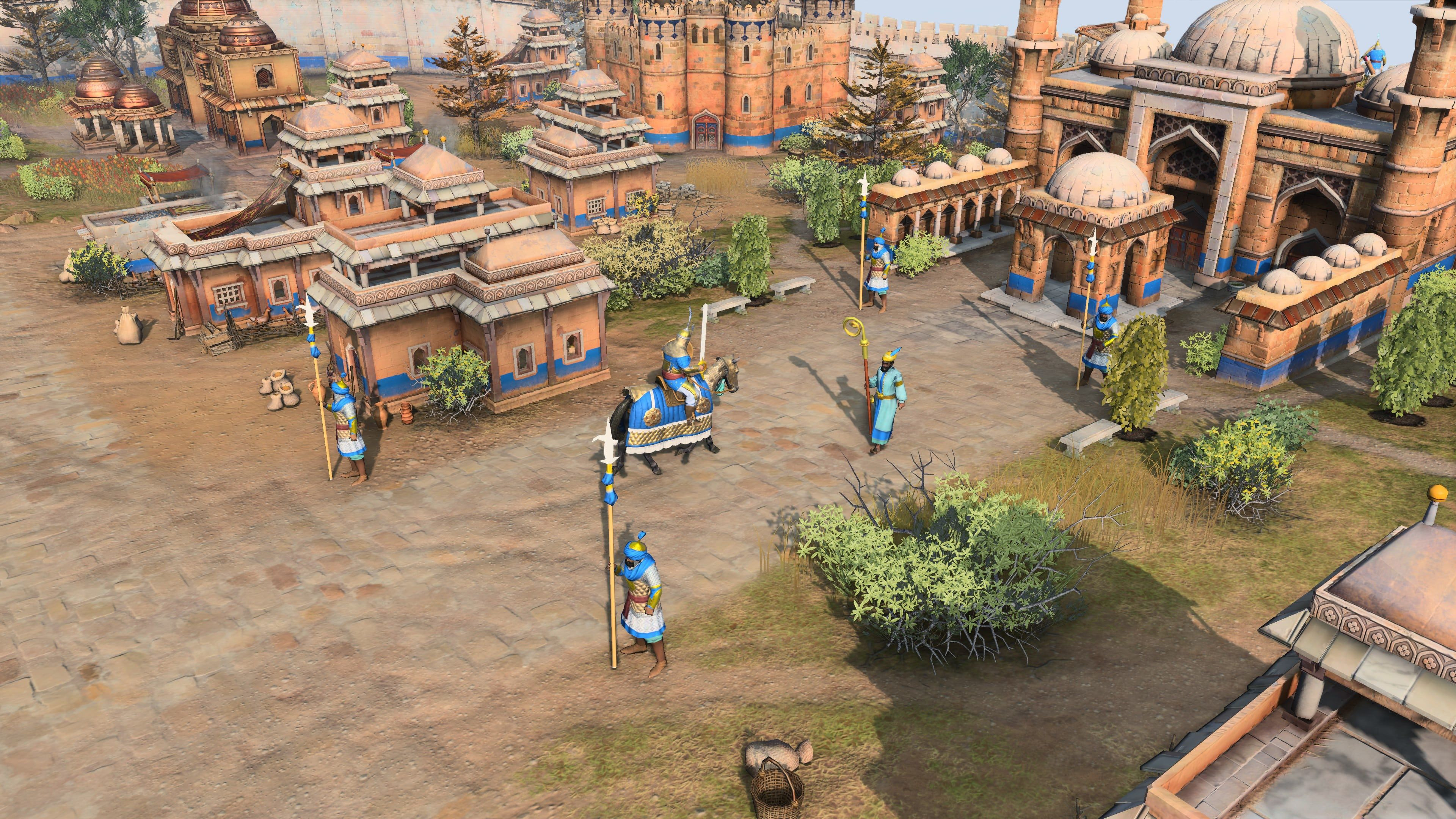
- I like the colors (amount of color, color contrast etc.)
- I like the unit details
- I like the building details (architecture etc.)
- I like the resource details (trees etc.)
- I like the terrain details (ground, mountains, dirt etc.)
- I like the shadow/lighting effects
- I like the building:unit proportions
- I like the unit:arrow proportions and how they entrench (in units or buildings etc.)
- I like the size of weapons
- I like the infantry combat animations
- I like the cavalry combat animations
- I like the artillery combat animations
- I like the construction animations
- I like how cavalry moves
- I like how infantry moves
- I like the corpse animation
- I like the building destruction animations
- I like the UI
- I like the mini-map layout
What do you dislike?
- I dislike the colors (amount of color, color contrast etc.)
- I dislike the unit details
- I dislike the building details (architecture etc.)
- I dislike the resource details (trees etc.)
- I dislike the terrain details (ground, mountains, dirt etc.)
- I dislike the shadow/lighting effects
- I dislike the building:unit proportions
- I dislike the unit:arrow proportions and how they entrench (in units or buildings etc.)
- I dislike the size of weapons
- I dislike the infantry combat animations
- I dislike the cavalry combat animations
- I dislike the artillery combat animations
- I dislike the construction animations
- I dislike how cavalry moves
- I dislike how infantry moves
- I dislike the corpse animation
- I dislike the building destruction animations
- I dislike the UI
- I dislike the mini-map layout
Feel free to discuss poll related things here. Try not to double post things you may have already wrote here
14 Likes
I am enjoying the cav archers shooting while moving. I think color problems will be fixed with unit proportion and weapons. I dont mean the need to be perfect 1:1 ratio just a little smaller and which should make weapons smaller. Writing it out i think just reducing the unit proportion by 15% would fix most of the visual issues.
6 Likes
Shadow effects are okay, but I hope we can reduce or disable lighting effects. Could be annoying and makes game looking more cartoonish.
1 Like
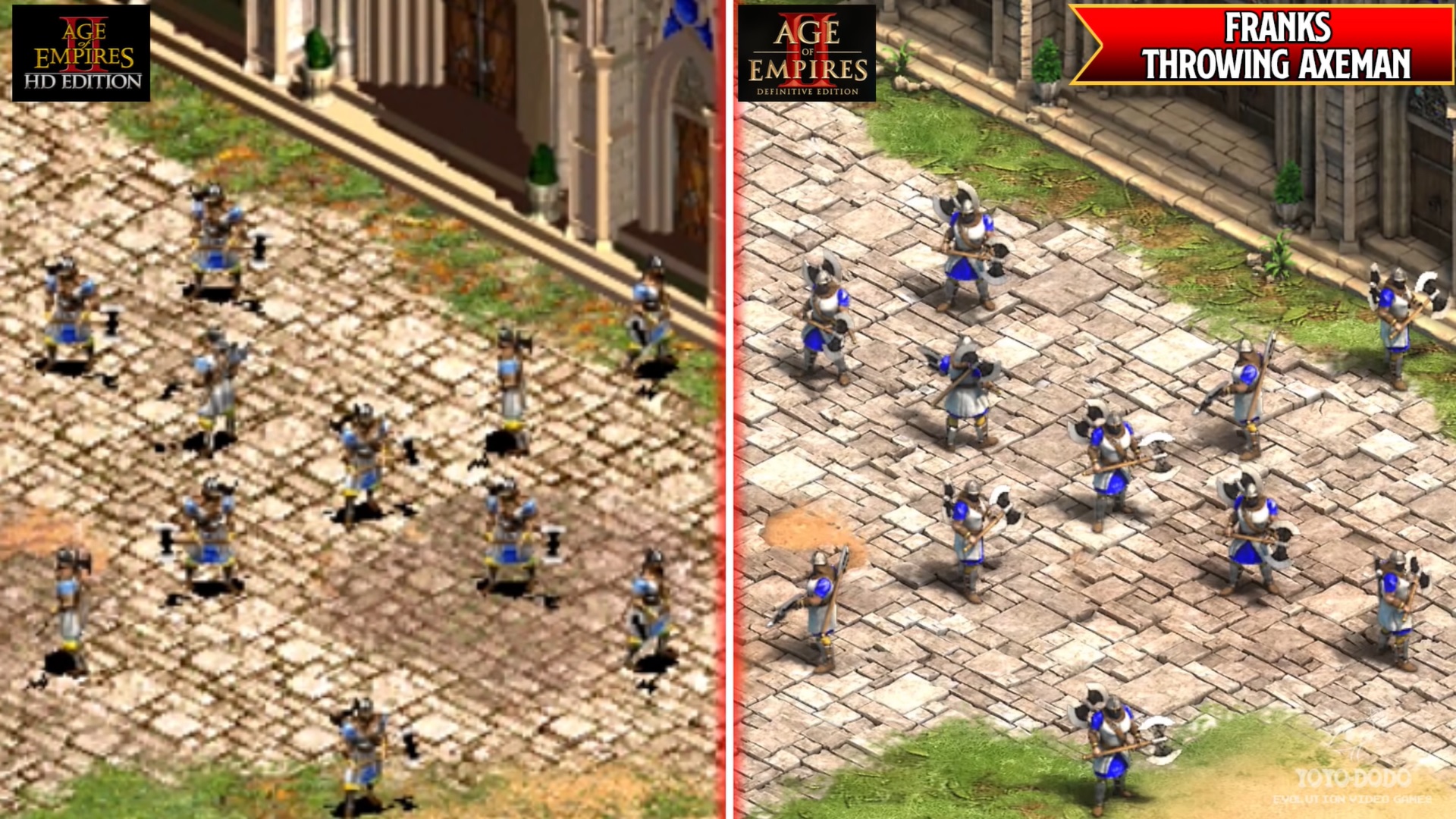
The main problem for me is how texture look blurry on everything: Units/Terrain/Buildings. And lack of shine on metalic objects.
It’s a problem that AoE3 doesn’t have.
Makes the world look like rubber or plastic.
10 Likes
I vastly believe the majority dislike the cartoony graphic of the units and buildings. Whose idea was this to look at the graphics of Age of Empires II & III and realize they should turn it into an even cartoonier graphics? Most gamers are mature, and while we do play game like DOTA and Valorant, when it comes to historical game - especially Medieval time period - most of us would rather prefer to have a grittier atmosphere and graphics; hence why games like Mount and Blade, Chivalry, Modhau, Kingdom Come: Deliverance, and Total War are so vastly popular even today.
The whole eSport and marketing this game for kids to be more inclusive is to be honest, a really dumb strategy. While I can’t make a direct prediction as to how many people would tune in to Twitch to watch Age of Empires IV thanks to the cartoony graphics, I think most would rather see a realistic looking units brawling up against each others during LIVE stream, and kids are capable of playing games that has more matured tone, hence why Grand Theft Auto and Red Dead Redemption 2, games which were made for adults, harbor lots of younger audience.
4 Likes
I mean, take a close look at the textures on everything here.
Too blurry and clean, lacking detail. They need to be sharper.
This seems like what a sequel to AoE Online would have been.
9 Likes
Yeah you are very right.
Pretty disappointing considering the detail in CoH and CoH2.
CoH is 15 years old and the graphics are still amazingly good and detailed, with huge zoom.
I guess all the good staff also left Relic in the last 15 years
5 Likes
Idk, seems it’s just a design decision.
You just don’t make everything blurry like that unless it’s intentional.
about low textures on units i’ve read some developers interview and it seems the main reason it was readability for competitive games and for casual. But i really suppose that reason are Competitive games.
It doesn’t need to downgrade the graphic for all players only for multiplayer and competitive gamers. A graphic engine is scalable for this reason. Most of multiplayer gamers can set down the graphic options as they always done but develepers should give to the other players who are not interested to competitive games the possibility to play with the best graphic if they wanna it.
It’s only a matter of “give players different choices”.
6 Likes
Why would they change graphics for everyone in multiplayer? I have never seen this in any games
1 Like
Ok I get that.
But they need to find a better way to do this. Like you said, options to enable more readable textures if you are going for multiplayer.
Hell they can even make an optional texture pack just for that. For people that want more simple textures.
But it’s not worth butchering the graphics over.
1 Like
I think “Size of weapons” is not specific enough.
Most weapons are correctly sized.
Pole arms are supposed to be bigger than a soldier. Lances are long.
The shields are in some cases even a bit small, I mean how do you defend against arrows if it only covers half of your body?
Crossbows and Bows are also normal sized not different from previous AoE games.
But swords are way to big and to wide. In some scenes I thought they were using pole arms in at the first moment.
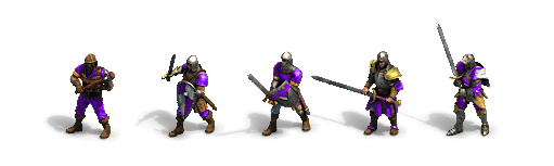
They were already too big in the past though. The Longsword is using a two handed sword in one hand. Even the Man at Arms one is too big.
But it’s not like this is a new thing for AoE. AoE had unrealistically big weapons before.
Visually I don’t like that the metal parts of the weapons are just plain white.
Over all there is noting that is really bad but there are always things that can be improved.
8 Likes
Size/proportion/scale all the same and most people will know what i mean ¯_(ツ)_/¯
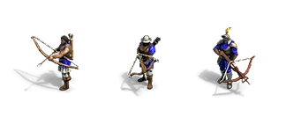
How people were expecting the units and combat to be:
yes, and i’ll repeat that i’m fine with art style and terrains. But models have to be more detailed: high textures mean more realism.
I really don’t think that’s the case ther are some that like and some that dislike the graphics. It’s just a matter of personal preference. I personally really like the new style and the direction they went with it. Of course there are still some fields that need improving but for the most part I think they did a great job with the graphics.
1 Like
The better poll for the moment. Devs please listen it.
Most voters here dislike unit details.
More people even disliked the color which was a bit of a surprise to me because its the only thing that doesn’t seem bad lol.
1 Like
You think microsoft is gonna have combat like that when they’re aiming for a T rating? Lol.
Btw, I’m pretty sure NOONE(at the very least only a handful) was expecting THAT from an AGE game