New Main Menu and User Interface

What are your thoughts on it? Mods can be found next to your profile’s avatar, which I find in quite a bad place. I think it should be near the bottom of the screen somewhere. Map editor in single player window seems strange also.

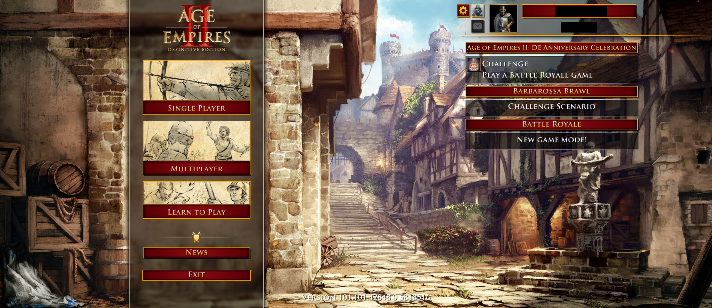
Edit: [Anne_HK] Old Main Menu. Quick play is hidden. You need to click on the battle royale button to access quick play.

Edit new poll

The New Menu Vote
  • Bring back old menu.
  • Keep new menu.
  • Make it optional.
0 voters

Quoted edit post by xWHIT3W0LFx for good feedback.

Some in-depth feedback and suggestions regarding the overall user interface:

Problems with the modern UI in general:
The new UI, and I don’t talk about the main menu alone, I talk about the modern mobile-game-ish UI, has a few problems. It contradicts with the general UI design philosophy of the game. Most menus are held in this oldschool paper background design. It is clear, easy to read and makes a good overall impression. And then threre is this new UI with huge all-caps fonts, huge buttons etc… It’s not ugly but it wastes so many space if you compare it to the oldschool UI. This is a PC game, played mostly in high resolutions and this screen space should be used. Apart from looking a little clumsy, it also doesn’t fit the historical setting of the game as much as the oldschool UI.

The new Quick Play user interface feels a bit out of place, firstly because all other multiplayer UIs are in a single screen and secondly because all other multiplayer interfaces have the old design. I suggest adding a new tab “Quick Play” to the multiplayer interface right next to the “Ranked” tab to have everything multiplayer related combined in one place.

Animations:
For me, transition animations are completely unnecessary. I wouldn’t mind them being in the game though, as long as you can turn them off somehow.

Civilization selection menu:
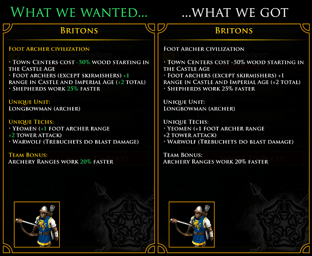
I really like the new civ selection, however a few things could be improved here as well:

  • do not use all-caps font, it’s a pain to read
  • remove the “Confirm” button and change the behaviour so you only have to do one click to select the desired civ and close the dialog
  • maybe highlight some stats and bonus values like suggested in this reddit thread:

reddit

r/aoe2 - [UI] What we wanted vs what we got

803 votes and 119 comments so far on Reddit

Campaign Screen:
The campaign screen is absolutely amazing. The only thing which could be changed is to remove “The Art of War” and the “Historical Battles” from there. It makes no sense to have them besides person-centered campaigns positioned on a world map.

“Historical Battles” should definitely be accessible via the main menu. Some people even asked on reddit or here on the forums if the the historical battles were removed because they couldn’t find them after the November patch.

“The Art of War” and should be selectable via a new “Learn to Play” selection screen alongside with the “William Wallace” learning campaign.

History Screen:
In comparison to older versions of the game, the history screen is a step backwards. The old UI not only fitted better into the game, the readability was also better, because you saw much more text at once.

This topic has already been discussed here:
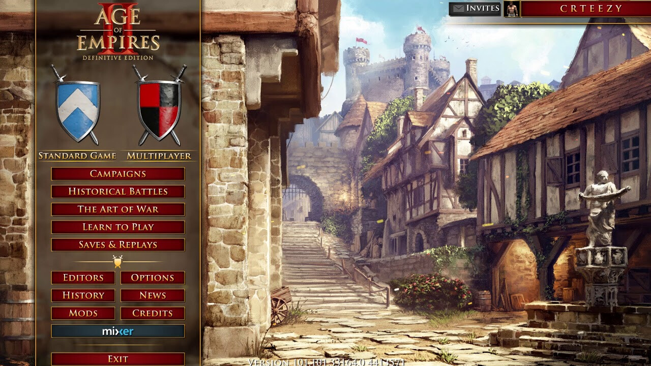
Main Menu:
Designwise I can’t really make helpful suggestions as I’m no graphic designer, but I can make some regarding the structure:

In my opinion the above displayed menu items are essential and should therefore be directly accessible to the user. Right now, some of these items are hidden behind a little gear symbol, where you would normally expect to navigate to the options menu… not optimal. The “Learn to Play” button should lead to a screen like the campaign selection screen with fancy background etc. where you can access the “The Art of War” and “William Wallace” learning campaigns.

menu

It has already been confirmed that the devs are working on a menu to access all the challange scenarios (Mongol Raiders, Barbarossa Brawl etc.). With this addition, there are a lot of options you could select if you want to play a singleplayer mode. Maybe these items could be merged into one main menu item leading to a submenu (only if it would overload the main menu too much).

The “News” button can be positioned like in the picture above. It’s a button you hardly ever click, so it doesn’t has to be as big as it is right now.

Conclusion:
In my opinion it would be better to discard the modern user interface completely and use the oldschool UI design, which is already used in most places anyway. The new UI feels more like a mobile game UI and doesn’t fit AoE II well.

Please consider making the user interface more consistent and don’t oversimplify simple things.

Ok, now enough of those words. Thank you so much Microsoft, Forgotten Empires and Tantalus for constantly updating this amazing game. I hope that this review is at least a little helpful.

62 Likes

Pretty annoying how the multiplayer button on the mainscreen leads to an in-between page with pictures, which then all lead to the same pages we already had… Just go there immediately.

2 paths to same locations just adds unnecessary complexity.

Mods and options are hidden and awkward now.

34 Likes

The new menu is just confusing and loses all AOE2 HD vibe. I don’t like it.

34 Likes

I’m not a fan of needing an extra click to get to the scenario editor.

36 Likes

The new main menu is so bad. It basically adds one more unnecessary click to reach where you want to go, for nothing.

Other things I want to complain about the UI: the civ select menu’s very unreadable all cap font for civ overview (I remember seeing a thread about it, but can’t find it now)

And the history tab (which is more unlikely to change, now that it’s hidden deeper in the menu), so sad

23 Likes

Why can’t Microsoft, and every other company, just leave well enough alone. Nothing was wrong with the game. But people at Microsoft are bored. So they make all these changes to the interface and match making, and now it is full of bugs and freezing. I have a top of the line gaming PC, and my PC NEVER froze before they made these changes. Please change it back, thanks.

21 Likes

The UI designer needs to keep his shoddy job somehow. All of these minimalist designs, plaguing websites, designed by hipsters are starting to get on my nerves.

Forget the freezing and the bad matchmaking, it’s so freaking ugly… ugh…

Like bro, I don’t care what you learned in your 6 months long course in university, you aren’t designing for tablets. This big icons bs needs to stop!

23 Likes

I didn’t played with update yet (so I am not sure about there is option or not). Why there is no option to select your menu or with modding? Like in HD there were Menu Modding and I used Constantinople Menu a lot. It was clean and good looking for me. You can change location of buttons and size of them on HD (2013 now).

Constantinople Main Menu: https://steamcommunity.com/sharedfiles/filedetails/?id=1380354919&searchtext=Constantinople+Main+Menu

4 Likes

First time it was ok, until i played few games the menu and interface got pretty much laggy, also in all the games that i have played i have had stutters and lag 24

5 Likes

Yes it was confusing like you have to research the forums or reddit on how to view your own replays unlike before where we have the replay tab in the main menu itself. Maybe they’re planning to add more content in the future so the minimalistic menu.

4 Likes

I was able to find loading replays, but where are the historic battles?

2 Likes

https://forums.ageofempires.com/t/new-ui-sucks/108625/3

I am to lazy to post something new. I just quote my own post.

3 Likes

It’s there in the Campaigns if I recall the Historical Battles are under Africa.

3 Likes

Aha! I see it now. Quite bizarre, given that Hastings, for example, is not in Africa, but at least they’re accessible.

2 Likes

The new ui is the worst thing to happen to the game since malay aged up 166%.

Now you have to click through multiple buttons to access the same place as before, and to make it even worse you have to wait for a fancy animation to complete in-between each page. In addition the new UI seems to not have been tested on lower end systems, as my computer which ran aoe2 perfectly before this update has occasional lagginess when navigating the UI due to the animations I presume.

The new civ pick screen is just bad, and is also an example of catering to new players, while screwing over existing ones. I understand and admire the intention of making civ bonuses more easy to decipher for new players, but forcing people who already know the civs, to use a new selector that covers the entire screen, and needs an animation and confirmation click once you select your civ is atrocious. In the old ui it took 2 seconds to pick my civ, and it could be easily switched out multiple times if it’s a teamgame and I’m discussing civs with my teammates still. Now it takes about 10-15 seconds to make a choice, assuming that the animation doesn’t lag, as it is oft to do.

Dev’s please make the new ui optional, and if that isn’t possible at the very least you need to get rid of these slow animations in-between each page. This is like forcing us to play with confirmation delete.

35 Likes

Hahaha, when I saw animation I thought it’s cool but it’s delaying players a lot and nobody loved it. Why developers didn’t add any options on settings like disabling animation, old definitive menu or classic menu?

7 Likes

So the new UI is not only ugly, but also time consuming and laggy?!
Seems like the devs screw up the UI very much.

14 Likes

I think this part can grow on us

But the option to toggle it is certainly a need

2 Likes

Yeah I agree I dont normally comment much on forums but I find the new UI ugly and unnecessary and hope they implement an option or mod to revert it.
Little things can make a huge difference - least thats what the misses says

6 Likes

From

Over

To this

These are sad times if this is seen as “progress”

42 Likes